How can I have Image and Text for Picker in SegmentedPickerStyle in SwiftUI?
Asked Answered
M

4

9

I am building a Picker with SwiftUI.

Now i want do add an icon AND text for each selection. So it should look something like this:

enter image description here

Is this possible? If yes how to do it?

Or is it not recommended by Apples apples human interface guidelines at all?

I already tried to use a HStack to wrap image and text together.

enum Category: String, CaseIterable, Identifiable {
    case person
    case more

    var id: String { self.rawValue }
}

struct ContentView: View {

    @State private var category = Category.person

    var body: some View {
        Picker("Category", selection: $category) {
            HStack {
                Image(systemName: "person")
                Text("Person")
            }.tag(Category.person)
            HStack {
                Image(systemName: "ellipsis.circle")
                Text("More")
            }.tag(Category.more)
        }.pickerStyle(SegmentedPickerStyle())
        .padding()
    }
}

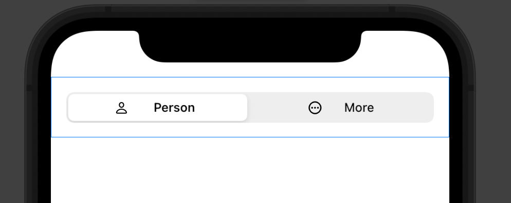
But the framework splits it up into four.

enter image description here

Monique answered 18/9, 2021 at 16:1 Comment(4)
Without a Minimal Reproducible Example it is impossible to help you troubleshoot with what you have tried.Tomokotomorrow
There doesn't seem to be a trivial way of doing this. You shouldn't really mix images + text here anyway, it should be either but not both.Timepleaser
This seemed like a simple question: just put a Label instead of the HStack... But it does not work?! I have also tried to use a custom LabelStyle... but without success. It seems as if the SegmentedPickerStyle only uses one of the two provided views. Choosing a WheelPickerStyle would show the label as expected. It's definitely an issue with the segmented picker only.Gent
According to Apple Human Interface Guidelines for segmented controls it is definitely not desired to have both text and image. So it is not a bug of SwiftUI, but a feature: you cannot do it wrong :-)Gent
C
8

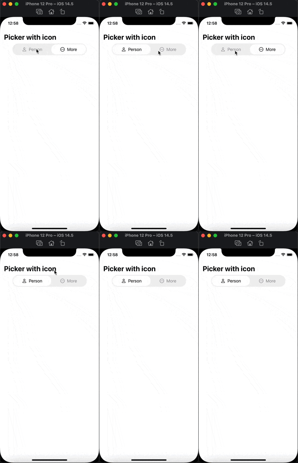
You can make a custom Picker

struct ContentView: View {
var body: some View {
    Home()
}
}

struct Home: View {

@State var index = 0
var body: some View {
    
    VStack {
        HStack {
            Text("Picker with icon")
                .font(.title)
                .fontWeight(.bold)
                .foregroundColor(.black)
            Spacer(minLength: 0)
        }
        .padding(.horizontal)
        
        
        HStack(spacing: 0){
            HStack{
                Image(systemName: "person")
                    .foregroundColor(self.index == 0 ? .black : .gray)
                Text("Person")
                    .foregroundColor(self.index == 0 ? .black : .gray)
                
                
            }
            .padding(.vertical, 10)
            .padding(.horizontal, 35)
            .background((Color.white).opacity(self.index == 0 ? 1 : 0))
            .clipShape(Capsule())
            .onTapGesture {
                self.index = 0
            }
            
            HStack{
                Image(systemName: "ellipsis.circle")
                    .foregroundColor(self.index == 1 ? .black : .gray)
                Text("More")
                    .foregroundColor(self.index == 1 ? .black : .gray)
                
                
            }
            .padding(.vertical, 10)
            .padding(.horizontal, 35)
            .background((Color.white).opacity(self.index == 1 ? 1 : 0))
            .clipShape(Capsule())
            .onTapGesture {
                self.index = 1
            }
        }
        .padding(3)
        .background(Color.black.opacity(0.06))
        .clipShape(Capsule())
        Spacer(minLength: 0)
    }
    .padding(.top)
}

} example

Calyptra answered 18/9, 2021 at 23:1 Comment(4)
Thank u very much! I spend a lot of time to find out how to do similar segmented controller, especially how to change height of segmented controllerDorie
Could you please say how you show view when selecting specific segment?Dorie
Embed in Zstack and add condition (if index == 0 {View1}else if index == 1 {View2}....)Calyptra
@Calyptra can you please improve answer with more system looks like animations? And also with example of selecting as improve overall. Thanks!Woodworking
D
2

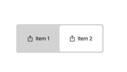
Here is another possibility with a @ViewBuilder for building items. It's adaptable for your needs, hope it can help !

import SwiftUI

struct CustomPicker<T: Identifiable & Equatable, C: RandomAccessCollection<T>, Content: View>: View  {
    let items: C
    @Binding var selection: T
    @ViewBuilder let itemBuilder: (T) -> Content
    var body: some View {
        HStack(spacing: 0) {
            ForEach(items) { source in
                Button {
                    selection = source
                } label: {
                    itemBuilder(source)
                        .padding()
                        .background(selection == source ? Color.white : Color.clear)
                        .cornerRadius(7)
                        .foregroundColor(Color.black)
                }
                .buttonStyle(PlainButtonStyle())
                .animation(.default, value: selection)
            }
        }
        .padding(4)
        .background(Color.gray.opacity(0.4))
        .cornerRadius(7)
        
    }
}

struct Item: Identifiable, Equatable {
    let id: String
    let name: String
}

struct CustomPicker_Previews: PreviewProvider {
    struct Container: View {
        @State var selection = Item(id: "item-1", name: "Item 1")
        var body: some View {
            CustomPicker(items: [Item(id: "item-1", name: "Item 1"), Item(id: "item-2", name: "Item 2")], selection: $selection) { item in
                HStack {
                    Image(systemName: "square.and.arrow.up")
                    Text("\(item.name)")
                }
                .padding()
            }
        }
    }
    
    static var previews: some View {
        Container()
    }
}

Preview

Demarche answered 18/4, 2023 at 15:17 Comment(1)
can it be more like system animation with? !Woodworking
U
2

For iOS 16+ you can use ImageRenderer:

enum Category: String, CaseIterable, Identifiable {
    case person
    case more
    var id: String { self.rawValue }
    
    var systemImageName: String {
        switch self {
        case .person: return "person"
        case .more: return "ellipsis.circle"
        }
    }
}

struct ContentView: View {
    @State private var category = Category.person
    var body: some View {
        Picker("Category", selection: $category) {
            ForEach(Category.allCases) { category in
                if let catUIImage = ImageRenderer(content: buildCategoryView(category: category)).uiImage {
                    Image(uiImage: catUIImage)
                       .tag(category)
                }
            }
        }.pickerStyle(.segmented)
        .padding()
    }
    
    private func buildCategoryView(category: Category) -> some View {
        HStack {
            Image(systemName: category.systemImageName)
            Text(category.rawValue)
        }
    }
}

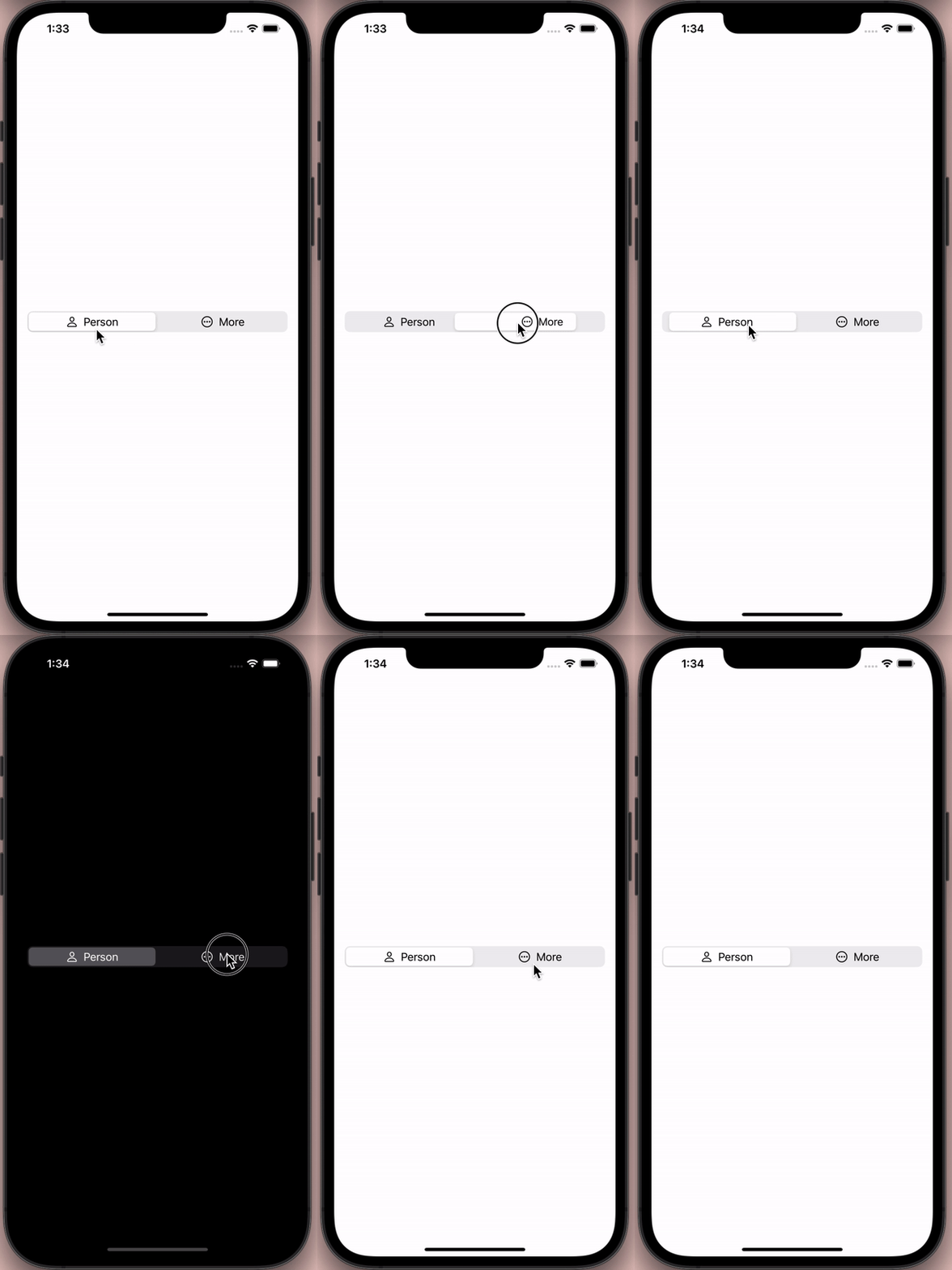
result category picker

Ugh answered 25/4 at 8:59 Comment(2)
I like this solution better than others. While Apple HIG recommends not to render both text and image in a segment, this solution allows for both while maintaining the look and feel of the native picker. My only fear is that it may lack accessibility support. converting an HStack of Text and Image may require extra effort to maintain an accessibility feature like Voice Over and Dynamic Type.Hyozo
VoiceOver will not be able to read the text in the picker options. This is bad for accessibility.Weiss
A
0

This is a way using Apple Picker with the output you want:

enum Category: String, CaseIterable, Identifiable {
    case person
    case more
    
    var id: String { self.rawValue }
}


struct ContentView: View {
    
    @State private var category = Category.person
    
    private var view1: some View { HStack { Image(systemName: "person"); Text("Person") } }
    private var view2: some View { HStack { Image(systemName: "ellipsis.circle"); Text("More") } }
    
    @State private var uiImage1: UIImage? = nil
    @State private var uiImage2: UIImage? = nil
    
    var body: some View {
        
        return Picker("Category", selection: $category) {
            
            if let unwrappedUIImage1 = uiImage1 {
                Image(uiImage: unwrappedUIImage1)
                    .tag(Category.person)
                
            }
            
            if let unwrappedUIImage2 = uiImage2 {
                Image(uiImage: unwrappedUIImage2)
                    .tag(Category.more)
                
            }
            
        }
        .pickerStyle(SegmentedPickerStyle())
        .padding()
        .onAppear() {
            
            DispatchQueue.main.async {
                uiImage1 = viewToUIImageConverter(content: view1)
                uiImage2 = viewToUIImageConverter(content: view2)
            }
            
            print("Your selection is:", category.rawValue)
        }
        .onChange(of: category, perform: { newValue in print("Your selection is:", newValue.rawValue) })
        
    }
}


func viewToUIImageConverter<Content: View>(content: Content) -> UIImage? {
    
    let controller = UIHostingController(rootView: content)
    let view = controller.view
    
    let targetSize = controller.view.intrinsicContentSize
    
    view?.bounds = CGRect(origin: .zero, size: targetSize)
    view?.backgroundColor = UIColor.clear
    
    let renderer = UIGraphicsImageRenderer(size: targetSize)
    
    return renderer.image { _ in
        view?.drawHierarchy(in: controller.view.bounds, afterScreenUpdates: true)
    }
    
}

enter image description here

Astereognosis answered 18/9, 2021 at 23:30 Comment(4)
I tired the the code above, all the options are just in white, no icon or text shown. Any clue?Pricilla
Just white for iOS 16Woodworking
Like the other answer that renders to images, VoiceOver will not be able to read the text in the picker options. This is bad for accessibility.Weiss
@SteveMadsen: Do not worry about it, apple AI will be able to read it.Astereognosis

© 2022 - 2024 — McMap. All rights reserved.