Is it possibly to keep vertical rhythm using only CSS?
Asked Answered
A

6

9

I'm developing a typography oriented WordPress theme, and I'm getting troubles with the in-line images.

I can control every element and adjust its line height, bottom margin, etc, to keep the vertical rhythm. But since images pasted through the editor can have any height, they obviously disrupt all the following content.

Is it possible using margin, padding, both or another solution, to make sure that independent of the image size it will adjust to the baseline?

I know there are some alternatives like make all images turn to a multiple of the line height, that way I can keep the rhythm. Other option would be use JavaScript, not ideal, but if there's no CSS solution, I'll have to consider it.

Anguilliform answered 13/2, 2011 at 21:20 Comment(6)
Images default to lining up on their baseline. I don't know what it is you're asking.Adoree
the only option is to use javascript and scale images to fit the rhythm - or if this would be enough - apply margin/padding to match the rhythm so you don't get squeezed/stretched images as image scaling through css/js can be quite scary )Airlie
I didn't understand. Maybe "vertical-align: middle" and "display: inline-block" can help youGarotte
For the folks who don't understand what he means by "vertical rhythm": webtypography.net/Rhythm_and_Proportion/Vertical_Motion/2.2.2Giacomo
Somewhat unrelated, but super cool: lamb.cc/typographPeary
@tom-tu The main problem is that the margin/padding of the image "depends" on the parent margin/padding element (the paragraph), so as long I don't modify them (which is the idea), I always get the same the same padding/margin independent of the image size. Maybe I could use javascript to adjust "dynamically" the margin/padding instead of the image size, that way I could keep the baseline.Anguilliform
T
9

(edited -- new and improved solution)

I don't know if WordPress provides any way to generate wrapper divs around images, but if it does, then this should work. It is fairly robust in the face of different text scales and image sizes, though you may need to adjust the length of the generated-content string of alternating spaces and non-breaking spaces, depending on how tall or short your images tend to be.

The way this works is that it uses a negative margin to make the outer image wrapper just enough wider than the inner wrapper, so that one non-breaking space will fit on one line before a wrap will occur, and then it generates a string of alternating non-breaking and normal spaces that fills up one line at a time down the right edge, before spilling onto the line below. Finally, a negative margin equal to one line-height counteracts the partially-filled line of spaces below the image.

<!DOCTYPE html>
<html>
  <style>
    html {
        line-height: 1.25em;
    }
    .p {
        margin: 0;
        padding: 0;
    }
    .section,
    .imginner {
        width: 20em;
    }
    .section {
        float: left;
        margin: 0.5em;
        background-color: #eeeeff;
    }
    .fakeimage {
        background-color: #ffeeee;
    }
    .imgouter {
        margin-right: -0.5em;
        background-color: #eeffee;
        margin-bottom: -1.25em; /* minus 1 line-height */
    }
    .imgouter:after {
        content:'\00a0  \00a0  \00a0  \00a0  \00a0  \00a0  \00a0  \00a0  \00a0  \00a0  \00a0  \00a0  \00a0  \00a0  \00a0  \00a0  \00a0  \00a0  \00a0  \00a0  \00a0  \00a0  \00a0  \00a0'
    }
    .imginner {
        float: left;
        background-color: #ffffdd;
    }
  </style>
<head>
</head>
<body>
  <div class='section'>
    Some text text text text text text.
    Some text text text text text text.
    <div class='imgouter'>
      <div class='imginner'>
        <div class='fakeimage' style="width:145px; height:92px">
          (image here)
        </div>
      </div>
    </div>
    Some text text text text text text.
    Some text text text text text text.
    Some text text text text text text.
  </div>
  <div class='section'>
    Some text text text text text text.
    Some text text text text text text.
    Some text text text text text text.
    Some text text text text text text.
    Some text text text text text text.
    Some text text text text text text.
    Some text text text text text text.
    Some text text text text text text.
    Some text text text text text text.
    Some text text text text text text.
    Some text text text text text text.
    Some text text text text text text.
    Some text text text text text text.
    Some text text text text text text.
  </div>
</body>
</html>
Threshold answered 14/2, 2011 at 1:1 Comment(7)
I've read this a couple of times, and still doesn't understand how it works... and consequently doesn't understand how to implement it D:Anguilliform
The inner wrapper expands vertically with the image, so it has the same height. The inner wrapper also has the same width as the container. The outer wrapper has a negative margin, making it slightly larger, leaving empty space to the right of the inner that's still within the outer. The outer:after content is alternating breaking and non-breaking spaces that line-wrap down the right-hand space, and then spill out onto the line below. Finally, a negative margin raises up the content below by 1 line height, overlaying that bottom line of spaces. Does that make sense?Threshold
The outer:after content fills up many short text lines to the right of the inner wrapper until it spilling off of the bottom of the inner wrapper, then fills part of the line below. The outer wrapper has a negative bottom margin with the same size as 1 line height, effectively negating that last line that the outer:after text spilled onto. The inner wrapper has the same height as its content (the image). The inner wrapper's width is hard-coded same as the container, and the outer wrapper is 0.5 em wider by virtue of its negative right margin, leaving space in between for lines on the right.Threshold
@GregoryPakosz The only think I see there that looks wrong is that the body element has a margin that's not zero or a multiple of the line height, and the background is applied to the html element, so it's shifted upward relative to the text lines. The vertical rhythm still looks correct (in my browser anyway). The text lines in the left and right columns appear to line up perfectly both before and after the image, and the lines in the background image cut through the same position on each text line. What do you see, and what browser are you using?Threshold
@SteveJorgensen why is it important to float imginner to the left? otherwise the lines generated would be below and not to the right?Canales
@GregoryPakosz, That's right. An inflated block element such as an unfloated div creates a vertical break. An inline element would not help either because it would be part of the same line as the initial added space, thus throwing off the line rhythm.Threshold
Argh -- stupid spell-check -- and I can't edit the comment. That's "unfloated", not "inflated".Threshold
S
1

@PaBLoX, I believe it is entirely possible to achieve vertical rhythm using only CSS. The real question is, "can you create a reusable vertical-rhythm boilerplate using only CSS?". Every project is different, uses different font families, etc. Although vertical rhythm is supposed to be based on math driven by inputs, the variables change with each project. You might not need "blog-style" vertical rhythm on a shopping site...

In any case, it's been a while since this question was asked, but if you or anyone else wants to see an example (attempt) at creating a boilerplate for vertical-rhythm, here is the repo on github: https://github.com/jonschlinkert/vertical-rhythm

It's a starting point. I suspect the project will eventually consist of a few different boilerplates for different needs.

Southland answered 13/2, 2011 at 21:20 Comment(1)
Yes, It's been a while. Though I will probably need to do this again in the following weeks. I'll check it, thanks =).Anguilliform
Q
1

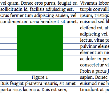
If you want to do this purely with CSS, then you have to know the size of each image ahead of time. For example, in this demo:

screenshot

I have a 20px grid, and the image has a height of 150px, so I have wrapped the image in a container with a height of 160px. This requires extra markup:

<div class=figure>
  <div class=image-wrap style="height:160px">
    <img width=150 height=150>
  </div>
  <p class=caption>Figure 1
</div>

Perhaps such markup could be generated by a WordPress plugin, which receives the image markup and the minimum height and outputs a grid-aligned div wrapper. (I am unfamiliar with WordPress.)

The alternative would be to use JavaScript, which has been addressed in this similar question.

Quinidine answered 14/2, 2011 at 0:56 Comment(2)
Images that has captions like the one in your example are generated automatically so work on those divs shouldn't be to hard. I have never worked with plugins, but I imagine that should be possible to modify the height to adapt to a multiple of the baseline. Images without caption doesn't have a wrapper div, but as you suggest it should be achievable through a plugin. Thanks for the link too!Anguilliform
A problem with this approach is that with an editor you can modify the size, it's not that easy to know in advance the height of the image. Wordpress has some default sizes (thumbnail, medium and full), so that's the closest thing I can came up closer to "know the image ahead of time". In this situation I lose some flexibility, but still it's a good idea.Anguilliform
P
1

I cannot guarantee that any of this will work, but it may be worth a try:

If you can guarantee that all images heights are specified in em, you can set the font-size of the img elements to be the same as the line-height to make sure that all properly inserted images are sized properly:

html
{
  font-size: 15px;
  line-height: 18px;
}

img
{
  font-size: 18px;
  line-height: 18px;
}

Alternatively, you can try floating images within paragraphs so that the image is wrapped with correct rhythm.

<p><img ... /> Lorem ipsum dolor sit amet...</p>

And finally, the pure CSS you'd-have-to-be-crazy-to-implement-this method:

  1. Calculate the line-spacing you're using
  2. Make sure it comes out to a whole pixel (otherwise this will never work).
  3. Make sure all heights are specified uniformly: <img height="100" vs <img height="100px"
  4. Write an obscene number of CSS rules:
img[height$="1"]
{
  margin-bottom: 9px;
}
img[height$="2"]
{
  margin-bottom: 8px;
}
...etc...

Note, this works just fine for 10, and other multiples of 10 and 5, but it'll be a royal pain for pretty much everything else.

Practiced answered 15/2, 2011 at 18:27 Comment(5)
Thanks, it works partially with floated images, but not everytime though. If you change the height of the image the rhythm is broke immediately. I can come up with two possible solutions: a) since wordpress allows to define the height of the main "sizes", I could keep all of them multiples of the baseline, or b) since css can't dinamically make calculations, I should use javascript to add some bottom margin equal to the difference to the next baseline multiple. (Which btw could be something like this)Anguilliform
@PaBLoX, PHP can output dynamic CSS if you want/need it to.Practiced
Is there a particular reason you need perfect rhythm? I'd definitely understand if you're putting content on a horizontally striped background or something like that, but if it's just because you heard rhythm was good to have, it's not that important. The vast majority of attractive websites give very little thought to rhythm. Users wont notice the mismatch, they're used to it.Practiced
Actually no, I just found that coincidentally the websites I read the more are the ones that had vertical rhythm. Of course, I'm trying to find a comfortable approach, if I found myself doing weird stuff I'd probably drop it. I was trying to find if there were a simpler approach that I wasn't seeing ;). BTW... how is that I can output dynamic css with PHP? Can you point me where to look for it?Anguilliform
Take a .css file, rename it to .php, add <?php header('Content-type: text/css'); ?> as the first line. You can now write php that will be output as CSS. If you do some fancy mod-rewrite stuff you can even have your .css files evaluated as php files, or whatever you want. If you're certain the website's you read have perfect vertical rhythm, check out their source to see what they're doing to make it perfect.Practiced
L
1

In my opinion a pure css soluition is impossible. Take for instance a table. A table cell has by default a little bit of padding so it's content is readable. You could try and make each table cell exactly the right height, but that will be hard. Also, adding for instance a bottom border somewere will also add to the height of the element, which means you have to reckon with it. I love the way that Compass's vertical rhythm tools help maintain a vertical rhythm, but for inline images and for instance tables I found that pure CSS is lacking. For that reason I wrote a simple jquery plugin that could help with this, find it here: https://github.com/dagomar/rhythm.js

Only drawback is that for inline elements to work, it will need an offset, I haven't figured out yet if that can be automated. The offset you can only find by testing it out, I found that an offset of 6 (default) works the best for baselines from 21-24 pixels, but it may be that font-size has an influence. For now, as a proof of concept I found that it works extremely well. It works also for responsive images (window.resize). Hope this helps.

Laundromat answered 23/2, 2013 at 11:16 Comment(1)
Yes, you are right... I've seen a some new js libs that are kind of lightweight (like baseline.js seems a good idea too). Thanks for your insights.Anguilliform
A
0

I'd suggest using a CSS framework like Foundation or Bootstrap and Compass+SCSS to help with this. I've actually done some work to setup Foundation with a decent default set of Vertical Rhythm rules, which you can use straight out of the box. I have a blog post up which explains it and has a link to a pull-request on Github.

http://lucisferre.net/2012/10/08/getting-into-vertical-rhythm/

With that you can generate some decent base CSS for your typography and other page elements. Or you can just apply the technique to your existing CSS. It's a bit tedious but it isn't all that hard.

Augean answered 9/10, 2012 at 4:47 Comment(4)
Sorry, I don't understand how does that article relates to the question D:Anguilliform
bah! I fixed it. lol that's what happens when you use copy/past too much. I thought I grabbed the link but, alas...Southland
Sorry must have mis-copied the link. Not sure what Jon's comment is about though.Augean
I just found you corrected the link, weird. Well, thanks I'm gonna take a look as soon as I can.Anguilliform

© 2022 - 2024 — McMap. All rights reserved.