Plotly: Adding custom Text to px.Treemap visual
Asked Answered
D

1

5

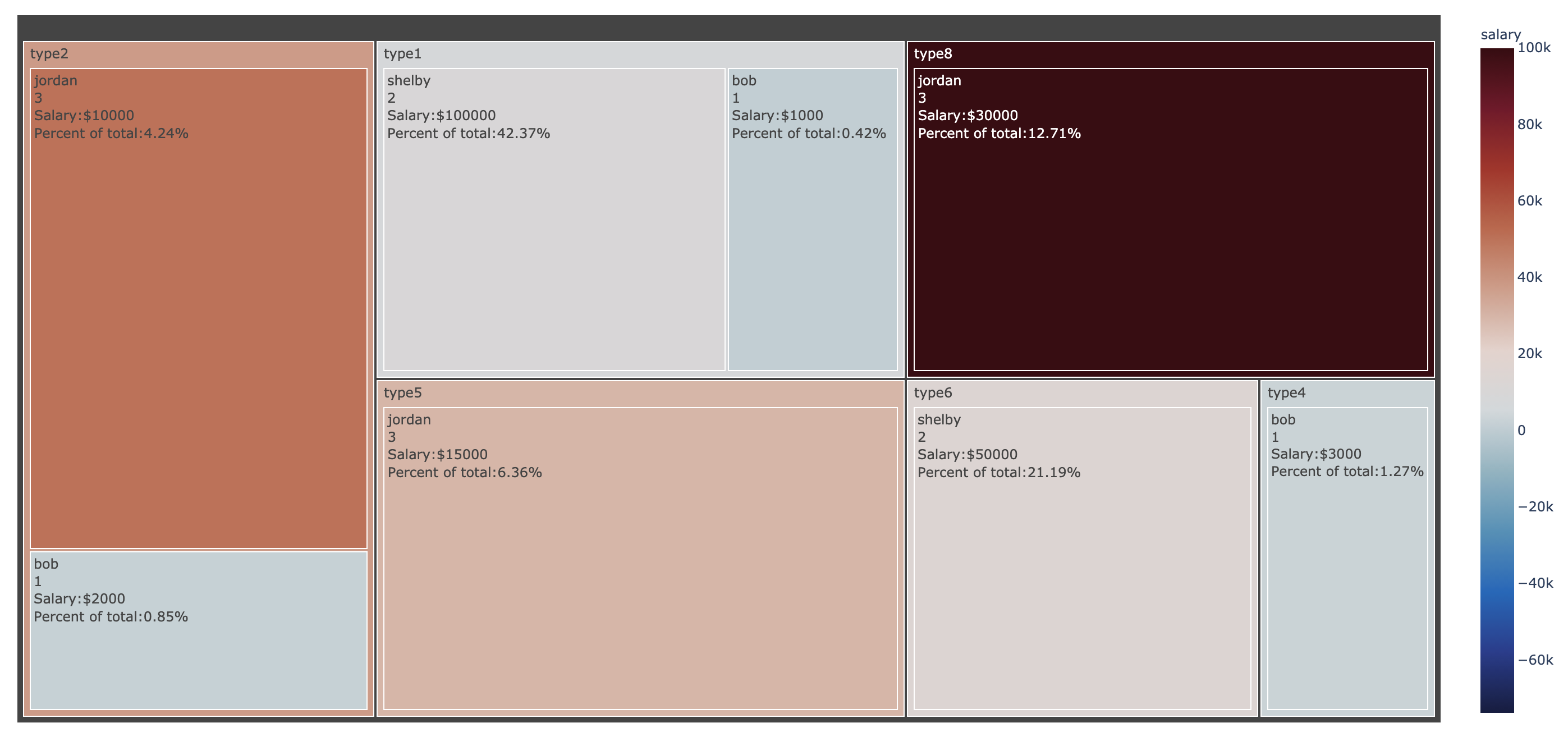
I am using plotly express to make a treemap. I would like to annotate my data sectors with a label as well as the % of the parent and the value that is used in the color scale.

How can I add an annotation to display the actual value that is used in the color argument of the treemap? In the below example code I would like to annotate "salary" for each sector. I would like to add some additional text to describe the numbers in each sector as well. For example "Percent of Total:" Appended to the percent value for more text description would be ideal to help annotate the treemap a bit more. Any ways to add custom text would be beneficial.

import pandas as pd
import numpy as np
import matplotlib.pyplot as plt
import plotly.express as px

d = {'count': [1,1,1,2,2,3,3,3,4], 
     'name': ['bob','bob','bob','shelby','shelby','jordan','jordan','jordan','jeff'],
     'type': ['type1','type2','type4','type1','type6','type5','type8','type2',None],
     'salary':[1000,2000,3000,10000,15000,30000,100000,50000,25000]}
df = pd.DataFrame(data=d)

# group data and aggregate
df_plot = df.groupby(['name','type'])[['salary','count']].sum().reset_index()

avg_salary = df_plot['salary'].sum()/df_plot['count'].sum()

# plot treemap
fig = px.treemap(df_plot,
                 values='count',
                 color='salary',
                 color_continuous_scale='balance',
                 color_continuous_midpoint=avg_salary,
                 path=['type','name'])
fig.data[0].textinfo = 'label+value+percent parent'
fig.show()
Descartes answered 4/5, 2021 at 20:48 Comment(0)
R
8

You can store a numpy array in fig.data[0].customdata and then access the variable customdata from the texttemplate string.

In your case, since you want to annotate percent and salary (and possibly add more annotations) we can store both of these in an nx2 numpy array that we set fig.data[0].customdata equal to. Then we'll access each slice of the array using customdata[0] and customdata[1] in the texttemplate.

EDIT: As @Coldchain9 pointed out, the DataFrame to be passed to px.treemap needs to be sorted by name and type prior to creating the percents and salaries for the customdata to properly match the name and type on the treemap.

import pandas as pd
import numpy as np
import matplotlib.pyplot as plt
import plotly.express as px

d = {'count': [1,1,1,2,2,3,3,3,4], 
     'name': ['bob','bob','bob','shelby','shelby','jordan','jordan','jordan','jeff'],
     'type': ['type1','type2','type4','type1','type6','type5','type8','type2',None],
     'salary':[1000,2000,3000,10000,15000,30000,100000,50000,25000]}
df = pd.DataFrame(data=d)

# group data and aggregate
df_plot = df.groupby(['name','type'])[['salary','count']].sum().reset_index()
df_plot.sort_values(by=['name','type'],inplace=True)

avg_salary = df_plot['salary'].sum()/df_plot['count'].sum()

# plot treemap
fig = px.treemap(df_plot,
                 values='count',
                 color='salary',
                 color_continuous_scale='balance',
                 color_continuous_midpoint=avg_salary,
                 path=['type','name'])
# fig.data[0].textinfo = 'label+value+percent parent'
percents = (100*df.salary / sum(df.salary)).tolist()
salaries = df.salary.tolist()

## store multiple lists of data in customdata
fig.data[0].customdata = np.column_stack([salaries, percents])
fig.data[0].texttemplate = "%{label}<br>%{value}<br>Salary:$%{customdata[0]}<br>Percent of total:%{customdata[1]:.2f}%"
fig.show()

enter image description here

Raw answered 5/5, 2021 at 8:48 Comment(5)
This is great. Thank you. However, the Salary numbers in the custom text do not match the actual Salary for that sector in the data. I imagine the idea to fix this would be to sort the data by the "value" used (since thats what determines the order of the sectors, I think) then the list would be in the proper order for plotting? I'm not sure. I'll need to experiment unless you have any thoughts.Descartes
So it looks like Plotly sorts the labels by the path in reverse order. I verified this by checking fig.data[0] and looked at the "ids" I used df_plot.sort_values(by=['name','type'],inplace=True) to sort the data before creating the percents and salaries lists and they match up perfectly to the values after using this within your solution.Descartes
Oh, that's a great catch. I'll update my answer and diagram when I have a moment!Raw
I wish I was able to order the way Plotly decides to sort the data when it decides the parent - root hierarchy. for example, I would prefer if the parents were ordered left to right (type1, type2, type8) but for whatever reason it decides some sort of default ordering that is not easy to modify. Not sure why it defaults to "type2" first... I have viewed the contents of fig.data[0] and the ordering just seems decided in some way.Descartes
I wasn't able to get this method to work, so I took advantage of the custom_data argument in px.treemap. The advantage of doing it this way is that I didn't have to worry about sorting the data "correctly" (and honestly I couldn't get it to line up no matter how I sorted the DataFrame). I ended up just adding the custom "percents" field to the data frame, so df_plot["percents"] = (100 * df.salary / sum(df.salary)) and then added custom_data=["salary", "percents"] to the px.treemap function call.Pyroelectric

© 2022 - 2024 — McMap. All rights reserved.