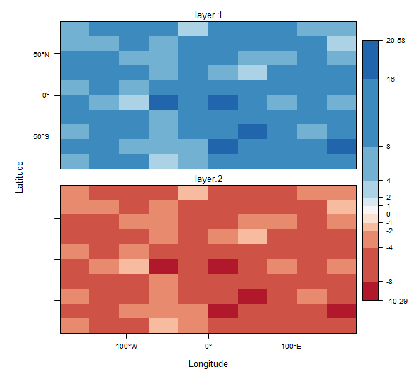
I am using the R function levelplot() from the rasterVis package to plot a stack of three rasters with a single diverging color ramp. I would like to change the scale of a raster color ramp so that the map accentuates differences in lower values. This can be done by non-linear binning of the color breaks.
I'm using the code from a gist written by @jbaums (code included below). Any suggestions on how to adjust the color ramp in this code so that the breaks follow 2^x but the min and max values are preserved? It would seem that changing the sequences of s (below) would have the desired effect.
diverge0 <- function(p, ramp) {
  # p: a trellis object resulting from rasterVis::levelplot
  # ramp: the name of an RColorBrewer palette (as character), a character
  #       vector of colour names to interpolate, or a colorRampPalette.
  require(RColorBrewer)
  require(rasterVis)
  if(length(ramp)==1 && is.character(ramp) && ramp %in%
     row.names(brewer.pal.info)) {
    ramp <- suppressWarnings(colorRampPalette(brewer.pal(11, ramp)))
  } else if(length(ramp) > 1 && is.character(ramp) && all(ramp %in% colors())) {
    ramp <- colorRampPalette(ramp)
  } else if(!is.function(ramp))
    stop('ramp should be either the name of a RColorBrewer palette, ',
         'a vector of colours to be interpolated, or a colorRampPalette.')
  rng <- range(p$legend[[1]]$args$key$at)
  s <- seq(-max(abs(rng)), max(abs(rng)), len=1001)
  i <- findInterval(rng[which.min(abs(rng))], s)
  zlim <- switch(which.min(abs(rng)), `1`=i:(1000+1), `2`=1:(i+1))
  p$legend[[1]]$args$key$at <- s[zlim]
  p$par.settings$regions$col <- ramp(1000)[zlim[-length(zlim)]]
  p
}
And here is some code that applies this function:
library (rasterVis)

ras1 <- raster(nrow=10,ncol=10)
set.seed(1)
ras1[] <- rchisq(df=10,n=10*10)
ras2 <- ras1*(-1)/2
s <- stack(ras1,ras2)

p <- levelplot(s, par.settings=RdBuTheme())

diverge0(p, ramp='RdBu')


cut()your continuous field value into a vector of factors (bins). I've done this a fair amount withrasterobjects, then piped them into ggplot. For example:as.data.frame(my_raster, xy = TRUE) %>% ggplot(aes(x,y, fill = cut_bins)) + geom_raster() + scale_fill_manual() + theme_void().Then inscale_fill_manualyou specify the values, breaks, and labels for each bin. Complete control! – Sporocyte