I'm creating some modals with Bootstrap.
I'm using different div's as showed in Bootstrap component explanation.
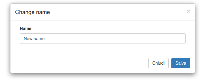
What I'm experiencing is that when my screen size is larger than x (mean some unknown value) the div containing my modal-body is pushed up (empty), and the div containing my modal-footer absorb elements on modal-body.
This is an image to explain what I'm saying:
Code it's the same, just change the screen size.
<HTML>
<head>
<script src="https://maxcdn.bootstrapcdn.com/bootstrap/3.3.6/js/bootstrap.min.js"></script>
<link href="https://maxcdn.bootstrapcdn.com/bootstrap/3.3.6/css/bootstrap.min.css" rel="stylesheet"/>
</head>
<body>
<div id='modal' class='modal-dialog'>
<div class='modal-content'>
<div class='modal-header'>
<button type='button' class='close' data-dismiss='modal' aria-label='Close'>
<span aria-hidden='true'>×</span>
</button>
<h4 class='modal-title'>Change name</h4>
</div>
<div class='modal-body'>
<form id='formModal' method='post' action='giocatori.php'>
<div class='form-group col-md-12'>
<label>Name</label>
<input id='nome_iscrizione' type='text' class='form-control' name='name' value='New name'>
</div>
</form>
</div>
<div class='modal-footer'>
<button type='button' class='btn btn-default' data-dismiss='modal'>Chiudi</button>
<button type='button' class='btn btn-primary'>Salva</button>
</div>
</div>
</div>
</body>
</HTML>If you want experience the squeezed modal, run the snippet and then press on Full page button.
How can I avoid squeezed body?


