I am creating a dialog with two buttons aligned right in relation to the parent ConstraintLayout.
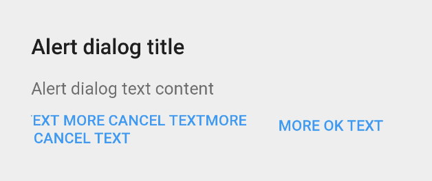
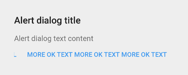
Everything is fine, until the text of the buttons becomes very long. When the text of either or both buttons is lengthy, the buttons extend beyond the bounds of the parent, causing clipping of the text, as shown in the image below. I would like to handle cases where there is longer text.
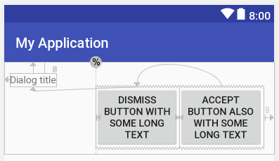
i.e. The desired behavior would be
- buttons should wrap text when text is long
- buttons should stay within bounds of parent and obey parent padding
- buttons should stay aligned right of parent
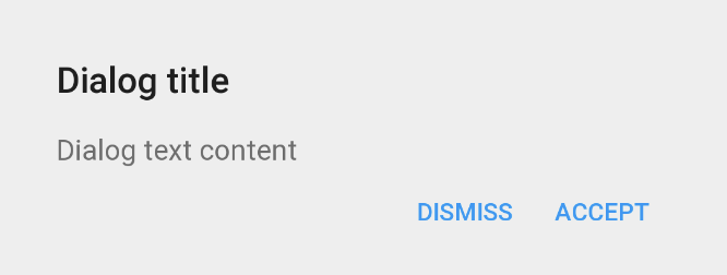
When button text is short, the layout works as intended:
When button text is long:
- Cancel text is truncated when cancel button text is long. This is happening because the button itself is being pushed past the parent's boundaries.
![enter image description here]()
- Cancel text pushed beyond parent boundaries when ok button's text is long, again, because the button is pushed beyond the parent's boundaries.
![enter image description here]()
Layout code
<?xml version="1.0" encoding="utf-8"?>
<android.support.constraint.ConstraintLayout
    android:layout_width="match_parent"
    android:layout_height="wrap_content"
    android:paddingBottom="@dimen/dialog_padding"
    android:paddingLeft="@dimen/dialog_padding"
    android:paddingRight="@dimen/dialog_padding"
    android:paddingTop="@dimen/dialog_padding">

    <TextView
        android:id="@+id/dialog_title"
        android:layout_width="wrap_content"
        android:layout_height="wrap_content"
        android:layout_marginTop="@dimen/dialog_text_margin"
        tools:text="Dialog title" />

    <TextView
        android:id="@+id/dialog_content"
        android:layout_width="wrap_content"
        android:layout_height="wrap_content"
        android:layout_marginTop="@dimen/dialog_text_margin"
        app:layout_constraintTop_toBottomOf="@id/dialog_title"
        tools:text="Dialog text content" />

    <Button
        android:id="@+id/cancel_btn"
        android:layout_width="wrap_content"
        android:layout_height="wrap_content"
        app:layout_constraintEnd_toStartOf="@id/ok_btn"
        app:layout_constraintTop_toBottomOf="@id/dialog_content"
        tools:text="Dismiss" />

    <Button
        android:id="@+id/ok_btn"
        android:layout_width="wrap_content"
        android:layout_height="wrap_content"
        app:layout_constraintEnd_toEndOf="parent"
        app:layout_constraintTop_toBottomOf="@id/dialog_content"
        tools:text="Accept" />
</android.support.constraint.ConstraintLayout>
Things that I've tried to no avail:
- adding
app:layout_constraintStart_toStartOf="parent"to the cancel button causes the buttons to no longer be aligned right, and so that solution is incorrect - constraining the end of the dismiss button to the start of the accept button causes buttons to no longer be aligned right
- using
layout_width="0dp"for the buttons and usingapp:layout_constrainedWidth="true"has no effect


app:layout_constraintHorizontal_bias="1.0"on the button views? – Pectoralisapp:layout_constraintStart_toStartOf="parent"to the cancel button is incorrect because it causes the buttons to no longer be aligned right. – Archiepiscopate