box shadows on multiple elements at same level but without overlap?
Asked Answered
S

4

9

I want to create something like the following screenshot, but I can't figure out any z-index value for which the shadow doesn't appear either over the first or second box (they are always stacked either with the first one on top, or the second). Overlapping boxes
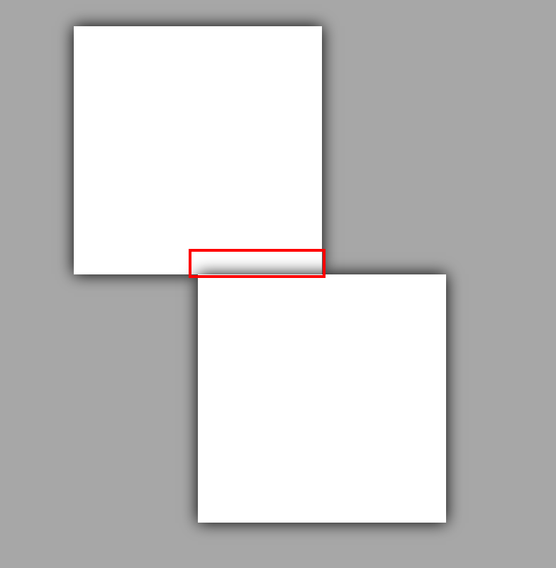
Is there a way to achieve the following?

Desired - no overlap

body { background: darkgrey; padding-top: 50px}
div { background: white; width: 200px; height: 200px; box-shadow: 0 0 20px 
black; margin: auto; position: relative; }
#box-one { left: -50px; z-index: 1; }
#box-two { right: -50px; z-index: 1; }

https://codepen.io/eoghanmurray/pen/oVEEVK

Secular answered 14/3, 2019 at 15:52 Comment(1)
Do you have content filling to where the overlap is or could you cover it with something solid?Eucalyptus
A
15

If you can use filter and drop-shadow then you can apply a drop-shadow to the container. This shadow differs as it conforms to the alpha channel of the image (in this case, the outline of the content) instead of a simple rectangle:

body {
  background: darkgrey;
  padding-top: 50px
}

#box-one,
#box-two {
  background: white;
  width: 200px;
  height: 200px;
  margin: auto;
  position: relative;
}

#box-one {
  left: -50px;
  z-index: 1;
}

#box-two {
  right: -50px;
  z-index: 1;
}

#top {
  filter: drop-shadow(0 0 20px black);
}
<div id="top">
  <div id="box-one"></div>
  <div id="box-two"></div>
</div>
Additional answered 14/3, 2019 at 15:56 Comment(1)
That is a life / mind saver :DArgilliferous
K
3

You can consider drop-shadow filter on a parent element:

body {
  background: pink;
}

.b1,
.b2 {
  width: 150px;
  height: 150px;
  background: #fff;
}

.b2 {
  margin-left: 100px;
}
.container {
  filter:drop-shadow(0 0 10px #000);
}
<div class="container">
  <div class="b1"></div>
  <div class="b2"></div>
</div>

Or use an extra element to hide the overlapping shadows:

body {
  background: pink;
}

.b1,
.b2 {
  width: 150px;
  height: 150px;
  background: #fff;
  box-shadow: 0 0 13px #000;
  position: relative;
}

.b2 {
  margin-left: 100px;
}

.b1:before,
.b2:before {
  content: "";
  position: absolute;
  bottom: 0px;
  right: 0;
  left: 0;
  height: 15px;
  background: inherit;
  z-index: 1;
}

.b2:before {
  top: 0;
  bottom: initial;
}
<div class="container">
  <div class="b1"></div>
  <div class="b2"></div>
</div>

You can also build this using only one element:

body {
  background: pink;
}
.container {
  width:250px;
  height:300px;
  background:
     linear-gradient(#fff,#fff) top left,
     linear-gradient(#fff,#fff) bottom right;
   background-size:150px 150px;
  background-repeat:no-repeat;
  filter:drop-shadow(0 0 10px #000);
}
<div class="container">
</div>
Kinetics answered 14/3, 2019 at 15:58 Comment(1)
Thanks, super answer; looks like @chazsolo's answer was just 2 minutes quickerSecular
C
1

I create a new div and set some css for it.

body { background: darkgrey; padding-top: 50px}
div { background: white;  width: 200px; height: 200px; box-shadow: 0 0 20px black; margin: auto; position: relative; }
#box-one { left: -50px; }
#box-two { right: -50px;  }
#div1{
  position:absolute;
  background: white;
  width:100px;
  height:15px;
  margin-right:10px;
  box-shadow: none;
  margin-top:185px;
  margin-left:199px;
  content: '';
  z-index: 1
 

}
<div id="div1"></div>
<div id="box-one"></div>
<div id="box-two"></div>
Cheerless answered 14/3, 2019 at 16:46 Comment(0)
I
0

A cleaner solution is to add the box-shadow to a pseudo-element like ::before or ::after and then add position:relative to a parent element.

#box-one
{
  left: -50px;
}

#box-two
{
  right: -50px;
}

body
{
  background: darkgrey;
  padding-top: 50px;
}

.box-container
{
    position: relative;
    z-index: 2;
}

.box
{
  background: white;
  width: 200px;
  height: 200px;
  margin: auto;
  position: relative;
}

.box::after
{
  content: "";
  box-shadow: 0 0 20px black;
  position: absolute;
  top: 0;
  right: 0;
  bottom: 0;
  left: 0;
  z-index: -1;
}
<div class="box-container">
  <div id="box-one" class="box"></div>
  <div id="box-two" class="box"></div>
</div>
Ingather answered 5/6, 2020 at 12:43 Comment(0)

© 2022 - 2024 — McMap. All rights reserved.