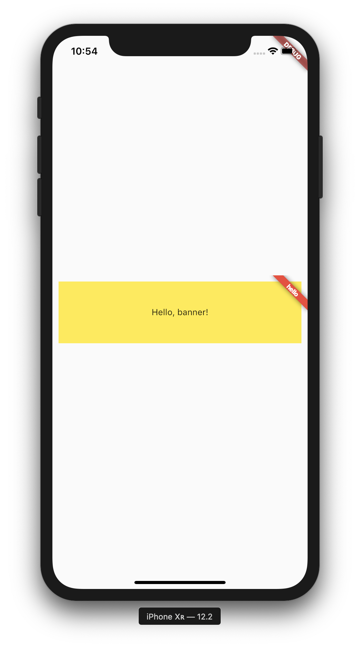
I have a problem with banner widget. To demonstrate it I have made some demonstration code. What I want is to have a banner in the top right corner of a container, but it is ugly, as it overflows its child (pls. see the attached image).
Here is my code:
class TestPage extends StatelessWidget {
  @override
  Widget build(BuildContext context) {
    return Scaffold(
      body: Center(
        child: Banner(
          message: "hello",
          location: BannerLocation.topEnd,
          color: Colors.red,
          child: Container(
            margin: const EdgeInsets.all(10.0),
            color: Colors.yellow,
            height: 100,
            child: Center(child: Text("Hello, banner!"),),
          ),
        ),
      ),
    );
  }
}
I tried to play with the margin, but I still have this behavior even if margin set to 0.
How can avoid this 'banner overflow'?
Thanks a lot!


