CSS: Multi-Column, Multi-Page layout like an open book
Asked Answered
P

2

10

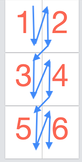
Is it possible to create a two-column, multi-page layout with HTML and CSS as shown in this mockup where content automatically flows from 1 → 2 → 3 → 4 → …?

book layout

I'm building an eBook reader/writer. Essentially the layout is similar to that of a desktop word processing app like Word or Pages:

  • Two pages next to each other filling the screen ("left" and "right" page if you open a book)
  • The next two pages below, scrolling vertically, etc. (imagine turning a page in a book)
  • Text flows automatically from one page to the next 1 → 2 → 3 → 4 → ...

I experimented with the CSS Multi-column Layout Module¹. Getting two columns is straight forward, but I could not figure out how to "break" at the viewport height into multiple "two-column" layouts, one for each set of "left & right" pages.

CLARIFICATION:

The content is essentially one big <div contenteditable="true">. Its contents need to flow automatically across the pages.

<div id="bookeditor" contenteditable="true">
    Book contents go here...
    Wrap from page to page, from row to row...
</div>

1: https://developer.mozilla.org/en-US/docs/Web/CSS/CSS_Columns/Using_multi-column_layouts

Paring answered 5/3, 2020 at 11:57 Comment(4)
No, AFAIK that is not possible using CSS Columns. (You effectively want rows here as well, at the same time, whether you explicitly call them that or not.) CSS Grid might be a more promising direction to look, I think.Trimmer
I think you need to consider doing what many html word-editors do: treat each paragraph as its own editable entity. That way you can display the items in a large CSS grid element, with defined 2 columns, and have them wrap elegantly. This is nontrivial from a DOM <--> Data management perspective, but is likely what it will take to accomplish your goal.Dale
The ability to render text into horizontal columns that flow and scroll vertically, like in a newspaper, should be made part of css, so the flowing algorithm can be in machine code for speed.Erich
Also, why limit the number of columns to two? Very wide screens could accommodate many columns. Breaking these columns into pages would allow the text to be read easily on the screen, moving forward a page at a time. It can all be done in JavaScript, but it can be slow.Erich
L
0

Check this, it works for me:

#bookeditor{
  column-width: 200px;
  width: 450px;// pick your size
}
<div id="bookeditor">
    YOUR 
    CONTENT 
    HERE 
</div>

https://developer.mozilla.org/en-US/docs/Web/CSS/CSS_Columns/Spanning_Columns

Lawtun answered 2/11, 2021 at 6:37 Comment(1)
This looks like it wouldn't work to show paged columsn: with lots of text, it would require the user to scroll vertically down to read each column, then all the way to the top before being able to move horizontally to the next column. Very difficult!Erich
C
-3

I would personally use a framework with a grid such as https://getbootstrap.com/docs/4.4/layout/grid/ or https://get.foundation/sites/docs-v5/components/grid.html and create rows so that each page has CSS classes of col-md-6 col-sm-12 (Bootstrap example)

This means that when you are on a browser with a medium viewport (or bigger) each page will take 6 of 12 space (so 50%) of the screen, and when the user is on a small screen the page will take up 12 of 12 space (so 100%) - so the pages lay out one above the other.

Congest answered 5/3, 2020 at 12:7 Comment(1)
Thanks for your suggestion. However, my contents are in one big <div> that needs to flow across columns and rows. I updated the question to clarify this.Paring

© 2022 - 2024 — McMap. All rights reserved.