CSS responsive grid layout: grid-column span breaking minmax
Asked Answered
G

2

10

I have a neat responsive grid like this:

grid-template-columns: repeat(auto-fill, minmax(200px, 1fr));

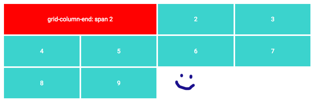
This makes each grid item at least 200px wide. One of the items (the red one) is twice as wide, like this:

grid-column-end: span 2;

Great so far!

grid works fine on large screens

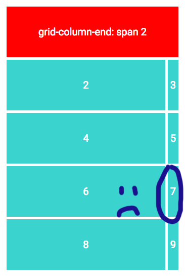
Now when I resize to a small width, the red item forces the grid to two columns. This gives me a weird small column, even though I specified the min width at 200px. Look:

grid breaks at small screens

I would really like the red item to collapse to a single column, so that the grid won't break.

The problem however is, I don't know the width of the total grid, so I can't use a mediaquery that triggers at a specific viewport size.

Is there a way to either force the red item to one column, or maybe to define the grid columns in another way that will solve this problem?

Gus answered 30/10, 2018 at 15:27 Comment(4)
While you may not know the exact sizes at which your design begins to break, you need to start to look for those break-points and then use media queries to to anticipate the breaks. Incidentally if you can post your minimal reproducible example code (including dummy content that allows that code to reproduce your problem) then you'll likely get better, or more, answers. Alternatively you should/could design for mobile (small-screen) first and then use break-points to adjust the design for larger screens. This may, or may not, simplify the work you'd need to do.Griseldagriseldis
Unfortunately I can't do that. I'm developing a visual website builder, and this is a problem I'm anticipating when clients design their own layouts. The 200px value for example could be any given width.Gus
Without enough code to reproduce the problem (even at a very basic level) it's hard to deliver solutions. We can only guess at this point. For instance, maybe you can take the first item out of the current grid. Have it function as a separate container, either grid or flex. But that's only speculation; without code, I can't test or show you the results.Millford
Are you looking for a css only solution or are you willing to use javascript?Hackathorn
O
2

You need to keep the dimensions and a little bit of math in mind while using grid. If you're telling an item to span to 2 columns then that means you always want at least 2 columns in your Grid, it'll not turn into a 1 column grid if the screen gets smaller. Now you have a min-width of 400px for your grid.

For that weird sized column, as you have 2 columns and column 2 takes it's min 200px width and the item after that is left with that weird size.

You can write a media query at that breakpoint to tell your item 1 to stay in column 1 and that should fix it.

@media screen and (max-width:415px){
.item1 {
grid-column: 1;
background:red;
}
}

Check out the Codepen I'm linking here

see on Codepen

Objectionable answered 23/6, 2019 at 11:29 Comment(2)
Although I'd always disagree with doing highly specific media-queries like this without good reasons, it does seem like this is the only solution besides breaking up the markup in smaller pieces, which can be problematic in its own way. As far as I know, until CSS gets updated so that grid items can span minmax(1, 2) columns, we'll have to do with hacks.Focal
I'm awaiting span minmax eagerly!Raff
B
0

Inspired by CSS Grid Masonry in the sense that CSS grid nearly does what we want and we can help it with a little JS I have the following solution:

We choose the maximum number of columns in our grid and the minimum width for a column. We have any number of grid items which can span between 1 and our maximum number of columns.

This example uses a maximum of 4 columns with a minimum width of 256px.

HTML:

<div class="grid">
  <div class="w1"></div>
  <div class="w1"></div>
  <div class="w2"></div>
  <div class="w1"></div>
  <div class="w3"></div>
  <div class="w4"></div>
  ...
</div>

CSS:

.grid {
  display: grid;
}

.w1 {
  grid-column-end: span 1;
}
.w2 {
  grid-column-end: span 2;
}
.w3 {
  grid-column-end: span 3;
}
.w4 {
  grid-column-end: span 4;

JS:

// The minimum width in pixels for our columns
const colWidth = 256;
// The maximum number of columns in our grid
const maxCols = 4;

function resizeGrid() {
  const grid = document.getElementsByClassName("grid")[0];
  
  // Calculate the number of cols we can have by dividing the grid width by our colWidth.
  // This is the maximum number of cols we can have if they are all colWidth.
  const gridWidth = grid.getBoundingClientRect().width;
  let cols = Math.floor(gridWidth / colWidth);

  // Clamp this to our maxCols.
  cols = Math.min(maxCols, cols);

  // Set the number of cols in the grid
  grid.style.gridTemplateColumns = "repeat(" + cols + ", 1fr)";

  // Update grid-column spans limiting them to the number of cols we have.
  // We must do this as grid with an item that spans n columns will automatically have a default of n columns.
  for (let j = 1; j < maxCols + 1; j++) {
    for (const gridItem of grid.getElementsByClassName("w" + j)) {
      gridItem.style.gridColumnEnd = "span " + Math.min(j, cols);
    }
  }
}

window.addEventListener("resize", resizeGrid);
resizeGrid();

This works by calculating the number of columns which will fit into our grid given the minimum width. We then set our grid to have that number of columns and we limit our items to span up to the number of columns. This has the effect of collapsing the number of columns based on the width of the grid.

You can see this working in this Codepen.

Bullheaded answered 11/6, 2023 at 12:28 Comment(0)

© 2022 - 2024 — McMap. All rights reserved.