iPhone X / Samsung Galaxy S8 aspect ratio issues for cocos2dx games
Asked Answered
G

2

10

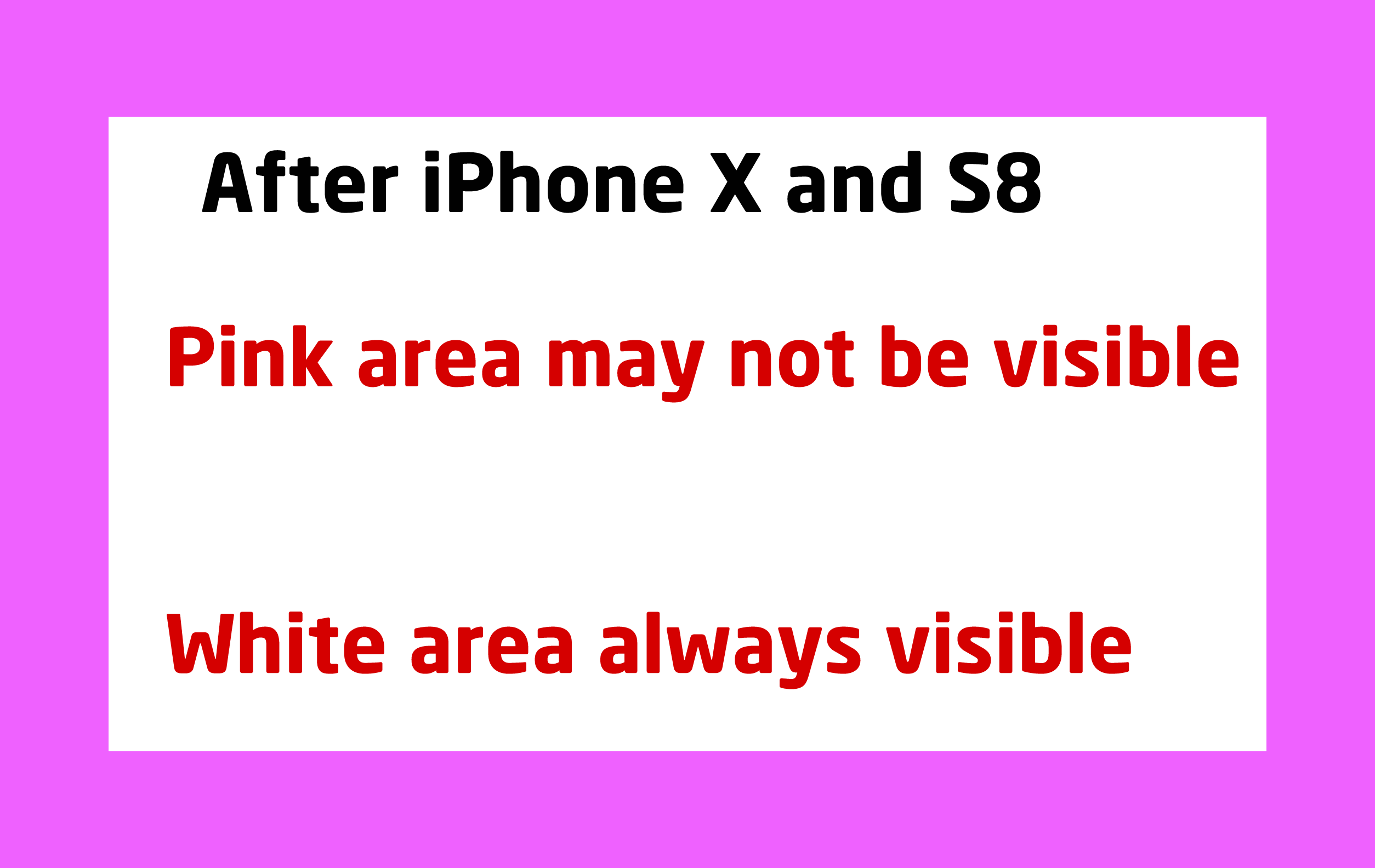
I have been designing all my landscape oriented cocos2dx mobile games at 2508x1584 with a "always visible area" of 2112x1408 so there would be no black borders or scaling, just a bit of cropping which would be limited to the "maybe not visible area" as shown below.

design area before iphone x

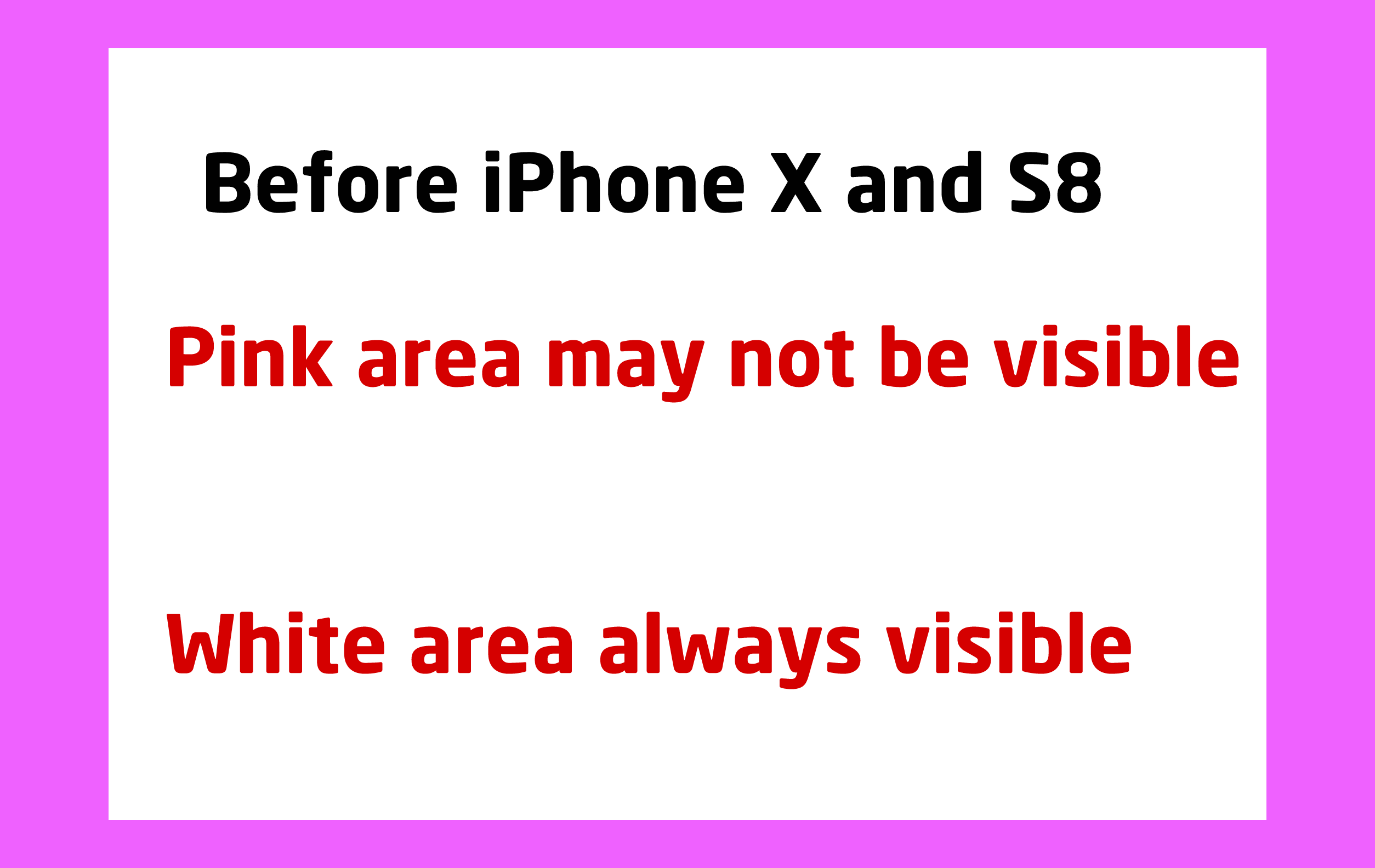
This worked well for all mobile device aspect ratios until iPhone X and Samsung Galaxy S8 arrived. These devices have 19.5:9 and 18:9 aspect ratios respectively which takes the "always visible area" down from 1408 to 1158 which is significant enough that it looks like i have no choice but to redesign all my games as shown in the image below.

design area after iphone x

Since I designed all my previous games for a taller visible area when I run them on iPhone X and Samsung galaxy S8 the top and bottom of the game are obviously cut off.

Am I stuck re-designing these games in order to make them fit this shorter aspect ratio? Or is there another solution I am overlooking here?

Gadabout answered 17/2, 2018 at 3:27 Comment(1)
interesting argumentsWendall
D
2

Sadly I don't see any magic solution. Here are the different options:

  • Test the screen ratio, and for iPhone X and Galaxy S8, switch resolution policy to ResolutionPolicy::SHOW_ALL instead of ResolutionPolicy::NO_BORDER. That's a quick-and-dirty solution, which will display black borders on left and right. You can improve this solution a little bit by scaling all content so that the important area takes all screen height.
  • Change the width of your design resolution, offset the content, and find a way to fill all this resolution with your background textures. This requires more effort but most of the content should not change, except for the offset. It will solve the problem because a larger design resolution means that it has less to cut vertically (which is the problem in your case).
  • As you said, you can also redesign the important area so that it is more flexible to different ratios. This requires some effort and reduces the size of this important area, which affects the experience on the other ratios.

I would go with the second option. Hope this helps, and sorry for not having a magic solution to that problem.

Durham answered 27/2, 2018 at 14:32 Comment(0)
D
1

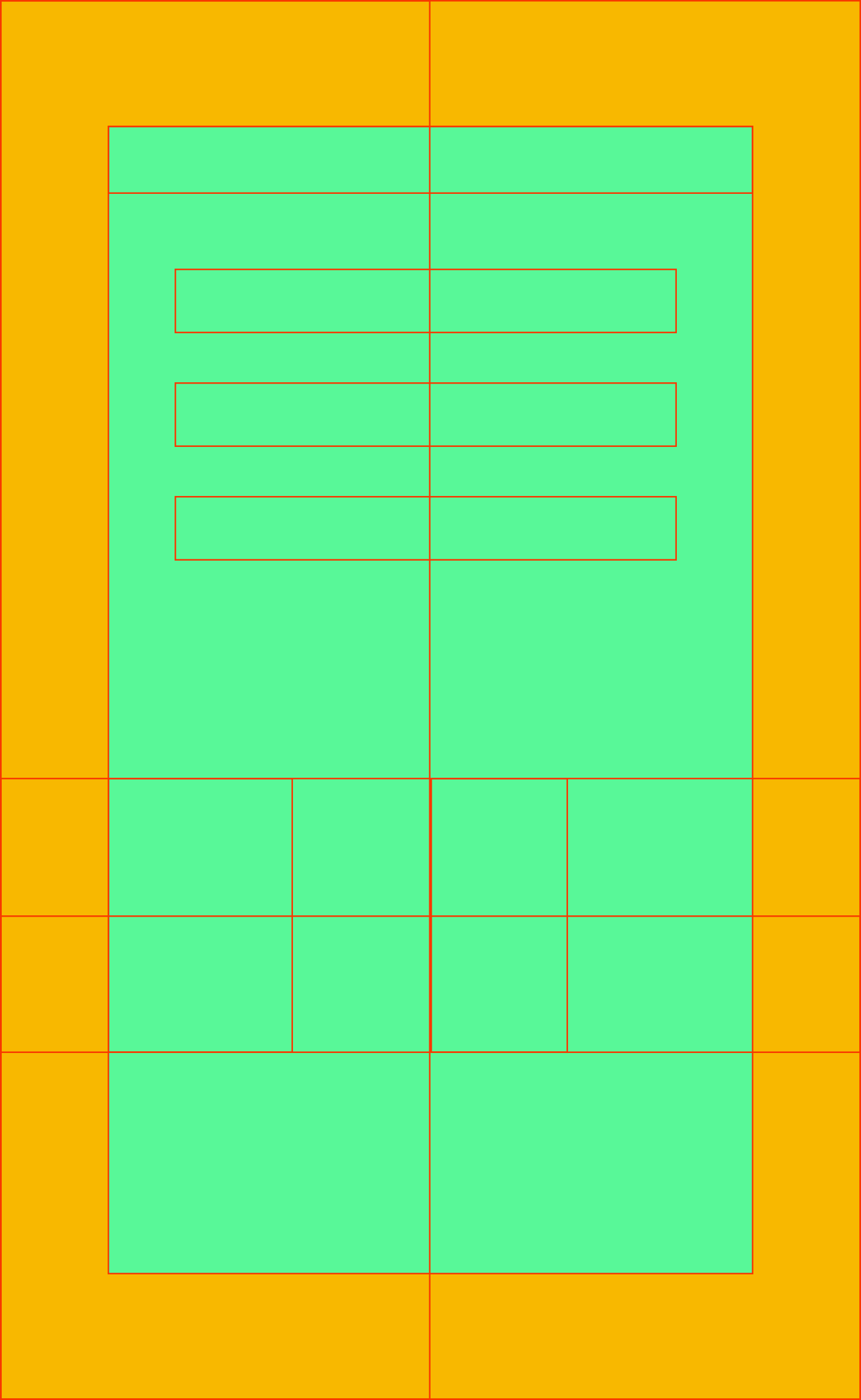
Might be a bit late for you, but I think I've solved this issue. I used ResolutionPolicy::NO_BORDER, a design resolution of 1080x1920 and this guide image

The green area is 1080x1920. You should design your app to fit within this area. Taller phones such as the S8 and iPhoneX will expand up into the orange space. Wider devices such as tablets will expand into the orange space on the left and right.

What you need to do on launch is to calculate a scale factor for the Director to use.

Do this in your AppDelegate.cpp

auto frameSize = glview->getFrameSize();
float deviceAspectRatio = frameSize.height / frameSize.width;
float designAspectRatio = designResolutionSize.height / designResolutionSize.width;
director->setContentScaleFactor(MAX(
        deviceAspectRatio / designAspectRatio,
        designAspectRatio / deviceAspectRatio)
);

To be honest I'm not 100% on why this works. I discovered it by trying random scale factors until I found one that worked, and then trying to work backwards to come up with some math that will work. Turns out dividing the aspect ratio of the device by the aspect ratio of your design resolution is what you want.

enter image description here

Dunaj answered 5/7, 2018 at 20:50 Comment(1)
Very interesting solution and it indeed does work very well. I also came up with a similar solution based on the advice in the accepted answer and I too had to use trial and error. Thanks for this contribution.Gadabout

© 2022 - 2024 — McMap. All rights reserved.