Label axes on Seaborn Barplot
Asked Answered
G

6

258

I'm trying to use my own labels for a Seaborn barplot with the following code:

import pandas as pd
import seaborn as sns
    
fake = pd.DataFrame({'cat': ['red', 'green', 'blue'], 'val': [1, 2, 3]})
fig = sns.barplot(x = 'val', y = 'cat', 
                  data = fake, 
                  color = 'black')
fig.set_axis_labels('Colors', 'Values')

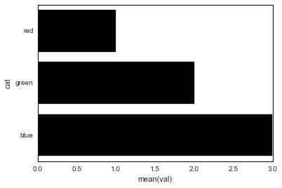
desired result

However, I get an error that:

AttributeError: 'AxesSubplot' object has no attribute 'set_axis_labels'

Why am I getting this error?

Gerent answered 26/7, 2015 at 1:8 Comment(0)
M
411

Seaborn's barplot returns an axis-object (not a figure). This means you can do the following:

import pandas as pd
import seaborn as sns
import matplotlib.pyplot as plt

fake = pd.DataFrame({'cat': ['red', 'green', 'blue'], 'val': [1, 2, 3]})
ax = sns.barplot(x = 'val', y = 'cat', 
              data = fake, 
              color = 'black')
ax.set(xlabel='common xlabel', ylabel='common ylabel')
plt.show()
Mueller answered 26/7, 2015 at 1:28 Comment(2)
seaborn does not have its own way to set these - without involving matplotlib ?Stopcock
So the general rule is FacetGrid / anything that facets returns a figure object and everything else returns an axis object?Acyclic
C
73

One can avoid the AttributeError brought about by set_axis_labels() method by using the matplotlib.pyplot.xlabel and matplotlib.pyplot.ylabel.

matplotlib.pyplot.xlabel sets the x-axis label while the matplotlib.pyplot.ylabel sets the y-axis label of the current axis.

Solution code:

import pandas as pd
import seaborn as sns
import matplotlib.pyplot as plt

fake = pd.DataFrame({'cat': ['red', 'green', 'blue'], 'val': [1, 2, 3]})
fig = sns.barplot(x = 'val', y = 'cat', data = fake, color = 'black')
plt.xlabel("Colors")
plt.ylabel("Values")
plt.title("Colors vs Values") # You can comment this line out if you don't need title
plt.show(fig)

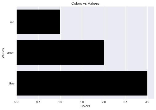
Output figure:

enter image description here

Crabtree answered 13/2, 2018 at 18:50 Comment(2)
I think it should be just plt.show(fig). It gives me TypeError: show() takes 1 positional argument but 2 were given. Just plt.show() gives me the desired resultGazelle
Doing it separately like this also has the advantage of specifying other miscellaneous matplotlib.text.Text properties. I used it most commonly to specify a custom font that our organization uses by setting fontproperties equal to the location of the TTF file.Drench
O
45

You can also set the title of your chart by adding the title parameter as follows

ax.set(xlabel='common xlabel', ylabel='common ylabel', title='some title')
Outrun answered 30/4, 2019 at 12:25 Comment(1)
Is there a way to also change the font size of the labels and title within ax.set() ?Metropolitan
G
10

Another way of doing it, would be to access the method directly within the seaborn plot object.

import pandas as pd
import seaborn as sns
import matplotlib.pyplot as plt

fake = pd.DataFrame({'cat': ['red', 'green', 'blue'], 'val': [1, 2, 3]})
ax = sns.barplot(x = 'val', y = 'cat', data = fake, color = 'black')

ax.set_xlabel("Colors")
ax.set_ylabel("Values")

ax.set_yticklabels(['Red', 'Green', 'Blue'])
ax.set_title("Colors vs Values") 

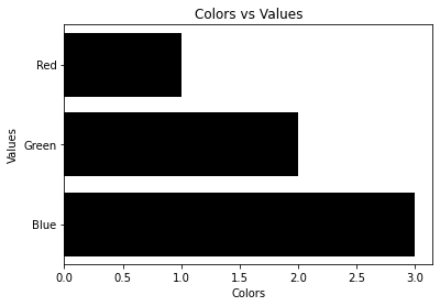
Produces:

enter image description here

Groundspeed answered 24/3, 2022 at 12:48 Comment(0)
S
1

The axis labels are the names of columns, so you can just rename (or set_axis) columns inside the barplot call:

fake = pd.DataFrame({'cat': ['red', 'green', 'blue'], 'val': [1, 2, 3]})
sns.barplot(x='Values', y='Colors', 
            data=fake.rename(columns={'cat': 'Colors', 'val': 'Values'}), 
            #data=fake.set_axis(['Colors', 'Values'], axis=1), 
            color='black');

Another way is, since barplot returns the Axes object, you can just chain a set call to it.

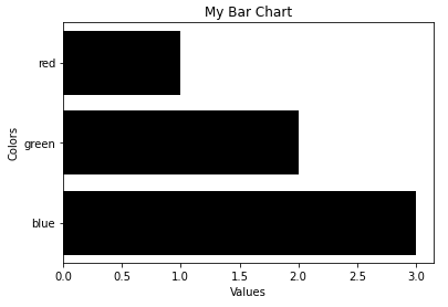
sns.barplot(x='val', y='cat', data=fake, color='black').set(xlabel='Values', ylabel='Colors', title='My Bar Chart');

res


If the data is a pandas object, pandas has a plot method that has a lot of options to pass ranging from titles, axis labels to figsize.

fake.plot(y='val', x='cat', kind='barh', color='black', width=0.8, legend=None,
          xlabel='Colors', ylabel='Values', title='My Bar Chart', figsize=(12,5));
Solander answered 3/3, 2023 at 20:6 Comment(0)
F
0

The error you encountered with set_axis_labels is because there's no such function in Seaborn's AxesSubplot object. To resolve this issue, you can use the set_xlabel() and set_ylabel() methods provided by the Matplotlib axes object returned by Seaborn's barplot. Here's how you can do it:

import pandas as pd
import seaborn as sns
import matplotlib.pyplot as plt

fake = pd.DataFrame({'cat': ['red', 'green', 'blue'], 'val': [1, 2, 3]})
fig = sns.barplot(x='val', y='cat', data=fake, color='black')

# Set custom axis labels
fig.get_xaxis().set_label_text('Values')
fig.get_yaxis().set_label_text('Colors')
plt.show()
Fourscore answered 4/11, 2023 at 18:5 Comment(0)

© 2022 - 2024 — McMap. All rights reserved.