Make columns same height in Vuetify Grid System
Asked Answered
A

1

10

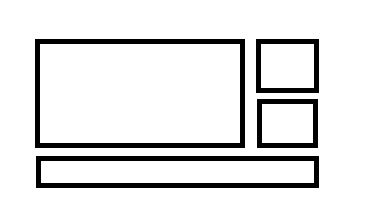
I'm currently creating a grid-layout in Vuetify, but I got stuck. I'm making a card-layout containing images. Here is the example:

enter image description here

I've tried it with the following code, but then small cards on the right are not aligned due to the margins.

    <v-container>
      <v-row class="justify-center">
        <v-col cols="6">
          <v-hover v-slot:default="{ hover }">
            <v-card
              to="/pools"
              :elevation="hover ? 12 : 2"
              :class="{ 'on-hover': hover , 'overwrite-hover' : $vuetify.breakpoint.xsOnly}"
            >
              <v-img class="white--text" :src="images[0]">
                <v-card-title class="white--text align-end fill-height headline">My Pools</v-card-title>
                <template v-slot:placeholder>
                  <v-row class="fill-height" align="center" justify="center">
                    <v-progress-circular indeterminate color="grey lighten-5"></v-progress-circular>
                  </v-row>
                </template>
              </v-img>
            </v-card>
          </v-hover>
        </v-col>
        <v-col cols="2">
          <v-card class="ma-2" light height="50%"></v-card>
          <v-card class="ma-2" light height="50%"></v-card>
        </v-col>
      </v-row>
      <v-row class="justify-center">
        <v-col cols="8">
          <v-card light height="120px"></v-card>
        </v-col>
      </v-row>
   </v-container>

Does anyone have a suggestion, or maybe a similar example?

Thanks in advance!

Arenaceous answered 18/2, 2020 at 19:39 Comment(1)
Would you have a screenshot or a fiddle for what you have with the current code?Velodrome
M
9

Luckily you only need to make minor adjustments to the smaller cards on the right. Make use of flex and let flex do its magic :) It's basically telling the cards to grow to the maximum height available without clipping. Then add some margin in between the cards with the helper classes mb and mt.

<v-col cols="2" class="d-flex" style="flex-direction:column">
  <v-card class="mb-1 flex-grow-1">
    Upper card
  </v-card>
  <v-card class="mt-1 flex-grow-1">
    Lower card
  </v-card>
</v-col>
Maggee answered 21/2, 2020 at 9:29 Comment(3)
Link seems to be brokenFlattery
Oof sorry for the broken link. Codesandbox apparently deleted all my saved projects in there. Imma edit the answer to remove the link but it was basically OPs question copy-pasted with my adjustmentsMaggee
style="flex-direction:column" can be replaced with class="d-flex flex-column"Oligocene

© 2022 - 2024 — McMap. All rights reserved.