Specify a custom timing function for CSS transitions?
Asked Answered
F

5

10

I use CSS transitions pretty frequently now but find it limiting to only have access to ease-in, ease-out etc.

The bezier-curve option appears to allow the most control but even this does not allow you to specify an actual easing equation that would simulate elastic easing etc..

Is there another option or does one need to resort to javascript to perform this type of animation?

Feliks answered 1/6, 2011 at 10:25 Comment(0)
F
2

I found there is no way to do an elastic transition with pure CSS. However you can cheat and do a CSS animation. This is what apple uses on their site:

@-webkit-keyframes open-1 {
    from { opacity:0; -webkit-transform:translate3d( 210px, -145px, 0); }
    25%  { opacity:1; -webkit-transform:translate3d( -15.6px, 4.1px, 0); }
    30%  { opacity:1; -webkit-transform:translate3d( -10.3px, 2.7px, 0); }
    35%  { opacity:1; -webkit-transform:translate3d( 0, 0, 0); }
    40%  { opacity:1; -webkit-transform:translate3d( 4.5px, -1.2px, 0); }
    45%  { opacity:1; -webkit-transform:translate3d( 2.9px, -0.8px, 0); }
    50%  { opacity:1; -webkit-transform:translate3d( 0, 0, 0); }
    55%  { opacity:1; -webkit-transform:translate3d( -1.3px, 0.3px, 0); }
    60%  { opacity:1; -webkit-transform:translate3d( -0.8px, 0.2px, 0); }
    65%  { opacity:1; -webkit-transform:translate3d( 0, 0, 0); }
    70%  { opacity:1; -webkit-transform:translate3d( 0.4px, -0.1px, 0); }
    75%  { opacity:1; -webkit-transform:translate3d( 0.2px, -0.1px, 0); }
    80%  { opacity:1; -webkit-transform:translate3d( 0, 0, 0); }
    85%  { opacity:1; -webkit-transform:translate3d( -0.1px, 0, 0); }
    90%  { opacity:1; -webkit-transform:translate3d( -0.1px, 0, 0); }
    to   { opacity:1; -webkit-transform:translate3d( 0, 0, 0); }
}

These animations are used to great extent on Apple's own website: http://www.apple.com/mac/

Obviously this is powerful to some extent -- since the animations are percentages you can easily change he duration and retain the effect.

However, this is still very static. Let's say you want to click a button and have it perform an elastic scaling animation. No problem, one animation can be used over and over again for each button. But let's say you want to have an element elastically snap it's position to wherever the user most recently clicked or tapped on the screen. Well in this case you'd need to dynamically recalculate the keyframes and then apply the animation to the element.

At the time of this writing I don't know that there are any good examples of dynamically generating CSS animations on the fly inside of javascript. In fact it probably warrants another question. All in all this is the only pure CSS way I found to do render a complex easing equation such as elastic easing purely with CSS.

Feliks answered 23/6, 2011 at 18:53 Comment(1)
I've created a javascript framework to do this easily from now on: github.com/jimjeffers/SauceFeliks
E
11

You can use Caesar to generate CSS for different equations.

Erasmoerasmus answered 1/6, 2011 at 10:34 Comment(3)
Thanks - this looks like the best so far but even here - it is not possible to do something more complex like an elastic ease without javascript.Feliks
on the contrary, it is :) I really like the Caesar tool, but if you want bouncy or elastic transitions, check this out: css3animationgenerator.com - it's a great complement to CaesarGoldsmith
I prefer this tool: cubic-bezier.comAlkalinity
F
2

I found there is no way to do an elastic transition with pure CSS. However you can cheat and do a CSS animation. This is what apple uses on their site:

@-webkit-keyframes open-1 {
    from { opacity:0; -webkit-transform:translate3d( 210px, -145px, 0); }
    25%  { opacity:1; -webkit-transform:translate3d( -15.6px, 4.1px, 0); }
    30%  { opacity:1; -webkit-transform:translate3d( -10.3px, 2.7px, 0); }
    35%  { opacity:1; -webkit-transform:translate3d( 0, 0, 0); }
    40%  { opacity:1; -webkit-transform:translate3d( 4.5px, -1.2px, 0); }
    45%  { opacity:1; -webkit-transform:translate3d( 2.9px, -0.8px, 0); }
    50%  { opacity:1; -webkit-transform:translate3d( 0, 0, 0); }
    55%  { opacity:1; -webkit-transform:translate3d( -1.3px, 0.3px, 0); }
    60%  { opacity:1; -webkit-transform:translate3d( -0.8px, 0.2px, 0); }
    65%  { opacity:1; -webkit-transform:translate3d( 0, 0, 0); }
    70%  { opacity:1; -webkit-transform:translate3d( 0.4px, -0.1px, 0); }
    75%  { opacity:1; -webkit-transform:translate3d( 0.2px, -0.1px, 0); }
    80%  { opacity:1; -webkit-transform:translate3d( 0, 0, 0); }
    85%  { opacity:1; -webkit-transform:translate3d( -0.1px, 0, 0); }
    90%  { opacity:1; -webkit-transform:translate3d( -0.1px, 0, 0); }
    to   { opacity:1; -webkit-transform:translate3d( 0, 0, 0); }
}

These animations are used to great extent on Apple's own website: http://www.apple.com/mac/

Obviously this is powerful to some extent -- since the animations are percentages you can easily change he duration and retain the effect.

However, this is still very static. Let's say you want to click a button and have it perform an elastic scaling animation. No problem, one animation can be used over and over again for each button. But let's say you want to have an element elastically snap it's position to wherever the user most recently clicked or tapped on the screen. Well in this case you'd need to dynamically recalculate the keyframes and then apply the animation to the element.

At the time of this writing I don't know that there are any good examples of dynamically generating CSS animations on the fly inside of javascript. In fact it probably warrants another question. All in all this is the only pure CSS way I found to do render a complex easing equation such as elastic easing purely with CSS.

Feliks answered 23/6, 2011 at 18:53 Comment(1)
I've created a javascript framework to do this easily from now on: github.com/jimjeffers/SauceFeliks
G
2

Actually you don't need a JavaScript library to support complex easing functions like bounce-ease-in or elastic-ease-out. Here's the CSS3 Animation Generator tool which generates the keyframes for you, and enables 12 additional easing functions not supported by the w3c spec:

http://www.css3animationgenerator.com/

Goldsmith answered 16/5, 2012 at 16:24 Comment(1)
Thanks Eric, but that is essentially the same as my answer. This uses javascript to generate a CSS keyframe animation via a web form. My solution was the same method except I'm using javascript to declaratively generate the CSS keyframes on the live document. There are advantages / disadvantages to both. What I was hoping for was a CSS based curve that supported multiple control points. That would allow us to bypass this javascript keyframe generation.Feliks
T
0

i know that if you're using mootools you could write your own equation:

http://mootools.net/docs/core/Fx/Fx.Transitions

Class: Fx.Transition

This class is only useful for math geniuses who want to write their own easing equations. Returns an Fx transition function with 'easeIn', 'easeOut', and 'easeInOut' methods.

Maybe the other libraries like jquery or prototype have the same class, probably they do have something similar.

Good Luck!

Through answered 1/6, 2011 at 10:39 Comment(0)
A
0

linear() approximation:

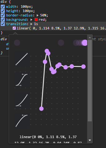
As per OP request to "specify an actual easing equation that would simulate elastic easing" it is now possible using the linear() CSS function (see support table).

💡 MDN has a very detailed page explaining it

For the below demo I have used this online tool which generates CSS linear() values for a given javascript mathematical easing function or an SVG visualized representation of an easing graph.

Hover the demo to see it in action:

body{ 
  height: 100vh; 
  display: grid;
  place-items: center;
}

body:hover div {
  scale: 2;
  background: blue;
}

div {
  width: 100px;
  height: 100px;
  border-radius: 50%;
  background: red;
  transition: 1s linear(
    0, 
    1.114 8.5%, 
    1.37 12.9%, 
    1.315 16.2%, 
    0.941 24%, 
    0.869 27.8%, 
    0.882 30.7%,
    1.012 38.3%, 
    1.046 42.7%, 
    0.984, 
    1.006 72.2%, 
    1
  )
}
<div></div>

enter image description here

Alkalinity answered 10/4 at 13:16 Comment(0)

© 2022 - 2024 — McMap. All rights reserved.