Vary the fill scale when using facet_wrap and geom_tile together
Asked Answered
R

2

10

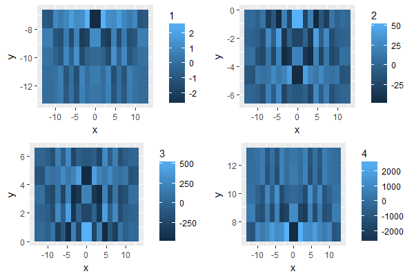
When using function geom_tile and facet_wrap together in ggplot2, how to set different limits of the aesthetic fill, as the option scales which can be set to be free/free_y/free_x in facet_wrap?

The following is an example to show the problem. For different type in data.frame df, the range of z could be so different. If we use the same limits of aesthetic fill, some panle, which one the z part have very small value, would be hard to see the details.

pp <- function (n,r=4) {
    x <- seq(-r*pi, r*pi, len=n)
    df <- expand.grid(x=x, y=x)
    df$r <- sqrt(df$x^2 + df$y^2)
    df$z <- cos(df$r^2)*exp(-df$r/6)
    df
}
tmp <- pp(20)
tmp$type <- rep(1:4,each=nrow(tmp)/4)
tmp$z <- tmp$z*(10^(tmp$type))
ggplot(tmp,aes(x,y))+geom_tile(aes(fill=z))+facet_wrap(~type,scales="free")
Rothstein answered 9/6, 2013 at 3:54 Comment(2)
Not at computer, but have you tried the shrink argument?Labarum
you would need a different legend for each facet, that's not really compatible with the ggplot2 framework. You could easily produce independent plots and arrange them together though.Biretta
A
11

I know this is an old issue, but I recently had the same problem and came up with this solution that I wanted to share. The trick is to collect the datasets needed for the individual geom_tile() plots in a nested dataframe using nest() from tidyr and then use map2() function from the purrr package and a wrapper function to create the individual plots:

library(tidyverse)

pp <- function (n,r=4) {
  x <- seq(-r*pi, r*pi, len=n)
  df <- expand.grid(x=x, y=x)
  df$r <- sqrt(df$x^2 + df$y^2)
  df$z <- cos(df$r^2)*exp(-df$r/6)
  df
}
tmp <- pp(20)
tmp$type <- rep(1:4,each=nrow(tmp)/4)
tmp$z <- tmp$z*(10^(tmp$type))

plot_func <- function(df, name) {
  ggplot(data = df, aes(x = x, y = y, fill = z)) +
    geom_tile() +
    scale_fill_continuous(name = name)
}

nested_tmp <- tmp %>% 
  group_by(type) %>% 
  nest() %>% 
  mutate(plots = map2(data, type, plot_func)) 

gridExtra::grid.arrange(grobs = nested_tmp$plots)

Grid-plot of maps with different color scale

The nested dataframe contains two list-columns, which contain the datasets and plots:

> nested_tmp
# A tibble: 4 × 3
     type               data    plots
    <int>             <list>   <list>
  1     1 <tibble [100 × 4]> <S3: gg>
  2     2 <tibble [100 × 4]> <S3: gg>
  3     3 <tibble [100 × 4]> <S3: gg>
  4     4 <tibble [100 × 4]> <S3: gg>    

From here it is very easy to modify plot_func() to fine-tune the plots.

Ance answered 21/3, 2017 at 17:52 Comment(2)
This is awesome!Gulf
+1 This is very cool. You can pipe directly into grid.arrange if you use grid.arrange(grobs = .$plots)Pigg
P
4

One way to solve this problem is to standardize the fill variable, so that the scale is similar for all facets.

library(dplyr)
tmp1 <- group_by(tmp,type) # grouping the data by type
tmp2 <- mutate(tmp1, z1 = (z-mean(z))/sd(z)) #groupwise standardization 
ggplot(tmp2,aes(x,y))+geom_tile(aes(fill=z1))+facet_wrap(~type,scales="free")

I wish there were anything like fill=std(z) so that I don't have to manually standardize.

Prologize answered 16/9, 2014 at 5:12 Comment(0)

© 2022 - 2024 — McMap. All rights reserved.