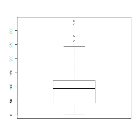
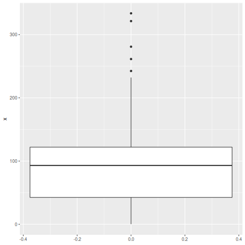
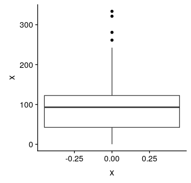
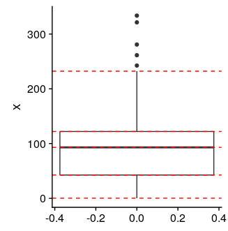
Can somebody explain to me why I get a different number of outliers with the normal boxplot command and with the geom_boxplot of ggplot2?
Here you have an example:
x <- c(280.9, 135.9, 321.4, 333.7, 0.2, 71.3, 33.0, 102.6, 126.8, 194.8, 35.5,
       107.3, 45.1, 107.2, 55.2, 28.1, 36.9, 24.3, 68.7, 163.5, 0.8, 31.8, 121.4,
       84.7, 34.3, 25.2, 101.4, 203.2, 194.1, 27.9, 42.5, 47.0, 85.1, 90.4, 103.8,
       45.1, 94.0, 36.0, 60.9, 97.1, 42.5, 96.4, 58.4, 174.0, 173.2, 164.1, 92.1,
       41.9, 130.2, 94.7, 121.5, 261.4, 46.7, 16.3, 50.7, 112.9, 112.2, 242.5, 140.6,
       112.6, 31.2, 36.7, 97.4, 140.5, 123.5, 42.9, 59.4, 94.5, 37.4, 232.2, 114.6,
       60.7, 27.8, 115.5, 111.9, 60.1)
data <- data.frame(x)
boxplot(data$x)
ggplot(data, aes(y=x)) + geom_boxplot()
With the boxplot command I get the plot below with 4 outliers.


(boxplot(data$x))shows that its upper hinge is at 122.5, not 122.0 as suggested byquantile(data$x). This would put the end of the whisker at 242.5, which is above the 241.25 point. @dww's excellent answer demonstrates a way to mitigate this. – Toole