I am trying to plot a stacked bar chart with python Matplotlib and I have positive and negative values that I want to draw. I have had a look at other posts talking about how to plot stacked bar charts with positive and negative values, but none of them has done it using Matplotlib so I couldn't find my solution. Stacked bar chart with negative JSON data d3.js stacked bar chart with positive and negative values Highcharts vertical stacked bar chart with negative values, is it possible?
I have used this code to plot stacked bar chart in python with matplotlib:
import numpy as np
import matplotlib.pyplot as plt
ind = np.arange(3)
a = np.array([4,-6,9])
b = np.array([2,7,1])
c = np.array([3,3,1])
d = np.array([4,0,-3])
p1 = plt.bar(ind, a, 1, color='g')
p2 = plt.bar(ind, b, 1, color='y',bottom=sum([a]))
p3 = plt.bar(ind, c, 1, color='b', bottom=sum([a, b]))
p4 = plt.bar(ind, d, 1, color='c', bottom=sum([a, b, c]))
plt.show()
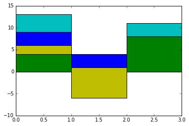
The above code gives the following graph:
This is not giving me correct results. Can someone tell me how I can code it whether using additional if else statement or any other way that would plot both negative and positive values in stacked bar charts.
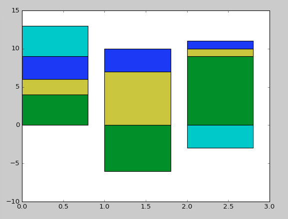
I am expecting to get the results as in the following chart: expected chart
Now the first column is plotted correctly as it has all the positive values, but when python works on the second column, it gets all mixed up due to negative values. How can I get it to take the positive bottom when looking at positive values and negative bottom when plotting additional negative values?


p1by itself works the way you say you want. Printsum([a])and let me know if that is what you want? Or do you wantnp.sum(a)? Or is your problem that all graphs overlap? Then see thesubplot(...)command. Maybe you could draw what you would like the output to look like. – Lynellelynett