ggplot2 geom_bar position failure
Asked Answered
E

2

10

I am using the ..count.. transformation in geom_bar and get the warning position_stack requires non-overlapping x intervals when some of my categories have few counts.

This is best explained using some mock data (my data involves direction and windspeed and I retain names relating to that)

#make data
set.seed(12345)
FF=rweibull(100,1.7,1)*20  #mock speeds
FF[FF>60]=59
dir=sample.int(10,size=100,replace=TRUE) # mock directions

#group into speed classes
FFcut=cut(FF,breaks=seq(0,60,by=20),ordered_result=TRUE,right=FALSE,drop=FALSE)

# stuff into data frame & plot
df=data.frame(dir=dir,grp=FFcut)
ggplot(data=df,aes(x=dir,y=(..count..)/sum(..count..),fill=grp)) + geom_bar()

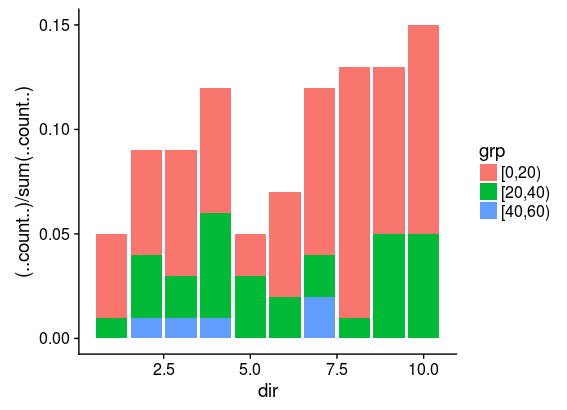
This works fine, and the resulting plot shows the frequency of directions grouped according to speed. It is of relevance that the velocity class with the fewest counts (here "[40,60)") will have 5 counts. Three categories of size 20 each
However more velocity classes leads to a warning. For instance, with

FFcut=cut(FF,breaks=seq(0,60,by=15),ordered_result=TRUE,right=FALSE,drop=FALSE)
 

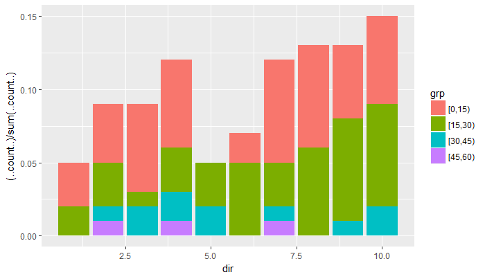
the velocity class with the fewest counts (now "[45,60)") will have only 3 counts and ggplot2 will warn that

position_stack requires non-overlapping x intervals

and the plot will show data in this category spread out along the x axis. Four categories of size 15 each. Now the last one with three elements is not added on top of the corresponding bar It seems that 5 is the minimum size for a group to have for this to work correctly.
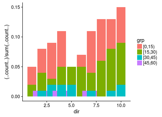
I would appreciate knowing if this is a feature or a bug in stat_bin (which geom_bar is using) or if I am simply abusing geom_bar.

Also, any suggestions how to get around this would be appreciated.

Sincerely

Emeryemesis answered 30/5, 2018 at 11:55 Comment(1)
Perhaps this? ggplot(data=df,aes(dir, fill=grp)) + geom_histogram(aes(y=(..count..)/sum(..count..)))Transom
G
17

This occurs because df$dir is numeric, so the ggplot object assumes a continuous x-axis, and aesthetic parameter group is based on the only known discrete variable (fill = grp).

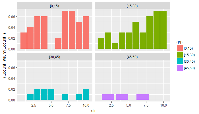
As a result, when there simply aren't that many dir values in grp = [45,60), ggplot gets confused over how wide each bar should be. This becomes more visually obvious if we split the plot into different facets:

ggplot(data=df,
            aes(x=dir,y=(..count..)/sum(..count..),
                fill = grp)) + 
  geom_bar() + 
  facet_wrap(~ grp)

facet view

> for(l in levels(df$grp)) print(sort(unique(df$dir[df$grp == l])))
[1]  1  2  3  4  6  7  8  9 10
[1]  1  2  3  4  5  6  7  8  9 10
[1]  2  3  4  5  7  9 10
[1] 2 4 7

We can also check manually that the minimum difference between sorted df$dir values is 1 for the first three grp values, but 2 for the last one. The default bar width is thus wider.

The following solutions should all achieve the same result:

1. Explicitly specify the same bar width for all groups in geom_bar():

ggplot(data=df,
       aes(x=dir,y=(..count..)/sum(..count..),
           fill = grp)) + 
  geom_bar(width = 0.9)

2. Convert dir to a categorical variable before passing it to aes(x = ...):

ggplot(data=df,
       aes(x=factor(dir), y=(..count..)/sum(..count..),
           fill = grp)) + 
  geom_bar()

3. Specify that the group parameter should be based on both df$dir & df$grp:

ggplot(data=df,
       aes(x=dir,
           y=(..count..)/sum(..count..),
           group = interaction(dir, grp),
           fill = grp)) + 
  geom_bar()

plot

Glyceric answered 30/5, 2018 at 15:58 Comment(2)
Thank you very much. Incidentally, my original code has dir as a categorial variable, but the plot I am working on is far more complex and also has ` coord_polar()` added. With the circular plot the discreteness in the x axis caused troubles when I added other layers to the plot. Having a continuous x axis solved those, but pherhaps that solution was premature.....Emeryemesis
Side note: I had this issue show up while trying to pass labels to plotly. While the ggplot was fixed by specifying the width (Solution #1 above), the labels passed to plotly became NA. Solution #3 worked perfectly.Hotchpot
J
1

This doesn't directly solve the issue, because I also don't get what's going on with the overlapping values, but it's a dplyr-powered workaround, and might turn out to be more flexible anyway.

Instead of relying on geom_bar to take the cut factor and give you shares via ..count../sum(..count..), you can easily enough just calculate those shares yourself up front, and then plot your bars. I personally like having this type of control over my data and exactly what I'm plotting.

First, I put dir and FF into a data frame/tbl_df, and cut FF. Then count lets me group the data by dir and grp and count up the number of observations for each combination of those two variables, then calculate the share of each n over the sum of n. I'm using geom_col, which is like geom_bar but when you have a y value in your aes.

library(tidyverse)

set.seed(12345)
FF <- rweibull(100,1.7,1) * 20  #mock speeds
FF[FF > 60] <- 59
dir <- sample.int(10, size = 100, replace = TRUE) # mock directions

shares <- tibble(dir = dir, FF = FF) %>%
  mutate(grp = cut(FF, breaks = seq(0, 60, by = 15), ordered_result = T, right = F, drop = F)) %>%
  count(dir, grp) %>%
  mutate(share = n / sum(n))

shares
#> # A tibble: 29 x 4
#>      dir grp         n share
#>    <int> <ord>   <int> <dbl>
#>  1     1 [0,15)      3  0.03
#>  2     1 [15,30)     2  0.02
#>  3     2 [0,15)      4  0.04
#>  4     2 [15,30)     3  0.03
#>  5     2 [30,45)     1  0.01
#>  6     2 [45,60)     1  0.01
#>  7     3 [0,15)      6  0.06
#>  8     3 [15,30)     1  0.01
#>  9     3 [30,45)     2  0.02
#> 10     4 [0,15)      6  0.06
#> # ... with 19 more rows

ggplot(shares, aes(x = dir, y = share, fill = grp)) +
  geom_col()

Jareb answered 30/5, 2018 at 13:52 Comment(1)
Thank you Camille. This is very useful. I had been thinking along these lines of making the code more explicit. The thing is I am updating a plotting routine I wrote in base R in 2001 (and which has been used continuously since then), and then everything was calculated explicitly. Cumbersome, but I knew what I had. Your solution is quite elegant, and not cumbersome at all....Emeryemesis

© 2022 - 2024 — McMap. All rights reserved.