Foreword
From what I understand, the seaborn distplot by default does a kde estimation.
If you want a normalized distplot graph, it could be because you assume that the graph's Ys should be bounded between in [0;1]. If so, a stack overflow question has raised the question of kde estimators showing values above 1.
Quoting one answer:
a continous pdf (pdf=probability density function) never says the value to be less than 1, with the pdf for continous random variable, function p(x) is not the probability. you can refer for continuous random variables and their distrubutions
Quoting first comment of importanceofbeingernest:
The integral over a pdf is 1. There is no contradiction to be seen here.
From my knowledge it is the CDF (Cumulative Density Function) whose values are supposed to be in [0; 1].
Notice: All possible continuous fittable functions are on SciPy site and available in the package scipy.stats
Maybe have also a look at probability mass functions ?
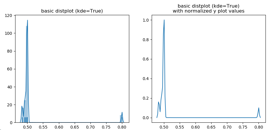
If you really want to have the same graph normalized, then you should gather the actual data points of the plotted function (Option1), or the function definition (Option 2), and normalize them yourself and plot them again.
Option 1
![enter image description here]()
import numpy as np
import matplotlib
import matplotlib.pyplot as plt
import seaborn as sns
import sys

print('System versions          : {}'.format(sys.version))
print('System versions          : {}'.format(sys.version_info))
print('Numpy versqion           : {}'.format(np.__version__))
print('matplotlib.pyplot version: {}'.format(matplotlib.__version__))
print('seaborn version          : {}'.format(sns.__version__))

protocols = {}

types = {"data_v": "data_v.csv"}

for protname, fname in types.items():
    col_time,col_window = np.loadtxt(fname,delimiter=',').T
    trailing_window = col_window[:-1] # "past" values at a given index
    leading_window  = col_window[1:]  # "current values at a given index
    decreasing_inds = np.where(leading_window < trailing_window)[0]
    quotient = leading_window[decreasing_inds]/trailing_window[decreasing_inds]
    quotient_times = col_time[decreasing_inds]

    protocols[protname] = {
        "col_time": col_time,
        "col_window": col_window,
        "quotient_times": quotient_times,
        "quotient": quotient,
    }

    fig, (ax1, ax2) = plt.subplots(1,2, sharey=False, sharex=False)
    g = sns.distplot(quotient, hist=True, label=protname, ax=ax1, rug=True)
    ax1.set_title('basic distplot (kde=True)')
    # get distplot line points
    line = g.get_lines()[0]
    xd = line.get_xdata()
    yd = line.get_ydata()
    # https://mcmap.net/q/300213/-normalize-numpy-array-columns-in-python
    def normalize(x):
        return (x - x.min(0)) / x.ptp(0)
    #normalize points
    yd2 = normalize(yd)
    # plot them in another graph
    ax2.plot(xd, yd2)
    ax2.set_title('basic distplot (kde=True)\nwith normalized y plot values')

    plt.show()
Option 2
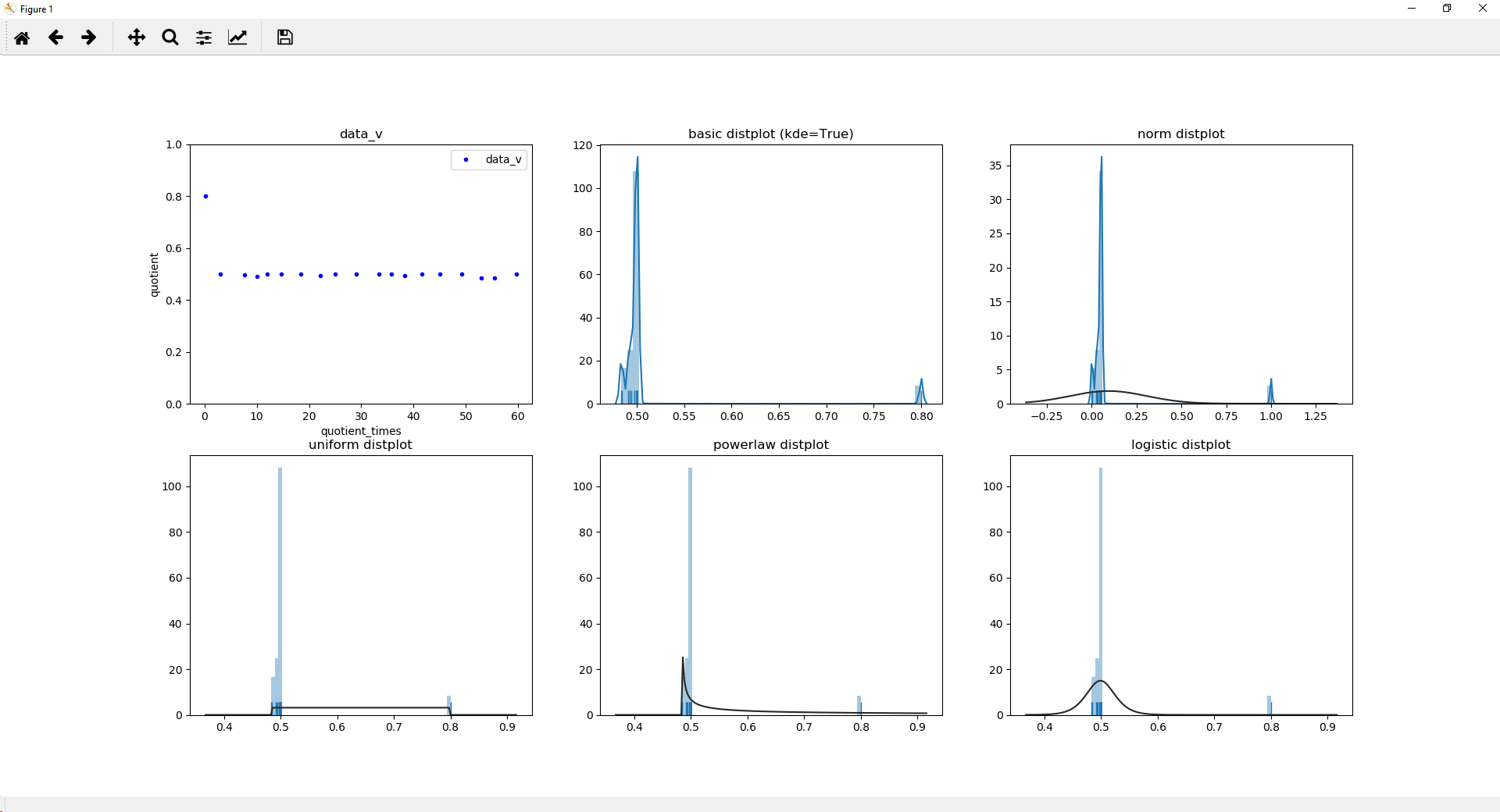
Below, I tried to perform a kde and normalize the obtained estimation. I'm not a stats expert, so the kde usage might be wrong in some way (It is different from seaborn's as one can see on the screenshot, this is because seaborn does the job way much better than me. It only tried to mimic the kde fitting with scipy. The result is not so bad i guess)
Screenshot:
![enter image description here]()
Code:
import numpy as np
from scipy import stats
import matplotlib
import matplotlib.pyplot as plt
import seaborn as sns
import sys

print('System versions          : {}'.format(sys.version))
print('System versions          : {}'.format(sys.version_info))
print('Numpy versqion           : {}'.format(np.__version__))
print('matplotlib.pyplot version: {}'.format(matplotlib.__version__))
print('seaborn version          : {}'.format(sns.__version__))

protocols = {}

types = {"data_v": "data_v.csv"}

for protname, fname in types.items():
    col_time,col_window = np.loadtxt(fname,delimiter=',').T
    trailing_window = col_window[:-1] # "past" values at a given index
    leading_window  = col_window[1:]  # "current values at a given index
    decreasing_inds = np.where(leading_window < trailing_window)[0]
    quotient = leading_window[decreasing_inds]/trailing_window[decreasing_inds]
    quotient_times = col_time[decreasing_inds]

    protocols[protname] = {
        "col_time": col_time,
        "col_window": col_window,
        "quotient_times": quotient_times,
        "quotient": quotient,
    }

    fig, (ax1, ax2, ax3, ax4) = plt.subplots(1,4, sharey=False, sharex=False)
    diff=quotient_times
    ax1.plot(diff, quotient, ".", label=protname, color="blue")
    ax1.set_ylim(0, 1.0001)
    ax1.set_title(protname)
    ax1.set_xlabel("quotient_times")
    ax1.set_ylabel("quotient")
    ax1.legend()

    sns.distplot(quotient, hist=True, label=protname, ax=ax2, rug=True)
    ax2.set_title('basic distplot (kde=True)')

    # taken from seaborn's source code (utils.py and distributions.py)
    def seaborn_kde_support(data, bw, gridsize, cut, clip):
        if clip is None:
            clip = (-np.inf, np.inf)
        support_min = max(data.min() - bw * cut, clip[0])
        support_max = min(data.max() + bw * cut, clip[1])
        return np.linspace(support_min, support_max, gridsize)

    kde_estim = stats.gaussian_kde(quotient, bw_method='scott')

    # manual linearization of data
    #linearized = np.linspace(quotient.min(), quotient.max(), num=500)

    # or better: mimic seaborn's internal stuff
    bw = kde_estim.scotts_factor() * np.std(quotient)
    linearized = seaborn_kde_support(quotient, bw, 100, 3, None)

    # computes values of the estimated function on the estimated linearized inputs
    Z = kde_estim.evaluate(linearized)

    # https://mcmap.net/q/300213/-normalize-numpy-array-columns-in-python
    def normalize(x):
        return (x - x.min(0)) / x.ptp(0)

    # normalize so it is between 0;1
    Z2 = normalize(Z)
    for name, func in {'min': np.min, 'max': np.max}.items():
        print('{}: source={}, normalized={}'.format(name, func(Z), func(Z2)))

    # plot is different from seaborns because not exact same method applied
    ax3.plot(linearized, Z, ".", label=protname, color="orange")
    ax3.set_title('Non linearized gaussian kde values')

    # manual kde result with Y axis avalues normalized (between 0;1)
    ax4.plot(linearized, Z2, ".", label=protname, color="green")
    ax4.set_title('Normalized gaussian kde values')

    plt.show()
Output:
System versions          : 3.7.2 (default, Feb 21 2019, 17:35:59) [MSC v.1915 64 bit (AMD64)]
System versions          : sys.version_info(major=3, minor=7, micro=2, releaselevel='final', serial=0)
Numpy versqion           : 1.16.2
matplotlib.pyplot version: 3.0.2
seaborn version          : 0.9.0
min: source=0.0021601491646143518, normalized=0.0
max: source=9.67319154426489, normalized=1.0
Contrary to a comment, plotting:
[(x-min(quotient))/(max(quotient)-min(quotient)) for x in quotient]
Does not change the behavior ! It only changes the source data for kernel density estimation. The curve shape would remain the same.
Quoting seaborn's distplot doc:
This function combines the matplotlib hist function (with automatic
calculation of a good default bin size) with the seaborn kdeplot() and
rugplot() functions. It can also fit scipy.stats distributions and
plot the estimated PDF over the data.
By default:
kde : bool, optional set to True
Whether to plot a gaussian kernel density estimate.
It uses kde by default. Quoting seaborn's kde doc:
Fit and plot a univariate or bivariate kernel density estimate.
Quoting SCiPy gaussian kde method doc:
Representation of a kernel-density estimate using Gaussian kernels.
Kernel density estimation is a way to estimate the probability density
function (PDF) of a random variable in a non-parametric way.
gaussian_kde works for both uni-variate and multi-variate data. It
includes automatic bandwidth determination. The estimation works best
for a unimodal distribution; bimodal or multi-modal distributions tend
to be oversmoothed.
Note that I do believe that your data are bimodal, as you mentioned it yourself. They also look discrete. As far as I know, discrete distribution function may not be analyzed in the same way continuous are, and fitting may proove tricky.
Here is an example with various laws:
import numpy as np
from scipy.stats import uniform, powerlaw, logistic
import matplotlib
import matplotlib.pyplot as plt
import seaborn as sns
import sys

print('System versions          : {}'.format(sys.version))
print('System versions          : {}'.format(sys.version_info))
print('Numpy versqion           : {}'.format(np.__version__))
print('matplotlib.pyplot version: {}'.format(matplotlib.__version__))
print('seaborn version          : {}'.format(sns.__version__))

protocols = {}

types = {"data_v": "data_v.csv"}

for protname, fname in types.items():
    col_time,col_window = np.loadtxt(fname,delimiter=',').T
    trailing_window = col_window[:-1] # "past" values at a given index
    leading_window  = col_window[1:]  # "current values at a given index
    decreasing_inds = np.where(leading_window < trailing_window)[0]
    quotient = leading_window[decreasing_inds]/trailing_window[decreasing_inds]
    quotient_times = col_time[decreasing_inds]

    protocols[protname] = {
        "col_time": col_time,
        "col_window": col_window,
        "quotient_times": quotient_times,
        "quotient": quotient,
    }
    fig, [(ax1, ax2, ax3), (ax4, ax5, ax6)] = plt.subplots(2,3, sharey=False, sharex=False)
    diff=quotient_times
    ax1.plot(diff, quotient, ".", label=protname, color="blue")
    ax1.set_ylim(0, 1.0001)
    ax1.set_title(protname)
    ax1.set_xlabel("quotient_times")
    ax1.set_ylabel("quotient")
    ax1.legend()
    quotient2 = [(x-min(quotient))/(max(quotient)-min(quotient)) for x in quotient]
    print(quotient2)
    sns.distplot(quotient, hist=True, label=protname, ax=ax2, rug=True)
    ax2.set_title('basic distplot (kde=True)')
    sns.distplot(quotient2, hist=True, label=protname, ax=ax3, rug=True)
    ax3.set_title('logistic distplot')

    sns.distplot(quotient, hist=True, label=protname, ax=ax4, rug=True, kde=False, fit=uniform)
    ax4.set_title('uniform distplot')
    sns.distplot(quotient, hist=True, label=protname, ax=ax5, rug=True, kde=False, fit=powerlaw)
    ax5.set_title('powerlaw distplot')
    sns.distplot(quotient, hist=True, label=protname, ax=ax6, rug=True, kde=False, fit=logistic)
    ax6.set_title('logistic distplot')
    plt.show()
Output:
System versions          : 3.7.2 (default, Feb 21 2019, 17:35:59) [MSC v.1915 64 bit (AMD64)]
System versions          : sys.version_info(major=3, minor=7, micro=2, releaselevel='final', serial=0)
Numpy versqion           : 1.16.2
matplotlib.pyplot version: 3.0.2
seaborn version          : 0.9.0
[1.0, 0.05230125523012544, 0.0433775382360589, 0.024590765616971128, 0.05230125523012544, 0.05230125523012544, 0.05230125523012544, 0.02836946874603772, 0.05230125523012544, 0.05230125523012544, 0.05230125523012544, 0.05230125523012544, 0.03393500048652319, 0.05230125523012544, 0.05230125523012544, 0.05230125523012544, 0.0037013196009011043, 0.0, 0.05230125523012544]
Screenshot:
![enter image description here]()


norm_hist=True– Systematism