Angular Material: CheckBox in mat-menu; Problem with dark themes
Asked Answered
G

3

10

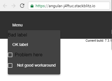
You can't put a <mat-checkbox> in a <mat-menu> normally. If so, dark themes don't apply to the text-part of your <mat-checkbox> (see the image at the end).

About <mat-label>s there is a similar issue. But the solution is simple:

  • Using <label mat-menu-item> instead of <mat-label>.

Similarly about buttons.


But I couldn't find a similar solution for <mat-checkbox>es! These are all states that I tested:

<mat-menu #menu="matMenu">
  <mat-label>Bad label</mat-label>
  <label mat-menu-item>OK label</label>
  <mat-checkbox>Problem here</mat-checkbox>
  <!-- ERROR:
  <mat-checkbox  mat-menu-item>
    Template parse errors:
More than one component matched on this element.
  </mat-checkbox>
  -->
  <br><mat-checkbox></mat-checkbox>
  <label mat-menu-item style="display:inline">Not good workaround</label>
</mat-menu>

stackblitz

And the result:

enter image description here

Guy answered 7/3, 2019 at 22:9 Comment(0)
S
14

There appears to be a way to assign menuitemcheckbox to the role input, on the mat-menu-item directive... unfortunately, I am not clear on how it should work...

<!-- https://github.com/angular/material2/commit/3f1588f562a4abd85d6add87a4f6ed969ba56898#diff-4cc67949abfd84b09e8b7178ac357febR2134 -->
  <button mat-menu-item role="menuitemcheckbox" aria-checked="true">Checked</button>
  <button mat-menu-item role="menuitemcheckbox" aria-checked="false">Not </button>

With that being said, assigning the mat-menu-item class rather than the directive may be a viable workaround.

<mat-checkbox class="mat-menu-item">Problem here</mat-checkbox>  

Stackblitz

https://stackblitz.com/edit/angular-j4ftuc-5s5k3t?embed=1&file=app/menu-overview-example.html

Semivowel answered 8/3, 2019 at 2:15 Comment(1)
As per github.com/angular/components/pull/14165, the role only controls the aria-role on the menu item. Adding first class mat-item-checkbox elements is coming in a future minor, maybeCounts
R
9

Since Angular Material 11 the class="mat-menu-item" Workaround introduced by Marshal seems to be broken. You can fix it by applying the mat-menu-item directive on a div wrapping your mat-checkbox.

<div mat-menu-item>
  <mat-checkbox>Problem here</mat-checkbox> 
</div>

Be aware that the checkbox is now only triggered when you click exactly on the checkbox, not when you press any other spot of the menu-item. This causes only a click animation. To workaround this you can register a (click)="..." listener on the wrapping div.

Recalcitrant answered 17/4, 2021 at 13:19 Comment(2)
You're right, to add the click behaviour you can register the (click) like this: (click)="$event.preventDefault(); filterCheck._inputElement.nativeElement.click()"Lavin
should be <div mat-menu-item> <mat-checkbox>Problem here</mat-checkbox> </div>Puklich
E
4

Elaborating on Aki's answer:

<div mat-menu-item (click)="$event.stopPropagation(); cb.toggle()" (keydown.enter)="$event.stopPropagation(); cb.toggle()">
  <mat-checkbox class="mat-menu__checkbox" (click)="$event.stopPropagation()" #cb>Problem No Longer Here</mat-checkbox>
</div>

The wrapper div needs (keydown.enter) so the keyboard controls for the mat menu will still work correctly. We also register a click event so if the user clicks on the right or left edges of the menu item it will toggle the checkbox. $event.stopPropagation() is here to prevent the menu from closing while the user is interacting with the checkboxes.

Then add the following to your style sheet:

.mat-menu__checkbox {
  height: 100%;
  &::ng-deep .mat-checkbox-layout {
    height: 100%;
    &::ng-deep .mat-checkbox-label {
      margin: auto;
      vertical-align: middle;
      position: relative;
    }
  }
}

This style will make the label of your mat checkbox the full height of the menu item and keep it vertically centered. This makes it so the checkbox can be clicked anywhere and it will trigger.

Estrus answered 30/8, 2021 at 18:20 Comment(0)

© 2022 - 2024 — McMap. All rights reserved.