CSS animations with Spritesheets in a grid image (not in a row)
Asked Answered
R

4

10

I'm trying to animate a sprite image, and found this great example:

Blog: http://simurai.com/blog/2012/12/03/step-animation/ (has succumbed to linkrot).
Wayback Machine: http://web.archive.org/web/20140208085706/http://simurai.com/blog/2012/12/03/step-animation/
Code Fiddle: https://codepen.io/simurai/pen/tukwj

JSFiddle: http://jsfiddle.net/simurai/CGmCe/

.hi {
width: 50px;
height: 72px;
background-image: url("http://s.cdpn.io/79/sprite-steps.png");

-webkit-animation: play .8s steps(10) infinite;
   -moz-animation: play .8s steps(10) infinite;
    -ms-animation: play .8s steps(10) infinite;
     -o-animation: play .8s steps(10) infinite;
        animation: play .8s steps(10) infinite; }

@-webkit-keyframes play { from { background-position: 0px; } to { background-position: -500px; } }

@-moz-keyframes play { from { background-position: 0px; } to { background-position: -500px; } }

@-ms-keyframes play { from { background-position: 0px; } to { background-position: -500px; } }

@-o-keyframes play { from { background-position: 0px; } to { background-position: -500px; } }

@keyframes play { from { background-position: 0px; } to { background-position: -500px; } }

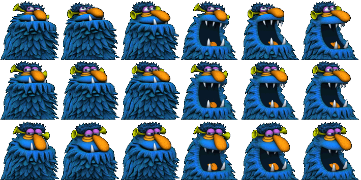
I'd like to do the same thing, but using a square (power-or-two sized) image atlas instead of an animation strip. For example, this one:

square image atlas

Righteous answered 22/3, 2014 at 0:47 Comment(0)
A
33

Since this can be a difficult to debug task, I would like to start with the same problem, but in an easier to debug environment.

I chose to do it as a rectangle animation over the full image.

.hi {
    width: 320px;
    height: 315px;
    background-image: url("https://i.sstatic.net/CjMscm.jpg");
    position: relative;
    border: solid 1px black;
}

.hi:before {
    content: "";
    position: absolute;
    width: 100%;
    height: 53px;
    left: 0px;
    top: 0px;
    border: solid 1px red;
    -webkit-animation: playv 18s steps(6) infinite; 
}

@-webkit-keyframes playv {
     0% { top:   0px; }
   100% { top: 315px; }
}

.hi:after {
    content: "";
    position: absolute;
    width: 53px;
    height: 100%;
    left: 266px;
    top: 0px;
    border: solid 1px red;
    -webkit-animation: playh 3s steps(6) infinite; 
}

@-webkit-keyframes playh {
     0% { left:   0px; }
   100% { left: 320px; }
}
<div class="hi">
</div>

Over the image, I display 2 pseudo elements, one is the row selector and the other the column selector. And I adjust the animations until they are ok


Now, lets verify that setting both animations at the same time works:

.hi {
    width: 320px;
    height: 315px;
    background-image: url("https://i.sstatic.net/CjMscm.jpg");
    position: relative;
    border: solid 1px black;
}

.hi:before {
    content: "";
    position: absolute;
    width: 53px;
    height: 53px;
    left: 0px;
    top: 0px;
    border: solid 1px red;
    -webkit-animation: playv 18s steps(6) infinite, playh 3s steps(6) infinite; 
}

@-webkit-keyframes playv {
     0% { top:   0px; }
   100% { top: 315px; }
}

@-webkit-keyframes playh {
     0% { left:   0px; }
   100% { left: 320px; }
}
<div class="hi">
</div>


And now the final project:

.hi {
  width: 53px;
  height: 53px;
  background-image: url("https://i.sstatic.net/CjMscm.jpg");
  position: relative;
  border: solid 1px black;
  -webkit-animation: playv 1s steps(6) infinite, playh 0.1667s steps(6) infinite;
  animation: playv 1s steps(6) infinite, playh 0.1667s steps(6) infinite;
}

@-webkit-keyframes playv {
  0% {
    background-position-y: 0px;
  }
  100% {
    background-position-y: -315px;
  }
}

@-webkit-keyframes playh {
  0% {
    background-position-x: 0px;
  }
  100% {
    background-position-x: -320px;
  }
}

@keyframes playv {
  0% {
    background-position-y: 0px;
  }
  100% {
    background-position-y: -315px;
  }
}

@keyframes playh {
  0% {
    background-position-x: 0px;
  }
  100% {
    background-position-x: -320px;
  }
}
<div class="hi">
</div>

All this for a webkit browser, remove prefixes for IE and FF. Also, in this approach it is imposible to avoid displaying the 2 blank images at the lower left corner. If you don't have a full grid, and don't want to display the empty images, you will need to specify all the keyframes one by one

Archiphoneme answered 22/3, 2014 at 9:37 Comment(10)
could you please tell us how you can specify all the keyframes one by one?Toritorie
This solution doesn't work in firefox, since this doesn't support background-position-x and background-position-yBerard
Thank you for the good idea @vals. I only had empty frames which were showing the blank space. Also animation is different in explorer 11, any idea?Tattle
I noticed that all the styles where done with -webkit- prefixes. So IE would probably have problems. I have adapted the last snippet; it should work now.Archiphoneme
Thanks you for your answer vals, the method is really niceApollonian
This is one of the nicest, most innovative, and best-explained answers on all of StackOverflow. And it’s a perfectly hidden gem.Belay
Amazing answer with detailed tutorial. ThanksXeric
Excellent answer, with practical example which helped me to achieve my target correctly... thank you so much for your experimental red moving grid... you are definitely very awesome programmer with great sense.Valadez
While your statement about blank tiles is true, just here to state the obvious to web searchers. It is often easier to simply duplicate existing frames in the image source so they are not blank; rather than define all keyframesLangbehn
not all heroes wear capesPalacio
S
6

Use background-position-x and background-position-y property instead.

For this image

preview

of size 710px × 355px

sprite frame size is 118.333px X 118.333px and we need to travel 6 frames horizontally and 3 frames vertically.

That means we need to create two separate keyframe animations to traverse each direction. When x direction animation is in play, other must froze until it completes.

Also duration of y animation must be 3X.

Here is code

<div class="hi"></div>


.hi {
  width: 118.333px;
  height: 118.333px;
  background-image: url("http://www.fore6.com/wp-content/uploads/2011/09/henson11-hp-1g.png");
  animation: playX 1s steps(6) infinite,
             playY 3s steps(3) infinite;
}

@keyframes playX {
  from {background-position-x: 0px;}
  to {background-position-x: -710px;}
}

@keyframes playY {
  from {background-position-y: 0px;}
  to {background-position-y: -355px;}
}

fiddle here

Simon answered 30/8, 2016 at 22:15 Comment(2)
Thank you very much for the cool example. I only have a different view of animation when opening in explorer 11. Any idea? It seems it dont animate either x or y coordinate. Thanks @Uday Hiwarale.Tattle
In your example the grid of 6x3 frames has no gaps, so it's an ideal situation. But what if you have a number of frames that don't fit nicely on a grid, such as a prime number? Or what if you want to stick to a convention of 10 frames per row, and you've got 24 frames? Those scenarios leave gaps in the grid, causing your approach to no longer work. Any ideas on how to address this, or should I open a new question?Messroom
A
0

To help understand how it works, here is a generic solution with SCSS in addition to the answer given by @vals : jsfiddle link

SCSS :

// Variables to edit
$imgUrl: 'https://mrbubblewand.files.wordpress.com/2009/08/magic_001.png';
$imageWidth: 960px;
$imageHeigth: 1152px;
$itemNbColumns: 5;
$itemNbLines: 6;
$spriteAnimationTime: 1s;


// =======================================

$squareWidth: $imageWidth / $itemNbColumns;
$squareHeigth: $imageHeigth / $itemNbLines;

// ========================================

.square {
    width: $squareWidth;
    height: $squareHeigth;
    background-image: url($imgUrl);
    position: relative;
    border: solid 1px black;
    -webkit-animation: playvsquare $spriteAnimationTime*$itemNbColumns*$itemNbLines steps($itemNbLines) infinite, playhsquare $spriteAnimationTime*$itemNbColumns steps($itemNbColumns) infinite; 
}

@-webkit-keyframes playvsquare {
     0% { background-position-y:   0px; }
   100% { background-position-y: -$imageHeigth; }
}

@-webkit-keyframes playhsquare {
     0% { background-position-x:   0px; }
   100% { background-position-x: -$imageWidth; }
}

// =======================================

.sprite {
    width: $imageWidth;
    height: $imageHeigth;
    background-image: url($imgUrl);
    position: relative;
    border: solid 1px black;
}

.sprite:before {
    content: "";
    position: absolute;
    width: 100%;
    height: $squareHeigth; /* taille du carré */
    left: 0px;
    top: 0px;
    border: solid 1px red;
    -webkit-animation: playvsprite$spriteAnimationTime*$itemNbColumns*$itemNbLines steps($itemNbLines) infinite; 
}

.sprite:after {
    content: "";
    position: absolute;
    width: $squareWidth;
    height: 100%;
    left: $squareWidth;
    top: 0px;
    border: solid 1px red;
    -webkit-animation: playhsprite $spriteAnimationTime*$itemNbColumns steps($itemNbColumns) infinite; 
}

// Déplacement
@-webkit-keyframes playvsprite {
     0% { top:   0px; }
   100% { top: $imageHeigth; }
}
// Déplacement
@-webkit-keyframes playhsprite {
     0% { left:   0px; }
   100% { left: $imageWidth; }
}

HTML :

<p>Square :</p>
<div class="square"></div>
<p>Entire sprite :</p>
<div class="sprite"></div>
Apollonian answered 3/12, 2017 at 20:3 Comment(0)
B
0

According to @Uday Hiwarale, I wrote a convenience function

const sprite = document.querySelector("div.sprite");
const url = "https://i.imgur.com/7xbso3d.png";
setSpriteSheet(sprite, url, 200, 540, 40, 90, 2);

function setSpriteSheet(element, imageUrl, imageWidth, imageHeight, patternWidth, patternHeight, animationWait) {
  if (!document.querySelector("style.sprite")) {
    const style = document.createElement("style");
    document.head.appendChild(style);
    style.className = "sprite";
    style.sheet.insertRule("@keyframes spriteFrameX { to { background-position-x: var(--sprite-width) } }");
    style.sheet.insertRule("@keyframes spriteFrameY { to { background-position-y: var(--sprite-height) } }");
  }
  element.style.backgroundImage = `url("${imageUrl}")`;
  element.style.width = patternWidth + "px";
  element.style.height = patternHeight + "px";
  element.style.setProperty("--sprite-width", -imageWidth + "px");
  element.style.setProperty("--sprite-height", -imageHeight + "px");
  element.style.animationName = "spriteFrameX , spriteFrameY";
  element.style.animationIterationCount = "infinite, infinite";
  const maxPatternX = imageWidth / patternWidth;
  const maxPatternY = imageHeight / patternHeight;
  const durationX = animationWait / 60 * maxPatternX; // Assuming in the context of 60fps
  const durationY = durationX * maxPatternY;
  element.style.animationDuration = `${durationX}s, ${durationY}s`;
  element.style.animationTimingFunction = `steps(${maxPatternX}), steps(${maxPatternY})`;
}
div.sprite {
  border: 1px solid;
  display: inline-block;
}

#original {
  border: 1px solid;
  width: auto;
  height: 180px;
}
<img id="original" src="https://i.imgur.com/7xbso3d.png">
<div class="sprite"></div>
Bolen answered 18/7 at 16:29 Comment(0)

© 2022 - 2024 — McMap. All rights reserved.