Responsive navbar in UIKit 3?
Asked Answered
F

3

11

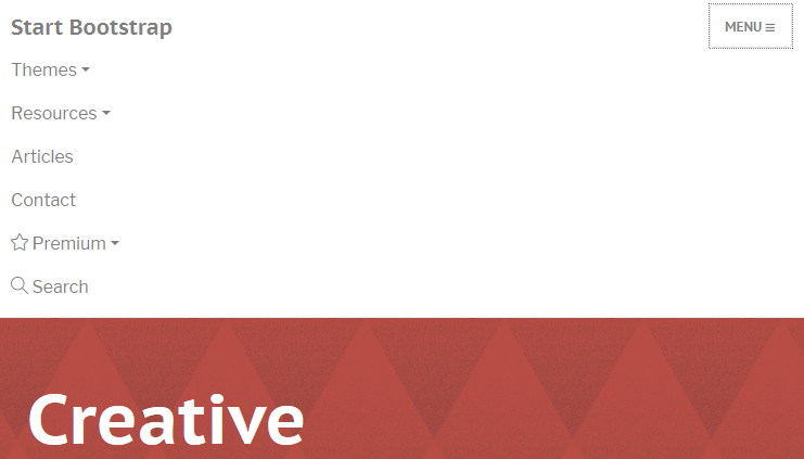
I've been migrating my website over to UIkit 3 instead of Bootstrap 4. But I've been stuck on the navbar for a while. Right now, my navbar is built in Bootstrap 4 and looks like this:

https://jsfiddle.net/eztwL9p7/1/

<nav class="navbar navbar-toggleable-sm  sticky-top navbar-light bg-faded">
  <button class="navbar-toggler" type="button" data-toggle="collapse" data-target="#navbarResponsive" aria-controls="navbarResponsive">
    <span class="navbar-toggler-icon"></span>
  </button>
  <div class="collapse navbar-collapse" id="navbarResponsive">
    <a class="navbar-brand">brand</a>
    <ul class="navbar-nav mr-auto">
      <li class="nav-item">
        <a class="nav-link">Blog <span class="sr-only">(current)</span></a>
      </li>
      <li class="nav-item">
        <a class="nav-link" href="#">Contact</a>
      </li>
      <li class="nav-item">
        <a class="nav-link" href="#">Projects</a>
      </li>
    </ul>
    <auth-partial>
      <ul class="nav navbar-nav">
        <li class="nav-item float-xs-right">
          <a href="#" class="nav-link">Log in</a>
        </li>
      </ul>
    </auth-partial>
  </div>
</nav>

So it's just a normal navbar, but when the page is small enough, a toggle button appears and the items become a drop down list. I've been trying to migrate this to UIKit, but I don't see any option for this in their templates. If I understand it right, it seems like I have to make 2 navbars, one for the normal view and then a smaller one?

The Navbar documentation suggests that the .uk-navbar-toggle class and the .uk-navbar-toggle-icon are added like below - resulting in a toggle icon - but without an expandable menu and also not able to hide specified menu items as Bootstrap can do.

<nav class="uk-navbar uk-navbar-container uk-margin">
    <div class="uk-navbar-left">
        <a class="uk-navbar-toggle" uk-navbar-toggle-icon href="#"></a>
    </div>
</nav>

The Navbar documentation recommends that the Off-canvas component (sidebar that slides in and out of the page) - or the Modal component - but neither of these result in a Bootstrap-style toggle menu.

Screenshots that show how the responsive navbar toggle / hide specified elements on smaller screens in Bootstrap:

Screen in normal size - all menu items are shown: enter image description here

Screen in smaller size - some or all menu items are hidden: enter image description here

Screen in smaller size - pressing Menu displays menu items: enter image description here

Fanchie answered 4/7, 2017 at 6:34 Comment(3)
Did you manage to find a solution?Dreda
I found no solution except to create 2 navbars, and making only one visible depending on the widthFanchie
As you though, it appears that UIkit expects the implementation with duplicated navbars similar as on their website. This is not always a good idea and I am strongly against such workarounds. For me it just looks as an unnecessary way of making the menu less maintainable, more error-prone and not to mention duplicated content might have negative impact on SEO. This is one of the biggest disappointments that I ran into while discovering this great framework which really does have a lot of potential. Not having an out-of-the-box togglable and stackable navbar is a big NO, NO Sorry UIkit dev teamWhilst
W
3

It's obvious UIkit expects the implementation with duplicated navbars each visible only in the respective viewport. That's their own website solution. In my opinion it is not always a good idea. I am strongly against such workarounds because to me it looks like an unnecessary way of making the menu less maintainable, less accessible, less structured, less readable or machine-parsable, more error-prone and not to mention duplicated content might have negative impact on SEO. It was one of the biggest disappointments that I ran into while discovering this great framework which really does have a lot of potential. Not having an out-of-the-box togglable and stackable navbar is a big NO, NO - sorry UIkit dev team. Other than that UIkit is an awesome toolkit.

If one wants to use a modal or off-canvas solutions as per their recommendation feel free to do so. But in that case I would still recommend not to have duplicated content on your site. Maybe one could use Javascript to move the content dynamically instead.

I am personally in favor of bootstrap-like navbar solution without a need of duplicated content. It is currently used on many major websites around. So why not to support it?

Requirements:

  • Horizontal navbar to be stackable vertically in smartphone view
  • Toggle navbar 'hidden' and 'hamburger icon' shown when reached smartphone view
  • Toggle icon shows/hides the navbar in smartphone view
  • Navbar is never hidden in desktop view, no matter if toggle icon was used or not

Solution:

Yes it's ugly, I know...

<nav class="uk-navbar-container uk-flex-column uk-flex-top" data-uk-navbar data-uk-toggle="media: @s; cls: uk-flex-row uk-flex-top; mode: media">
    <button type="button" data-uk-toggle="target: .navbar-collapse; cls: hidden-up-to-s" class="uk-navbar-toggle uk-hidden@s" data-uk-navbar-toggle-icon></button>
    <div class="navbar-collapse hidden-up-to-s">
        <div class="uk-navbar-left">
            <ul data-uk-toggle="media: @s; cls: uk-navbar-nav uk-padding-remove; mode: media" class="uk-nav uk-nav-primary uk-padding-small">
                <li class="uk-active"><a href="#">Active</a></li>
                <li><a href="#">Item</a></li>
            </ul>
        </div>
    </div>
</nav>

And some custom CSS in order to have the navbar hidden only in smartphone view:

.hidden-up-to-s {
    display: none;
}
@media (min-width: 640px) { /* @breakpoint-small */
    .hidden-up-to-s {
        display: block;
    }
}

More examples here: https://codepen.io/Hrvoje-Go/pen/LKWojr

Whilst answered 22/6, 2019 at 16:13 Comment(2)
Don't remember what was the problem with the posted solution but in the end I wrote JS script which places the menu where it needs to be structurally depending on the viewportWhilst
This worked nicely for normal usage, but it kinda breaks in the dropbar mode with parent navigation items.Wallford
M
1

Late Answer... With some CSS you can modify UiKit's Navbar to work like Bootstrap's responsive Navbar. Please note that this sample is not styled to look beautiful - I tried to keep the CSS as short as possible.

On mobile devices (touch) the drop-downs will open/close on touch event (this is an out-of-the-box feature of UiKit).

.uk-navbar {
  min-height: 50px;
}
.uk-navbar button.navbar-toggle {
  position: absolute;
  right: 0;
  top: 0;
  padding: 9px 10px;
  margin-top: 8px;
  margin-right: 15px;
  margin-bottom: 8px;
  background-color: transparent;
  background-image: none;
  border: 1px solid #ddd;
  border-radius: 4px;
}
.uk-navbar button.navbar-toggle .icon-bar {
  display: block;
  width: 22px;
  height: 2px;
  border-radius: 1px;
  background-color: #888;
}
.uk-navbar button.navbar-toggle .icon-bar + .icon-bar {
  margin-top: 4px;
}
.uk-navbar .uk-navbar-nav {
  flex-wrap: wrap-reverse;
  align-self: flex-end;
}
.uk-navbar .uk-navbar-nav > li > a {
  min-height: auto;
  line-height: 3em;
}
@media (max-width: 959px) {
  .uk-navbar .toggle-target.collapsed {
    display: none;
  }
  .uk-navbar .toggle-target .uk-navbar-nav {
    display: block;
    top: 50px;
    position: absolute;
    left: 0;
    right: 0;
    width: 100%;
    background: #f8f8f8;
  }
  .uk-navbar .toggle-target .uk-navbar-nav li a {
    display: block;
    min-height: 0;
    line-height: 2em;
    padding: 0 15px !important;
  }
  .uk-navbar .toggle-target .uk-navbar-dropdown {
    width: 90%;
    min-width: 200px;
  }
  .uk-navbar .toggle-target .uk-navbar-dropdown[class*='uk-navbar-dropdown-bottom'] {
    margin-top: 0;
  }
}
.sr-only {
    position: absolute;
    width: 1px;
    height: 1px;
    padding: 0;
    margin: -1px;
    overflow: hidden;
    clip: rect(0,0,0,0);
    border: 0;
}
a#logo {
  align-items:baseline
}
<script src="https://cdnjs.cloudflare.com/ajax/libs/uikit/3.0.3/js/uikit-core.min.js"></script>
<link href="https://cdnjs.cloudflare.com/ajax/libs/uikit/3.0.3/css/uikit-core.min.css" rel="stylesheet"/>

    <section id="mainnav">
        <nav class="uk-container" uk-navbar>
            <button type="button" class="navbar-toggle uk-hidden@m" uk-toggle="target:.toggle-target; cls:collapsed">
                <span class="sr-only">Toggle navigation</span>
                <span class="icon-bar"></span>
                <span class="icon-bar"></span>
                <span class="icon-bar"></span>
            </button>
            <div class="uk-navbar-brand">
                <a href="/" id="logo" class="uk-navbar-item uk-logo">LOGO</a>
            </div>
            <div class="uk-navbar-right toggle-target collapsed">
                <ul class="uk-navbar-nav">
                    <li class="active"><a href="#">Company</a>
                        <div class="uk-navbar-dropdown">
                            <ul class="uk-nav uk-navbar-dropdown-nav">
                                <li><a href="#">About Us </a></li>
                                <li><a href="#">Quality & Environment</a></li>
                                <li><a href="#">Tools</a></li>
                                <li><a href="#">History</a></li>
                            </ul>
                        </div>
                    </li>
                    <li><a href="#">Services</a>
                        <div class="uk-navbar-dropdown">
                            <ul class="uk-nav uk-navbar-dropdown-nav">
                                <li><a href="#">Programming</a></li>
                                <li><a href="#">Design</a></li>
                                <li><a href="#">Consultancy</a></li>
                            </ul>
                        </div>
                    </li>
                    <li><a href="#">News</a></li>
                    <li><a href="#">Carriere</a></li>
                    <li><a href="#">Contact</a></li>
                    
                </ul>
            </div>
        </nav>
    </section>
Mexican answered 9/3, 2019 at 19:17 Comment(0)
B
0
  <nav class="uk-navbar uk-navbar-container uk-margin  uk-hidden@m">
        <div class="uk-navbar-left">
            <a class="uk-navbar-toggle" uk-navbar-toggle-icon href="#" uk-toggle="target: #offcanvas-nav"></a>
        </div>
    </nav>

    <div id="offcanvas-nav" uk-offcanvas="overlay: false">
        <div class="uk-offcanvas-bar   uk-hidden@m">

            <ul class="uk-nav uk-nav-default">
                <li class="uk-active"><a href="#">Active</a></li>
                <li class="uk-parent">
                    <a href="#">Parent</a>
                    <ul class="uk-nav-sub">
                        <li><a href="#">Sub item</a></li>
                        <li><a href="#">Sub item</a></li>
                    </ul>
                </li>
                <li class="uk-nav-header">Header</li>
                <li><a href="#"><span class="uk-margin-small-right" uk-icon="icon: table"></span> Item</a></li>
                <li><a href="#"><span class="uk-margin-small-right" uk-icon="icon: thumbnails"></span> Item</a></li>
                <li class="uk-nav-divider"></li>
                <li><a href="#"><span class="uk-margin-small-right" uk-icon="icon: trash"></span> Item</a></li>
            </ul>

        </div>
    </div>
Board answered 10/5, 2021 at 17:38 Comment(0)

© 2022 - 2024 — McMap. All rights reserved.