Plotly: How to show all the stacked y axis data values while hovering for three y layout and one x axis shared graph?
Asked Answered
D

2

11

python 3.6 latest plotly used : The python Graph is created using plotly offline/Online function where three different dataframe inputs are used for y axis plotting and x axis are shared (In general it is Date index). The graphs are perfectly fine.

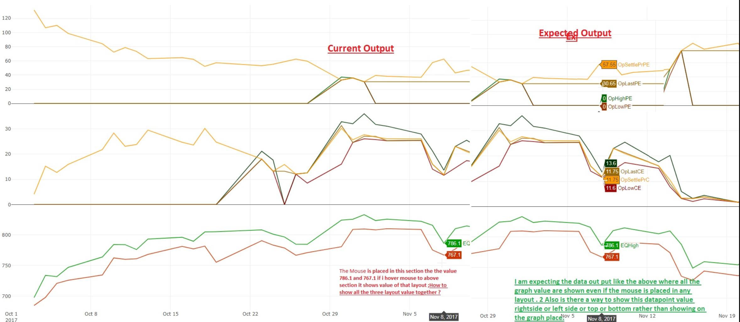
Only active area data on current layout's graph shown for the particular subplot layout, I want all the three layout data display when hovering the mouse in any layout.How to achieve this ?

eq_high = go.Scatter(
                    x=df.index,
                    y=df['High'],
                    name = "EQHigh",
                    line = dict(color = '#3EBF06'),
                    opacity = 0.8)

    eq_low = go.Scatter(
                    x=df.index,
                    y=df['Low'],
                    name = "EQLow",
                    line = dict(color = '#FD2D00'),
                    opacity = 0.8)

    ##
    op_high_ce = go.Scatter(
                    x=stock_opt_ce.index,
                    y=stock_opt_ce['High'],
                    name = "OpHighCE",
                    line = dict(color = '#15655F'),
                    opacity = 0.8)

    op_low_ce = go.Scatter(
                    x=stock_opt_ce.index,
                    y=stock_opt_ce['Low'],
                    name = "OpLowCE",
                    line = dict(color = '#0D7B7F'),
                    opacity = 0.8)

    op_last_ce = go.Scatter(
                    x=stock_opt_ce.index,
                    y=stock_opt_ce['Last'],
                    name = "OpLastCE",
                    line = dict(color = '#6AA6A2'),
                    opacity = 0.8)


    op_settlePr_ce = go.Scatter(
                    x=stock_opt_ce.index,
                    y=stock_opt_ce['Settle Price'],
                    name = "OpSettlePrCE",
                    line = dict(color = '#2AADD1'),
                    opacity = 0.8)

    ##
    op_high_pe = go.Scatter(
                    x=stock_opt_pe.index,
                    y=stock_opt_pe['High'],
                    name = "OpHighPE",
                    line = dict(color = '#FA6300'),
                    opacity = 0.8)

    op_low_pe = go.Scatter(
                    x=stock_opt_pe.index,
                    y=stock_opt_pe['Low'],
                    name = "OpLowPE",
                    line = dict(color = '#AC4C0D'),
                    opacity = 0.8)

    op_last_pe = go.Scatter(
                    x=stock_opt_pe.index,
                    y=stock_opt_pe['Last'],
                    name = "OpLastPE",
                    line = dict(color = '#E19B6D'),
                    opacity = 0.8)

    op_settlepr_pe = go.Scatter(
                    x=stock_opt_pe.index,
                    y=stock_opt_pe['Low'],
                    name = "OpSettlePrPE",
                    line = dict(color = '#A54E1F'),
                    opacity = 0.8)

     data = [eq_high,eq_low,op_high_ce,op_low_ce,op_settlePr_ce,op_high_pe,op_low_pe,op_settlepr_pe]

    #custome Date Range plotting
    layout = dict(
        title = "Graph",
        xaxis = dict(
            range = ['2017-10-1','2017-11-27'])
    )

    fig = dict(data=data, layout=layout)
    iplot(fig, filename = "CorrelationOfEquityAndOptionData")
    plot(fig,show_link = False)

1.what changes to be made in the above code to show all three layout data values while mouse hovering.currently it shows only one layout graph values.

2.How to show the graph data points on right side or top side or bottom side or left side ,rather than showing the graph data onto the graph.

3.Any better optimized way of doing this.

Expected result:

enter image description here

Divot answered 27/11, 2017 at 14:13 Comment(4)
Is there a solution for this please feedback.Divot
If you are still interested in an answer, can you add some sample data from your dataframe?Gamine
@MaximilianPeters what is the expected output captured in the graph(Click Link to See...) above. It is simple hover the mouse and show all the value wherever the line intersects.Divot
I have made it work for plotly Dash with custom javascript at plotly.js#2114(comment). It's maybe possible to inject javascript into the notebook with the HTML function, but very hacky.Galatea
S
2

This answer has been heavily edited after a brief discussion in the comments


Question 1:

After various attempts it seems that this is not possible at the moment. There is however an issue on github:

They would like hover labels to appear on all traces across all y-axes with shared x-axes. Right now, they only appear in the subplot that you are hovering in.

Question 2:

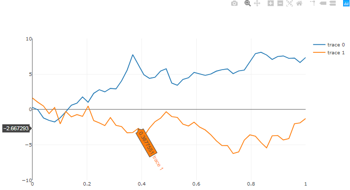
To alter the way the hoverinfo is displayed, use fig['layout']['hovermode']. The problem here is that your options are limited to one of the following: 'x', 'y', or 'closest'. And if you click the Compare data on hover option, there's no way to set it back to fig['layout']['hovermode'] = 'y' without running your code again. You can also change the way information is displayed for each series using fig['data'][ser]['hoverinfo']= 'all'. Here, you can insert multiple options like x or x+y in a list.

enter image description here

Heres an example with some random data:

# imports
from plotly.offline import download_plotlyjs, init_notebook_mode, plot, iplot
import pandas as pd
import plotly.graph_objs as go
import numpy as np

# setup
init_notebook_mode(connected=True)

# data
np.random.seed(1)
x = np.linspace(0, 1, 50)
y1 = np.cumsum(np.random.randn(50))
y0 = np.cumsum(np.random.randn(50))

# Data
trace0 = go.Scatter(
    x=x,
    y=y0,
)

trace1 = go.Scatter(
    x=x,
    y=y1,
)

# layout
layout = go.Layout(yaxis=dict(range=[-10,10])
)

# Plot
fig = go.Figure(data=[trace0, trace1], layout=layout)

# Edit hoveroptions
fig['layout']['hovermode'] = 'y'

for ser in range(0,len(fig['data'])):
    fig['data'][ser]['hoverinfo']= 'all'  


iplot(fig)

Question 3:

Im sorry to say that I don't know any other optimized way to do this.

Stralsund answered 29/4, 2019 at 13:8 Comment(4)
thanks for the detailed answers and it helps,It does not address the real issue ,Refer "CLICK Link to See :Current and Expected output in imageFormat" this in my post to get actual and expected output .When the plots are stacked means in single layout have multiple layer section charts and when you place mouse in part of chart wherver the x,y intersects it has to show the data points ,presently it shows only current active area data points. request me for chat to discuss this in detail.Divot
Ah, I see. My answer is a bit off then. I incorporated the screenshot in the question. I'll have another look at it in a bit. If my initial suggestion actually did help you somehow, I'll let it stand for now. Would you consider sharing a data sample?Stralsund
This will be really useful so let the answer be there though it is not solving the issue. Plotly is not very userfriendly still people find your answers very much helpful.Invite me to chat to discuss this topic more.Divot
Ok. I made a few changes though so that I'm answering, albeit not solving, your actual challenge.Stralsund
D
2

Question 1:

The easiest way is to plot all 3 charts on a single chart by using subplots. Below is basic code to make subplots and obtain all hover information.

from plotly.subplots import make_subplots

fig=make_subplots(rows=3, cols=1, shared_xaxes=True)

fig.update_layout(hovermode='x unified')

Use the above mentioned parameters along with the others that you might need.

Question 2:

I have been searching a way to reach same outcome but haven't been successful yet.

If you find the answer please let me know.

Drake answered 3/1, 2021 at 6:21 Comment(1)
Unified hovermode doesn’t appear to work on shared axes sublots.Skelp

© 2022 - 2024 — McMap. All rights reserved.