Responsive image not loading correctly in mobile browsers
Asked Answered
O

3

11

I have a website that includes header images.

However these header images do not seem to load at first when I load the website in Firefox or Safari on iOS. Here’s a screenshot:

Screenshot of website where header image does not load

This is the code for the header in question.

When I click on a different page in the menu, header images do load. Why do they not load at first?

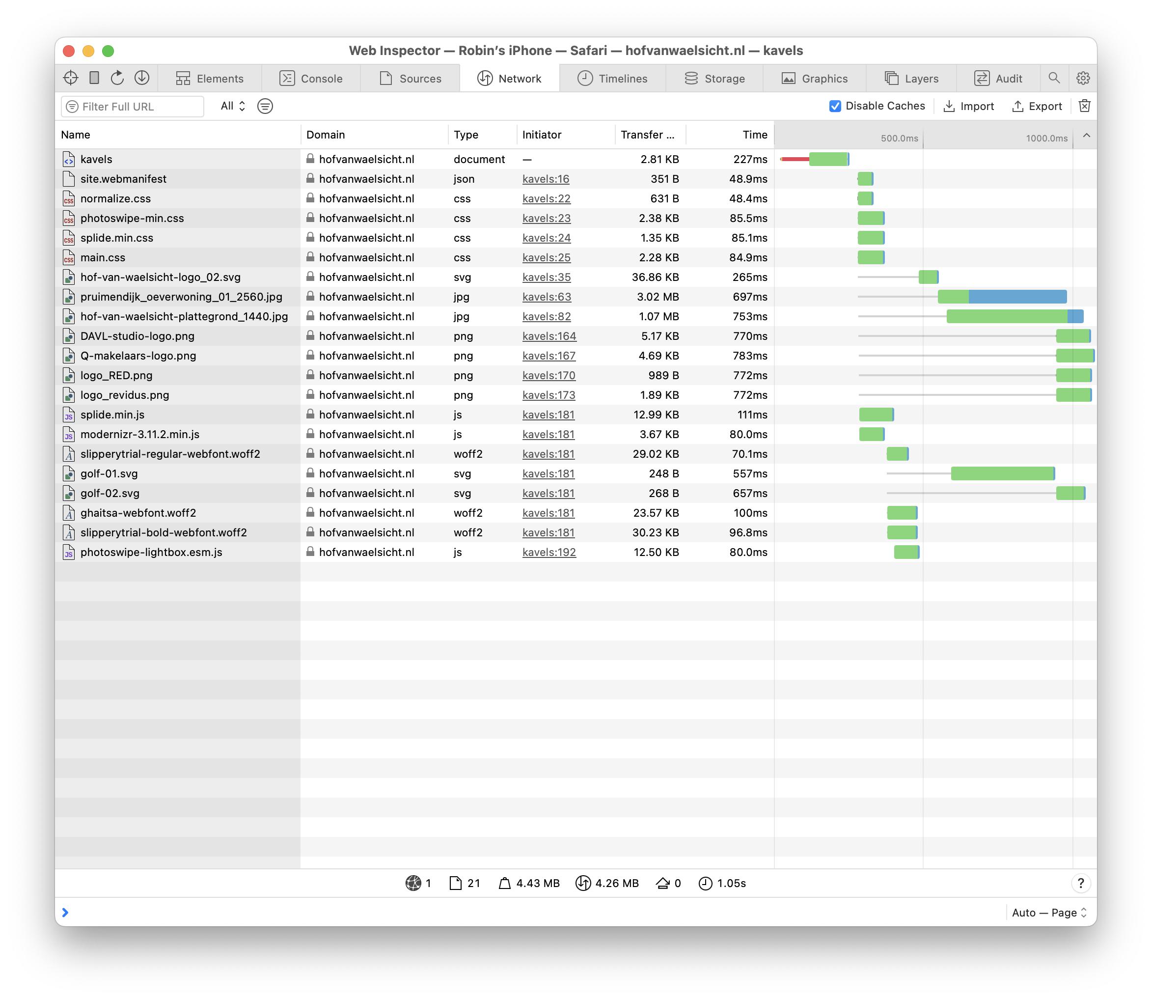
Debugging from my iPhone in Safari shows the following:

network tab in Safari developer tools

I think that maybe this has something to do with the fact that the image being loaded is the pruimendijk_oeverwoning_2560.jpg file, which is not the one I am trying to load on mobile.

This is the relevant html:

<figure class="cover">
  <img src="/img/pruimendijk_oeverwoning_01_2560.jpg"
       srcset="/img/pruimendijk_oeverwoning_01_768.jpg 768w,
               /img/pruimendijk_oeverwoning_01_1024.jpg 1024w,
               /img/pruimendijk_oeverwoning_01_1440.jpg 1440w,
               /img/pruimendijk_oeverwoning_01_1920.jpg 1920w,
               /img/pruimendijk_oeverwoning_01_2560.jpg 2560w"
       sizes="(max-width: 768px)   768px,
              (max-width: 1024px) 1024px,
              (max-width: 1440px) 1440px,
              (max-width: 1920px) 1920px,
              2560px"
       alt="Een woning in Hof van Waelsicht"
       class="cover-img">
</figure>

And this is the relevant scss:

.cover {
  padding: 0;
  margin: 9rem 0 0 0;
  @include at-least ($S) {
    margin-top: 6rem;
  }
  @include at-least ($M) {
    margin-top: 2.5rem;
  }
  @include at-least ($M) {
    margin-top: 0;
  }
}

.cover-img {
  display: block;
  width: 100vw;
  height: 100%;
  max-height: 87vh;
  object-fit: cover;
}
.cover-empty {
  height: 20rem;
  &+.page-title {
    background: none;
    .page-title-text {
      color: $text-color;
    }
  }
}

Is the srcset the way that I’ve formatted it wrong?

Oryx answered 9/12, 2023 at 13:46 Comment(2)
Hi, I also had the same problem with responsive images, I followed this kind of implementation developer.mozilla.org/en-US/docs/Learn/HTML/… via <picture> tag and <source> tag, and it worked for me.Gook
Something funky definitely seems to be going on with the srcset and/or sizes. Maybe you have invalid syntax or something. When I view the page in Chrome's Dev Tools while emulating mobile(in Windows), it's sending me the 1440px image, even though my screen is smaller than 768px. (Heck, even changing my monitor resolution to 800px by 600px won't prevent it from sending me the 1440px image.)Woodworth
G
3

Using a slightly different approach but still aimed at the same result could be as described here:

https://developer.mozilla.org/en-US/docs/Learn/HTML/Multimedia_and_embedding/Responsive_images?retiredLocale=it#art_direction

(This was the suggestion made by Michele De Falco in comments)

I crafted a demo using your same assets with the same checkpoints and you can see that this way it correctly matches the media conditions opposed to how the srcset and sizes attributes do on an <img> element instead of using <source> children nested in a parent <picture>.

You can run the demo expanded and change the horizontal resolution in the device simulation and see how it renders a different asset in real time according to the resolution:

<head>
  <base href="https://hofvanwaelsicht.nl/">
</head>

<body>  
  <picture>
    <source media="(max-width: 768px)" srcset="/img/pruimendijk_oeverwoning_01_768.jpg" />
    <source media="(max-width: 1024px)" srcset="/img/pruimendijk_oeverwoning_01_1024.jpg" />
    <source media="(max-width: 1440px)" srcset="/img/pruimendijk_oeverwoning_01_1440.jpg" />
    <source media="(max-width: 1920px)" srcset="/img/pruimendijk_oeverwoning_01_1920.jpg" />
    <!-- default behaviour (when the media conditions are not met, this will be the asset loaded) -->
    <img src="/img/pruimendijk_oeverwoning_01_2560.jpg" />
  </picture>
</body>
Grekin answered 12/12, 2023 at 10:49 Comment(0)
C
3

Your HTML markup is correct, and the result — different from your expectations — is in accordance with the specifications. The browser chose to display a 2560px wide image inside a 768px wide <img> element on the iPhone because it can. An excerpt from the specs:

The user agent will calculate the effective pixel density of each image from the specified w descriptors and the specified rendered size in the sizes attribute. It can then choose any of the given resources depending on the user's screen's pixel density, zoom level, and possibly other factors such as the user's network conditions.

If you view the page on iPhone 14 (390x844 logical pixels) the size of the <img> element would be (max-width: 768px) 768px. However the device has 3 device pixels per logical pixel so it can pack 768 x 3 = 2304 pixels horizontally, so the best matching image is 2560px. The other images would need to be up-scaled to match the device pixels.

As a workaround, you can add media queries for mobile screens without creating the corresponding image e.g. (max-width: 480px) 480px, ....

However, for the scenario in the OP, I would suggest using sizes="100vw" and let the browser handle the rest.

setInterval(function() {
  let str = "";
  str += "logical width: " + window.innerWidth + "<br>";
  str += "physical width: " + (window.devicePixelRatio * window.innerWidth) + "<br>";
  str += "current source: " + document.querySelector("#demo img").currentSrc.split("/").pop();
  document.querySelector("#demo figcaption").innerHTML = str;
}, 1000);
body { margin: 0; }
figure { margin: 0; position: relative; }
figure img { width: 100vw; }
figcaption { position: absolute; left: 0; top: 0; background-color: #FC0; }
<figure id="demo">
  <img src="https://hofvanwaelsicht.nl/img/pruimendijk_oeverwoning_01_2560.jpg"
    srcset="https://hofvanwaelsicht.nl/img/pruimendijk_oeverwoning_01_768.jpg 768w,
            https://hofvanwaelsicht.nl/img/pruimendijk_oeverwoning_01_1024.jpg 1024w,
            https://hofvanwaelsicht.nl/img/pruimendijk_oeverwoning_01_1440.jpg 1440w,
            https://hofvanwaelsicht.nl/img/pruimendijk_oeverwoning_01_1920.jpg 1920w,
            https://hofvanwaelsicht.nl/img/pruimendijk_oeverwoning_01_2560.jpg 2560w"
    sizes="100vw"
  >
  <figcaption>Loading...</figcaption>
</figure>
Caliber answered 18/12, 2023 at 12:6 Comment(2)
Thank you for your response. Do you have any idea what would cause the image not to appear in the example that I had?Oryx
OK, I just noticed that this image for example hofvanwaelsicht.nl/img/pruimendijk_oeverwoning_01_2560.jpg is totally different for Chrome and FireFox . On FireFox I get a 5120x3413px image whereas on Chrome I get a 2560x1707px image. Their filesizes are vastly different. I don't know if that caused the issue but according to specs, authors are supposed to match the 2560w part with actual width of the image.Caliber
A
0

Here's how to use HTML picture tag, I hope this logic is useful:

<picture>
        <source media="(min-width:768px)" srcset="/img/pruimendijk_oeverwoning_01_768.jpg">
        <source media="(min-width:1024px)" srcset="/img/pruimendijk_oeverwoning_01_1024.jpg">
        <source media="(min-width:1440px)" srcset="/img/pruimendijk_oeverwoning_01_1440.jpg">
        <img src="/img/pruimendijk_oeverwoning_01_2560.jpg" style="width:auto;">
      </picture>
Allele answered 13/12, 2023 at 5:53 Comment(0)

© 2022 - 2025 — McMap. All rights reserved.