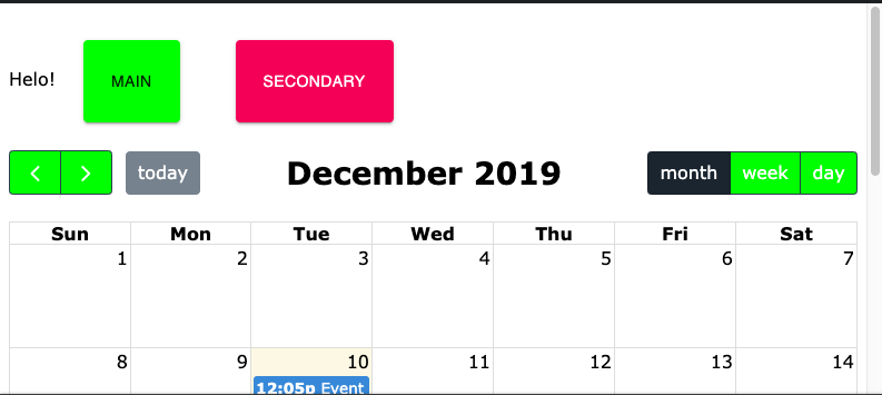
I have an application where I'm using Material UI and its theme provider (using JSS).
I'm now incorporating fullcalendar-react, which isn't really a fully fledged React library - it's just a thin React component wrapper around the original fullcalendar code.
That is to say, that I don't have access to things like render props to control how it styles its elements.
It does however, give you access to the DOM elements directly, via a callback that is called when it renders them (eg. the eventRender method).
Now what I'm wanting to do is make Full Calendar components (eg, the buttons) share the same look and feel as the rest of my application.
One way to do this, is that I could manually override all of the styles by looking at the class names it's using and implementing the style accordingly.
Or - I could implement a Bootstrap theme - as suggested in their documentation.
But the problem with either of these solutions, is that that:
- It would be a lot of work
- I would have synchronisation problems, if I made changes to my MUI theme and forgot to update the calendar theme they would look different.
What I would like to do is either:
- Magically convert the MUI theme to a Bootstrap theme.
- Or create a mapping between MUI class names and the calendar class names, something like:
.fc-button = .MuiButtonBase-root.MuiButton-root.MuiButton-contained
.fc-button-primary= .MuiButton-containedPrimary
I wouldn't mind having to massage the selectors etc to make it work (ie. For example - MUI Buttons have two internal spans, whereas Full Calendar have just one). It's mostly about when I change the theme - don't want to have to change it in two places.
Using something like Sass with its @extend syntax would is what I have in mind. I could create the full-calendar CSS with Sass easily enough - but how would Sass get access to the MuiTheme?
Perhaps I could take the opposite approach - tell MUI 'Hey these class names here should be styled like these MUI classes'.
Any concrete suggestions on how I would solve this?


