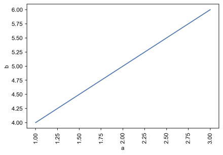
By chance, is there a way to rotate the xticks in the graphic below (just to make it a bit more readable)? The usual
sns.xticks() doesn't work in the new seaborn.objects development (which is amazing!)
tcap.\
    assign(date_time2 = tcap['date_time'].dt.date).\
    groupby(['date_time2', 'person']).\
    agg(counts = ('person', 'count')).\
    reset_index().\
    pipe(so.Plot, x = "date_time2", y = "counts", color = "person").\
            add(so.Line(marker="o", edgecolor="w")).\
            label(x = "Date", y = "# of messages",
                  color = str.capitalize,
                  title = "Plot 2: Volume of messages by person, by day").\
            scale(color=so.Nominal(order=["lorne_a_20014", "kayla_princess94"])).\
            show()
In addition, my x-axis is categorical and this warning: Using categorical units to plot a list of strings that are all parsable as floats or dates. If these strings should be plotted as numbers, cast to the appropriate data type before plotting. appears. I tried using:
import warnings
warnings.filterwarnings("ignore",category=UserWarning)


seaborn.objects, see Rotate label text in seaborn – Laritalariviere