CSS scroll-snaps overflows body when reaching top
Asked Answered
T

4

5

I'm having a pretty weird issue. Perhaps a bug in the scroll-snaps behaviour?

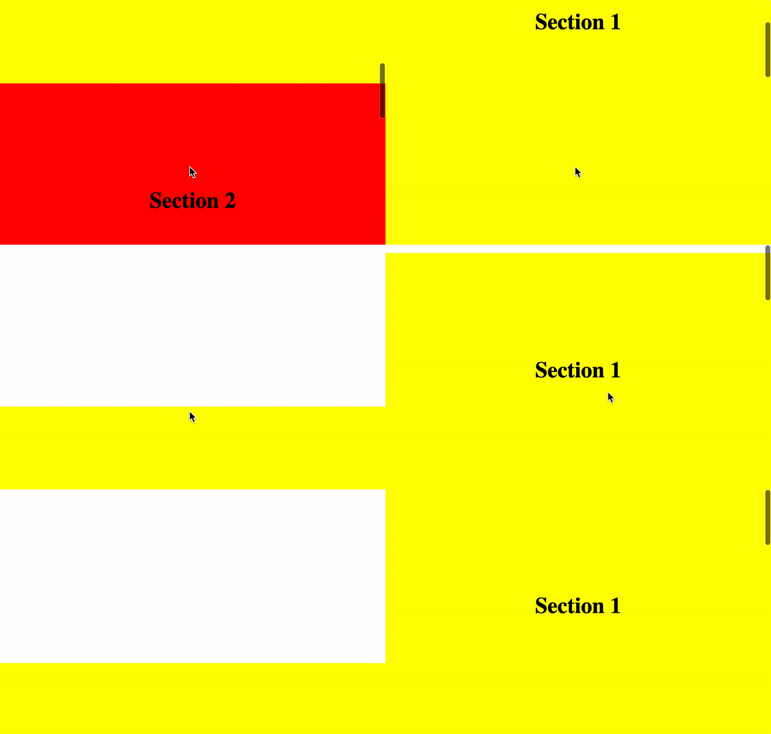
When I reach the top of the page and I keep scrolling up, then the body overflows and stays there if I do not scroll down again. Even when I reload the page.

Taking place only in Chrome for Mac (Version 75.0.3770.100 (Official Build) (64-bit)) I've tested it in Safari and Firefox and both seems to behave normally.

Reproduction online

Jsfiddle here but you can't reproduce it there. Probably because its inside an iframe?

Video of the issue:

enter image description here

Tetrapody answered 28/6, 2019 at 11:0 Comment(7)
I made a pen with an <iframe> referencing your website, still can't reproduce the problem. But you should be able to do the Iframe thing in a fiddle too, I think.Jig
Also, I noticed your fiddle doesn't have the same code as the website. The 'scroll-snap-type: mandatory;' part needs to be in the container, so here in '.snaps' and the 'scroll-snap-align: start;' part n the child of that container, so here, in '.sections'. Don't know it that's would fix t tho, because I wasn't able to reproduce the bug to test. When referencing your website in an <iframe> it doesn't do what you're showin.Jig
@Salix, as I said, I do not think we can reproduce the issue within an iframe. But can you reproduce it on my site's link? And yeah, they do not have exactly the same code because in jsfiddle I couldn't add a class to the <body> element without using JS. So I adapted it.Tetrapody
And no, it's not bugging on the website. Maybe I have a different chrome tho. But thechnically, it's supposed to be supported starting at chrome 69 so, idk.Jig
@Salix, let's forget the jsfiddle and the iframe :) Don't think about them. I'm not bothered about it. I just want my link's site to work properly, without iframe.Tetrapody
Nvm, missread stuff. But yeah, it's not reproduced on your website link is the thing. Tested on Mac 10.14; chrome 75 (64-bit); it doesn't keep scrolling up.Jig
"scroll-snap-align: start;" shouldn't in both .snap and .section, just in section. Doesn't seem to cause a problem on my end tho, I think it just ignores it, but it's really the only thing wrong I see, so you should fix that and check imo. Should be fixed either way.Jig
J
7

Well I looked for similar problems and solutions, after fixing your use of snap-scrolling, could be adding this:

html{
    height: 100%;
    overflow: hidden;
}
body{
    height: 100%;
    overflow: auto;
}

In some case, it apperently isn't enough, so you can also add :

body{
    overscroll-behavior: none;
}
Jig answered 1/7, 2019 at 20:39 Comment(11)
Just adding html{ overflow:hidden} seems to do the trick! Thanks for that!Tetrapody
I've reported it to Chrome anyways, so I hope they will deal with it in the future :)Tetrapody
Seem to be a iOS thing, sometimes it happens on safari apperently, but still, maybe they could do a work around or something.Jig
My issue was taking place in Chrome for desktop :)Tetrapody
*MacOS and iOS, I meant it's a Apple problem :PJig
You mean, a Webkit / Chrome one? :)Tetrapody
That only happens with Apple products :PJig
Yeah but Apple is not the one building Chrome. The issue is in Chrome's side.Tetrapody
@Tetrapody do you have a link to your report? I am dealing with the same issue.Airfield
@DrewBaker sure! Here it is: bugs.chromium.org/p/chromium/issues/…Tetrapody
adding overflow:hidden to html makes window.scrollY and document.documentElement.scrollTop always be 0Wooded
F
5

You need to add overscroll behavior. This controls if you can scroll below or above content of a site. Often used for sites with 'pull to refresh'. Read more here: https://developers.google.com/web/updates/2017/11/overscroll-behavior.

scroll-snap-type: y mandatory;    
overscroll-behavior-y: none;
Fetial answered 9/9, 2019 at 16:3 Comment(0)
Z
0

Maybe, you should try replacing:

body{
  -ms-scroll-snap-type: y mandatory;
  scroll-snap-type: y mandatory;
}

By this one:

#container {
  -ms-scroll-snap-type: y mandatory;
  scroll-snap-type: y mandatory;
  overflow-y: scroll;
}

I left you another example down here:

body {
  height: 100vh;
  margin: 0;  
}

.container {
  -ms-scroll-snap-type: y mandatory;
  scroll-snap-type: y mandatory;
  overflow-y: scroll;
  height: 100%;
}

.container div {
  scroll-snap-align: start;

  height: 100%;
  display: flex;
  justify-content: center;
  align-items: center;
  font-size: 4rem;
}

.container div:nth-child(1) {
  background: yellow;
  color: black;
}

.container div:nth-child(2) {
  background: red;
  color: white;
}

.container div:nth-child(3) {
  background: blue;
  color: white;
}

.container div:nth-child(4) {
  background: green;
  color: white;
}
<div class="container">
  <div>Section 1</div>
  <div>Section 2</div>
  <div>Section 3</div>
  <div>Section 4</div>
</div>
Zipper answered 1/7, 2019 at 22:27 Comment(1)
Not solving the issue.Tetrapody
P
0

Just two more line css you have to add to fix your problem. Make height to 100% to 100vh and give box-sizing:border-box; this will fix your padding property 100%width and height; box-sizing:border-box;. Why I use vh A percentage of the full viewport height. 10vh will resolve to 10% of the current viewport height and this will give you more responsive things. But if you want use 100% this will also work fine with box-sizing:border-box;

 html,body,#container, .section, .slide{
        height: 100vh;
        box-sizing:border-box;
 }

Here is your solution code

html,body,#container, .section, .slide{
            height: 100%;
            box-sizing:border-box;
     }
Postorbital answered 2/7, 2019 at 6:2 Comment(1)
Unforunately that doesn't solve the issue. I still can reproduce my issue with those changes on this page.Tetrapody

© 2022 - 2024 — McMap. All rights reserved.