HorizontalLayout with CSS3 Flexbox
The trusty HorizontalLayout and VerticalLayout classes from olden days are still in Vaadin 14. This pair of classes have been retrofitted to use modern Flexbox technology found in CSS3. See excellent tutorials on Flexbox at CSS-Tricks.com and at Mozilla. CSS3 Flexbox is very close conceptually to the behavior of classic Vaadin HorizontalLayout and VerticalLayout.
In this example below we start with a Vaadin HorizontalLayout.
final public class AuthenticateView extends HorizontalLayout
In the constructor, add your widget to the layout, a LoginForm being the widget in this example.
this.add ( new LoginForm() );
Make the HorizontalLayout to use all the available room with regards to both the width and the height.
this.setSizeFull ();
Set our content in the layout (our LoginForm) to move to the middle horizontally across. The verb “justify” here refers to typographer/designer lingo where justification means alignment to the margin of the page.
this.setJustifyContentMode ( FlexComponent.JustifyContentMode.CENTER );
Lastly, we can specify where our content should appear vertically within our now-very-tall layout. Do we want content at the top, at the bottom, or in the middle?
Notice the difference in syntax here from the Vaadin 8 generation: The term FlexComponent reflects the use of CSS Flexbox.
this.setDefaultVerticalComponentAlignment ( FlexComponent.Alignment.CENTER );
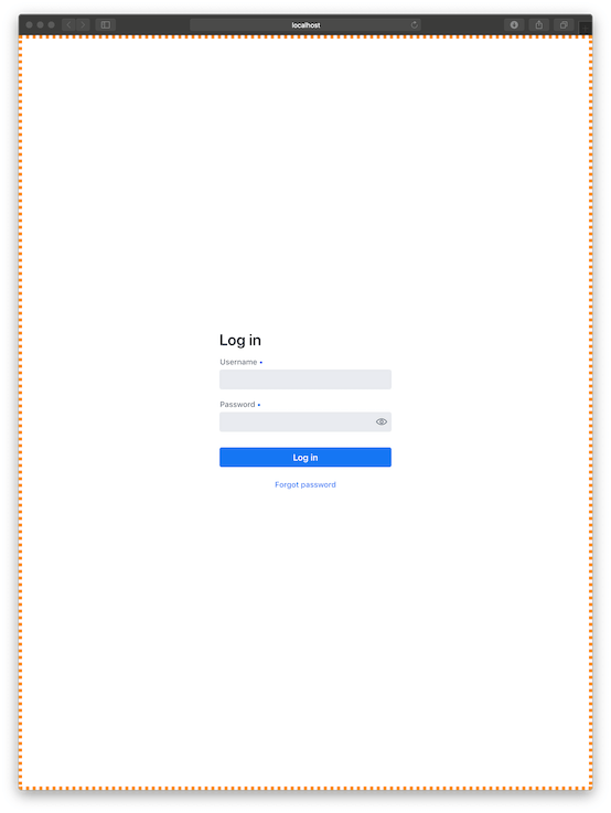
Bonus feature: Let's verify visually the behavior of our HorizontalLayout by coloring its otherwise invisible edges.
this.getStyle ().set ( "border" , "6px dotted DarkOrange" ); // DEBUG - Visually display the bounds of this layout.
Set this view to be default via the @Route annotation.
@Route ( "" )
final public class AuthenticateView extends HorizontalLayout
When run we find our login form appearing centered within our much bigger web browser window. Notice the orange border showing how our HorizontalLayout has grown to take the entire window.
![screenshot of Vaadin LoginForm widget appearing centered within a much bigger web browser window.]()
For fun, try disabling the various lines of code shown here. Run the app to see the impact the code has on behavior by noticing the placement of the LoginForm and the orange border.
Here is complete class code.
package work.basil.example.ui;

import com.vaadin.flow.component.login.LoginForm;
import com.vaadin.flow.component.login.LoginI18n;
import com.vaadin.flow.component.orderedlayout.FlexComponent;
import com.vaadin.flow.component.orderedlayout.HorizontalLayout;
import com.vaadin.flow.router.Route;

@Route ( "" )
final public class AuthenticateView extends HorizontalLayout
{
    // Constructor
    public AuthenticateView ( )
    {
        super ();

        // Widgets
        this.add ( new LoginForm () );

        // Arrange
        this.getStyle ().set ( "border" , "6px dotted DarkOrange" );  // DEBUG - Visually display the  bounds of this layout.
        this.setSizeFull ();
        this.setJustifyContentMode ( FlexComponent.JustifyContentMode.CENTER ); // Put content in the middle horizontally.
        this.setDefaultVerticalComponentAlignment ( FlexComponent.Alignment.CENTER ); // Put content in the middle vertically.

    }
}
Caveat: This code shown above is nowhere near sufficient for real-world login work. The focus here was on widget layout, not user authentication.

