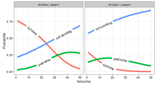
directlabels: avoid clipping (like xpd=TRUE)
Asked Answered
H

2

13

In the plot below, direct label positions were tweaked a bit vertically, but they get clipped at the left/right edges. Is there any way to avoid clipping (similar to xpd=TRUE) or adjust the clipped labels inwards in the plot frames?

nested1

Here's the code for this example:

library(car)
library(reshape2)
library(ggplot2)
library(directlabels)
library(nnet)

## Sec. 8.2 (Nested Dichotomies)

# transform data

Womenlf <- within(Womenlf,{
  working <-  recode(partic, " 'not.work' = 'no'; else = 'yes' ")
  fulltime <- recode(partic,
    " 'fulltime' = 'yes'; 'parttime' = 'no'; 'not.work' = NA")})

mod.working <- glm(working ~ hincome + children, family = binomial,
                   data = Womenlf)
mod.fulltime <- glm(fulltime ~ hincome + children, family = binomial,
                    data = Womenlf)

predictors <- expand.grid(hincome = 1:50,
                          children = c("absent", "present"))
fit <- data.frame(predictors,
    p.working = predict(mod.working, predictors, type = "response"),
    p.fulltime = predict(mod.fulltime, predictors, type = "response"),
    l.working = predict(mod.working, predictors, type = "link"),
    l.fulltime = predict(mod.fulltime, predictors, type = "link")
)

fit <- within(fit, {
  `full-time` <- p.working * p.fulltime
  `part-time` <- p.working * (1 - p.fulltime)
  `not working` <- 1 - p.working
  })

# Figure 8.10
fit2 = melt(fit,
            measure.vars = c("full-time","part-time","not working"),
            variable.name = "Participation",
            value.name = "Probability")

gg <- ggplot(fit2,
             aes(x = hincome, y = Probability, colour = Participation)) + 
        facet_grid(~ children, labeller = function(x, y) sprintf("%s = %s", x, y)) + 
        geom_line(size = 2) + theme_bw()

direct.label(gg, list("top.bumptwice", dl.trans(y = y + 0.2)))
Hidrosis answered 5/5, 2015 at 19:25 Comment(1)
possible duplicate of ggplot2 - annotate outside of plotWendelina
R
8

As @rawr pointed out in the comment, you can use the code in the linked question to turn off clipping, but the plot will look nicer if you expand the scale of the plot so that the labels fit. I haven't used directlabels and am not sure if there's a way to tweak the positions of individual labels, but here are three other options: (1) turn off clipping, (2) expand the plot area so the labels fit, and (3) use geom_text instead of directlabels to place the labels.

# 1. Turn off clipping so that the labels can be seen even if they are 
# outside the plot area.
gg = direct.label(gg, list("top.bumptwice", dl.trans(y = y + 0.2)))

gg2 <- ggplot_gtable(ggplot_build(gg))
gg2$layout$clip[gg2$layout$name == "panel"] <- "off"
grid.draw(gg2)

enter image description here

# 2. Expand the x and y limits so that the labels fit
gg <- ggplot(fit2,
             aes(x = hincome, y = Probability, colour = Participation)) + 
  facet_grid(~ children, labeller = function(x, y) sprintf("%s = %s", x, y)) + 
  geom_line(size = 2) + theme_bw() +
  scale_x_continuous(limits=c(-3,55)) +
  scale_y_continuous(limits=c(0,1))

direct.label(gg, list("top.bumptwice", dl.trans(y = y + 0.2)))

enter image description here

# 3. Create a separate data frame for label positions and use geom_text 
# (instead of directlabels) to position the labels. I've set this up so the
# labels will appear at the right end of each curve, but you can change
# this to suit your needs.
library(dplyr)
labs = fit2 %>% group_by(children, Participation) %>%
  summarise(Probability = Probability[which.max(hincome)],
            hincome = max(hincome))

  gg <- ggplot(fit2,
             aes(x = hincome, y = Probability, colour = Participation)) + 
    facet_grid(~ children, labeller = function(x, y) sprintf("%s = %s", x, y)) + 
    geom_line(size = 2) + theme_bw() +
    geom_text(data=labs, aes(label=Participation), hjust=-0.1) +
    scale_x_continuous(limits=c(0,65)) +
    scale_y_continuous(limits=c(0,1)) +
    guides(colour=FALSE)

enter image description here

Recording answered 5/5, 2015 at 20:24 Comment(0)
R
8

Updating to ggplot2 v2.0.0 and directlabels v2015.12.16

One approach is to change direct.label's method. There aren't too many other good options for labelling lines, but angled.boxes is a possibility.

gg <- ggplot(fit2,
             aes(x = hincome, y = Probability, colour = Participation)) + 
        facet_grid(. ~ children, labeller = label_both) + 
        geom_line(size = 2) + theme_bw()

direct.label(gg, method = list(box.color = NA, "angled.boxes"))

OR

ggplot(fit2, aes(x = hincome, y = Probability, colour = Participation, label = Participation)) + 
        facet_grid(. ~ children, labeller = label_both) + 
        geom_line(size = 2) + theme_bw() + scale_colour_discrete(guide = 'none') +
        geom_dl(method = list(box.color = NA, "angled.boxes")) 

enter image description here


Original answer

One approach is to change direct.label's method. There aren't too many other good options for labelling lines, but angled.boxes is a possibility. Unfortunately, angled.boxes does not work out of the box. The function far.from.others.borders() needs to be loaded, and I modified another function, draw.rects(), to change the colour of the box boundaries to NA. (Both functions are available here.)

(Or adapt answers from here)

## Modify "draw.rects"

draw.rects.modified <- function(d,...){
  if(is.null(d$box.color))d$box.color <- NA
  if(is.null(d$fill))d$fill <- "white"
  for(i in 1:nrow(d)){
    with(d[i,],{
      grid.rect(gp = gpar(col = box.color, fill = fill),
                vp = viewport(x, y, w, h, "cm", c(hjust, vjust), angle=rot))
    })
  }
  d
}


## Load "far.from.others.borders"

far.from.others.borders <- function(all.groups,...,debug=FALSE){
  group.data <- split(all.groups, all.groups$group)
  group.list <- list()
  for(groups in names(group.data)){
    ## Run linear interpolation to get a set of points on which we
    ## could place the label (this is useful for e.g. the lasso path
    ## where there are only a few points plotted).
    approx.list <- with(group.data[[groups]], approx(x, y))
    if(debug){
      with(approx.list, grid.points(x, y, default.units="cm"))
    }
    group.list[[groups]] <- data.frame(approx.list, groups)
  }
  output <- data.frame()
  for(group.i in seq_along(group.list)){
    one.group <- group.list[[group.i]]
    ## From Mark Schmidt: "For the location of the boxes, I found the
    ## data point on the line that has the maximum distance (in the
    ## image coordinates) to the nearest data point on another line or
    ## to the image boundary."
    dist.mat <- matrix(NA, length(one.group$x), 3)
    colnames(dist.mat) <- c("x","y","other")
    ## dist.mat has 3 columns: the first two are the shortest distance
    ## to the nearest x and y border, and the third is the shortest
    ## distance to another data point.
    for(xy in c("x", "y")){
      xy.vec <- one.group[,xy]
      xy.mat <- rbind(xy.vec, xy.vec)
      lim.fun <- get(sprintf("%slimits", xy))
      diff.mat <- xy.mat - lim.fun()
      dist.mat[,xy] <- apply(abs(diff.mat), 2, min)
    }
    other.groups <- group.list[-group.i]
    other.df <- do.call(rbind, other.groups)
    for(row.i in 1:nrow(dist.mat)){
      r <- one.group[row.i,]
      other.dist <- with(other.df, (x-r$x)^2 + (y-r$y)^2)
      dist.mat[row.i,"other"] <- sqrt(min(other.dist))
    }
    shortest.dist <- apply(dist.mat, 1, min)
    picked <- calc.boxes(one.group[which.max(shortest.dist),])
    ## Mark's label rotation: "For the angle, I computed the slope
    ## between neighboring data points (which isn't ideal for noisy
    ## data, it should probably be based on a smoothed estimate)."
    left <- max(picked$left, min(one.group$x))
    right <- min(picked$right, max(one.group$x))
    neighbors <- approx(one.group$x, one.group$y, c(left, right))
    slope <- with(neighbors, (y[2]-y[1])/(x[2]-x[1]))
    picked$rot <- 180*atan(slope)/pi
    output <- rbind(output, picked)
  }
  output
}


## Draw the plot

angled.boxes <-
  list("far.from.others.borders", "calc.boxes", "enlarge.box", "draw.rects.modified")

gg <- ggplot(fit2,
             aes(x = hincome, y = Probability, colour = Participation)) + 
        facet_grid(~ children, labeller = function(x, y) sprintf("%s = %s", x, y)) + 
        geom_line(size = 2) + theme_bw()

direct.label(gg, list("angled.boxes"))

enter image description here

Rhynchocephalian answered 5/5, 2015 at 23:23 Comment(0)

© 2022 - 2024 — McMap. All rights reserved.