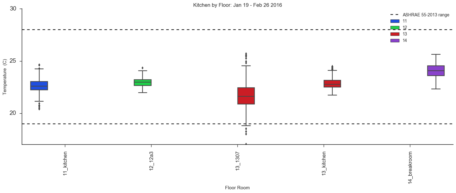
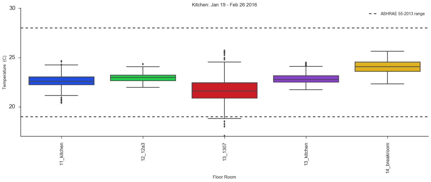
Seaborn boxplots changes (narrows) width of boxes when a hue is chosen, how might I remedy this?
Asked Answered
W

2

14

I am using seaborn to create a boxplot. When I specify a column by which to group/color the boxes, the width of the boxes becomes so narrow that they are hard to see. The only change I am making is specifying an argument for hue, which points to a column in the dataframe passed. I have tried using the 'width' parameter (as mentioned here), which does increase the width of the boxplots, but also the distance at which they are spread apart.

Help: How can I maintain the width of the boxes while specifying a hue parameter?

I will show my code and results below:

My dataframe:

Out[3]: 
                   timestamp   room_number floor       floor_room  temperature
0  2016-01-19 09:00:00-05:00         11a06    11         11_11a06          23.0
1  2016-01-19 09:00:00-05:00    east-inner    11    11_east-inner          22.8
2  2016-01-19 09:00:00-05:00   east-window    11   11_east-window          22.9

Use of seaborn with odd boxplot widths, using a grouping factor:

sns.boxplot(x=xunit, y=var, data=df, order=order, hue='floor')

enter image description here

Use of seaborn that has reasonable boxplot widths, but no grouping factor:

sns.boxplot(x=xunit, y=var, data=df)

enter image description here

Wera answered 18/3, 2016 at 19:0 Comment(3)
There is an answer given in the comments of the question you link to.Dwightdwindle
Ah, thanks for pointing me back there - I missed the most crucial comments when I did not expand the comment list!Wera
you should post an answer if you solve the problem regardless of the fact that you may have asked the question yourself.Estradiol
W
5

It turns out the the 'hue' parameter causes the issue (I am not sure why). By removing this parameter/argument from the function, the problem goes away, but you must provide extra information so that the boxplots are color coded by the condition desired. The following line of code fixed my problem:

sns.boxplot(x=xunit, y=var, data=df, order=order,palette=df[condition_column].map(palette_dir))

Where palette_dir is a dictionary of colors for each condition, mapped to a column of data.

The boxplots look normal now, but I am struggling to add a figure legend. I am hoping the person who resolved this in this post can point me to their method.

Wera answered 24/3, 2016 at 16:45 Comment(0)
O
11

In version 0.8 (July 2017), the dodge parameter was added

to boxplot, violinplot, and barplot to allow use of hue without changing the position or width of the plot elements, as when the hue varible is not nested within the main categorical variable.

(release notes v0.8.0)

Your code would look like this:

sns.boxplot(x=xunit, y=var, data=df, order=order, hue='floor', dodge=False)

Oreilly answered 12/6, 2018 at 17:19 Comment(0)
W
5

It turns out the the 'hue' parameter causes the issue (I am not sure why). By removing this parameter/argument from the function, the problem goes away, but you must provide extra information so that the boxplots are color coded by the condition desired. The following line of code fixed my problem:

sns.boxplot(x=xunit, y=var, data=df, order=order,palette=df[condition_column].map(palette_dir))

Where palette_dir is a dictionary of colors for each condition, mapped to a column of data.

The boxplots look normal now, but I am struggling to add a figure legend. I am hoping the person who resolved this in this post can point me to their method.

Wera answered 24/3, 2016 at 16:45 Comment(0)

© 2022 - 2024 — McMap. All rights reserved.