Recycler View with multiple rows and columns - AutoFit like Flow Layout [Android]
Asked Answered
A

3

15

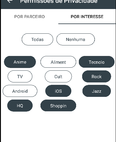
I'm in a challenge to build a layout like this:

enter image description here

My first insight was to use a RecyclerView with an adapter that can deal with each item and inflate its layout.

So far, not so good.

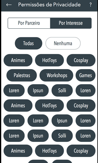
I got this layout so far:

enter image description here

I can felling that I'm almost there, but really... I spend a week think about how to make it better, or just like the UI propose.

Some of my tries were

  1. Use a grid layout and change max columns number depending on how many items there are on the list
  2. StaggeredGridLayoutManager sounded like a powerful candidate to fix it and make me happy, but unfortunately when I tried to use it I realize that we need to pass a number of spanCount (columns) on constructor and I found some ways to work around this limitation changing the number of columns of each row, but I didn't like the final result, was not like I saw in other apps like Foursquare when you setup your interests.
  3. I checked out this library Flow Layout, but I not even started to use it, because I don't want to lose the whole recycler view power and I believe that there is a way to make it works! .....Even knowing that the library do exactly what I need.

Guys, I'm not here looking for some already done peace of code or someone to do my job. Actually I am looking for the light at the end of the tunnel.

Anissaanita answered 20/8, 2015 at 4:38 Comment(14)
The staggered grid view effect... is that what you're missing here? Or is there more?Mamoun
The staggered grid view constructor needs a span count when we instantiating, I don't want to fix a number of columns, I would like to fit layout according to item width row by rowAnissaanita
Try this. public final void onBindViewHolder(RecyclerView.ViewHolder viewHolder, int position) { StaggeredGridLayoutManager.LayoutParams layoutParams = (StaggeredGridLayoutManager.LayoutParams) viewHolder.itemView.getLayoutParams(); layoutParams.setFullSpan(true); }Mamoun
I am not in my laptop right now but I've tried this approach earlier and I realized that each item fit the whole row widthAnissaanita
Did you try staggering horizontally?Mamoun
Yes I tried, but I lost the vertically scrolling and I have to set a number of spanCount. I'm thinking about to develop a custom LayoutManager of StaggedGridLayoutManagerAnissaanita
One of these might help you.Mamoun
have you got your solution ?Hurst
Not yet, right know I am using recycler view with 2 columns. I saw many libraries that make exactly what I want, but I have not had the time to working it.Anissaanita
Were you able to get a solution of this using RecyclerView.Elsi
@RenanNery Have you got solution for this with RecyclerView ? I'm too looking for a Custom LayoutManager but didn't get it right enough.Calefacient
Sorry @Gil nothing yet, still using gridAnissaanita
Did you ever solve this?Eckhart
Renan, could you post your code? I'm trying to do exactly what you are doing (a recyclerview with 3 items per line aligned on centerPersistence
H
5

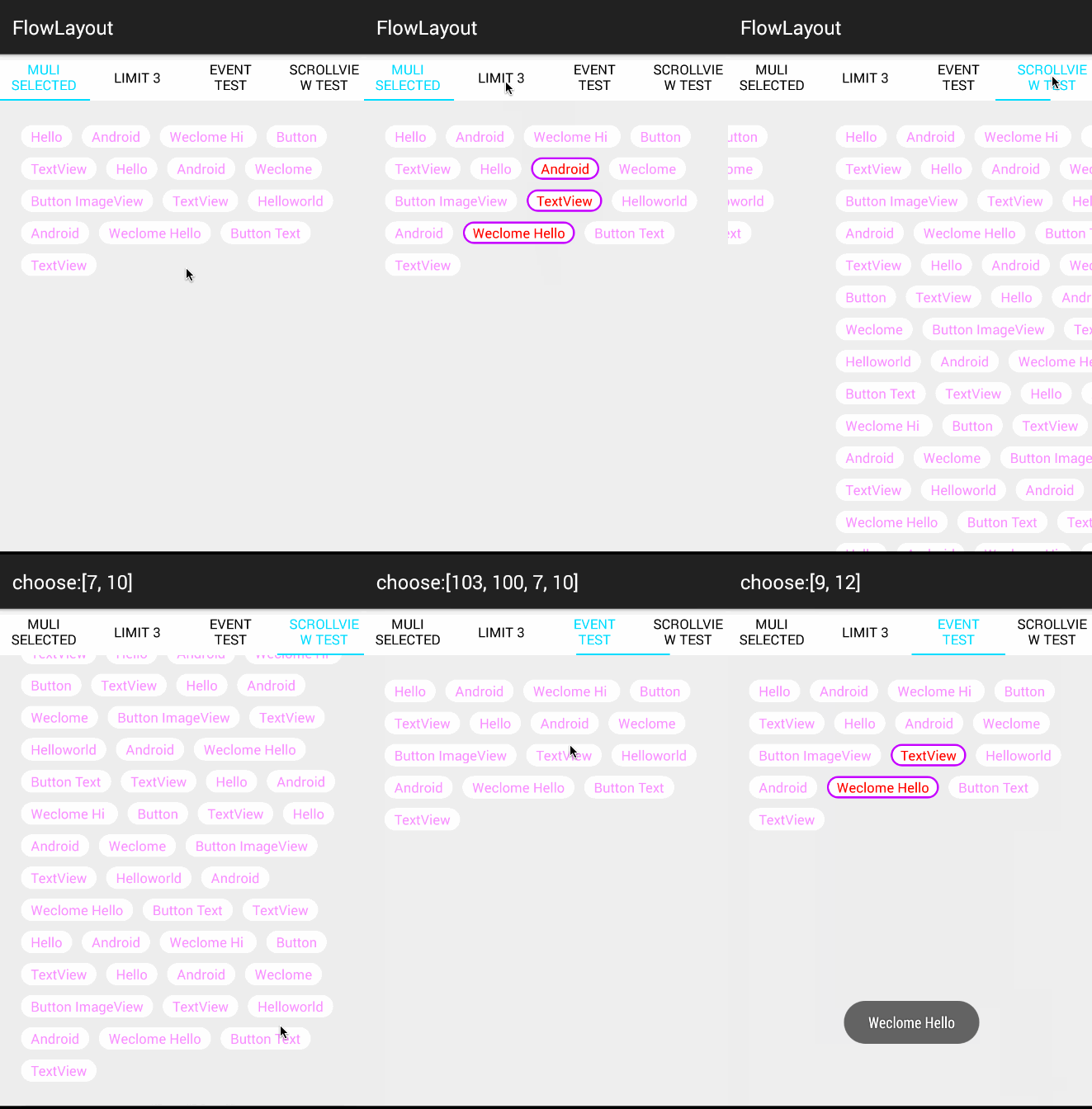
Hello if you dnt want to use recyclerview there is another example using custom Library which acts like List GitHubLibrary TagLayout

  • Sample Code:

    mFlowLayout.setAdapter(new TagAdapter<String>(mVals)
       {
           @Override
           public View getView(FlowLayout parent, int position, String s)
           {
               TextView tv = (TextView) mInflater.inflate(R.layout.tv,
                       mFlowLayout, false);
               tv.setText(s);
               return tv;
           }
       });
    

Using below code you can pre set selection you wanted:

mAdapter.setSelectedList(1,3,5,7,8,9);

Will show result like below:-

enter image description here

Hydrolyze answered 17/11, 2015 at 12:35 Comment(0)
O
4

It's easy to get this done using the new google material design library which contains a component called Chips. So you don't have to use a RecyclerView.

A Chip represents a complex entity in a small block, such as a contact. It is a rounded button that consists of a label, an optional chip icon, and an optional close icon. A chip can either be clicked or toggled if it is checkable.

HOW TO USE THE COMPONENT :

1. Import the library

implementation 'com.google.android.material:material:1.1.0'

2. Use code below

 <com.google.android.material.chip.ChipGroup
      android:layout_width="match_parent"
      android:layout_height="wrap_content">

 <!-- Your items here -->

     <com.google.android.material.chip.Chip
         android:layout_width="wrap_content"
         android:layout_height="wrap_content"
         android:text="Item 1"/>

     <com.google.android.material.chip.Chip
         android:layout_width="wrap_content"
         android:layout_height="wrap_content"
         android:text="Item 2"/>

     <com.google.android.material.chip.Chip
         android:layout_width="wrap_content"
         android:layout_height="wrap_content"
         android:text="Item 3"/>

 <!-- End -->

</com.google.android.material.chip.ChipGroup>

You can find more details here : Material components

Outlawry answered 28/3, 2019 at 19:6 Comment(0)
B
0

It may now be too late, but you can also use google's FlexBoxLayout

Demo

Boehmenist answered 25/4, 2019 at 14:18 Comment(1)
You should add an example or more details instead of just posting a link.Arsenide

© 2022 - 2024 — McMap. All rights reserved.