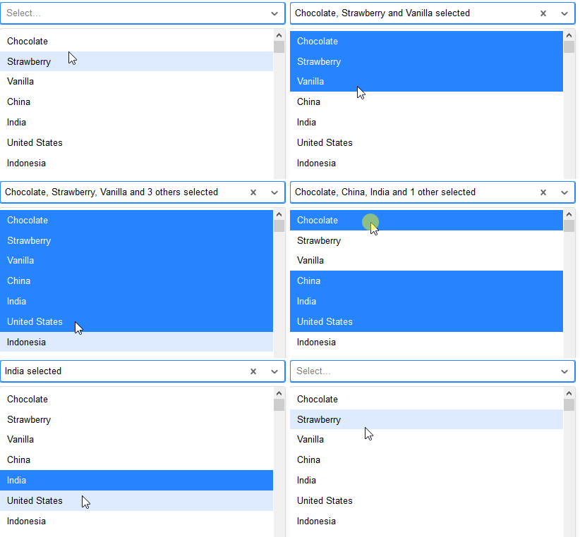
Note: this answer is for react-select v1. See the answer by NearHuscarl for a solution for v3.
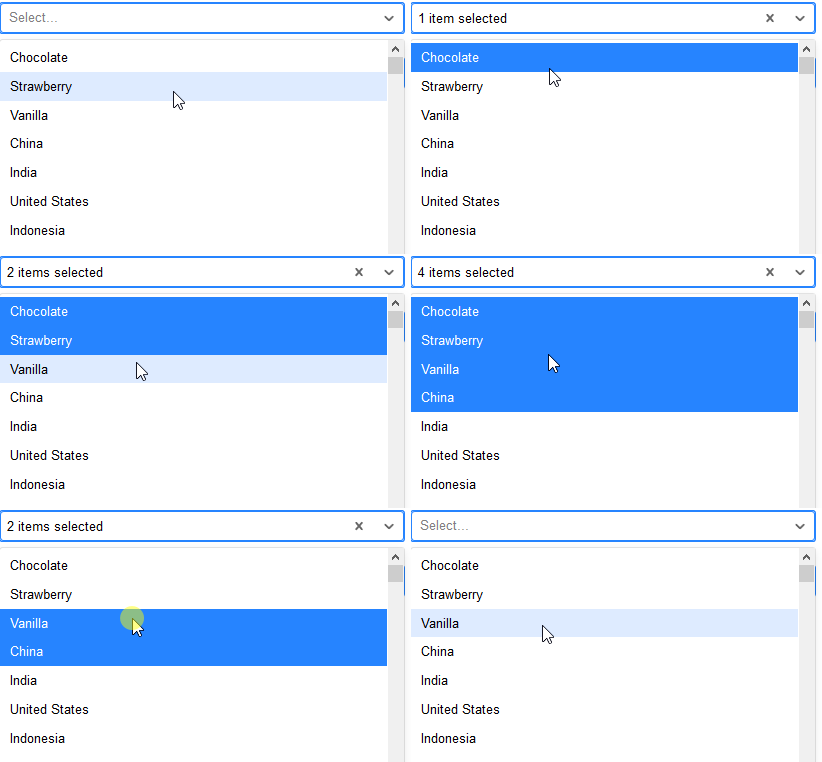
Rendering "N items selected"
This can be achieved with the valueRenderer and className props and a minimal amount of CSS.
Here I'm showing the first three selections normally, and then "N items selected" when 4+ items have been selected. It makes no sense to show the remove selection icon (×) besides "N items selected," so I also removed that (with CSS).
class App extends React.Component {
  state = {
    value: [],
  }
  className = () => {
    const baseClassName = 'my-react-select';

    if (this.state.value.length <= 3) {
      return baseClassName;
    }

    return `${baseClassName} ${baseClassName}--compact`;
  }
  handleChange = (value) => {
    this.setState({ value });
  }
  renderValue = (option) => {
    // The first three selections are rendered normally
    if (this.state.value.length <= 3) {
      return option.label;
    }

    // With more selections, render "N items selected".
    // Other than the first one are hidden in CSS.
    return <span>{this.state.value.length} items selected</span>;
  }
  render() {
    return (
      <Select
        className={this.className()}
        multi
        onChange={this.handleChange}
        options={[
          { value: 'zero',  label: 'Zero' },
          { value: 'one',   label: 'One' },
          { value: 'two',   label: 'Two' },
          { value: 'three', label: 'Three' },
          { value: 'four',  label: 'Four' },
          { value: 'five',  label: 'Five' },
          { value: 'six',   label: 'Six' },
          { value: 'seven', label: 'Seven' },
          { value: 'eight', label: 'Eight' },
          { value: 'nine',  label: 'Nine' },
        ]}
        value={this.state.value}
        valueRenderer={this.renderValue}
      />
    );
  }
}

ReactDOM.render(<App />, document.getElementById('root'));
.my-react-select {
  /* Custom styles */
}

.my-react-select--compact .Select-value:first-child {
  font-style: italic;
}
.my-react-select--compact .Select-value:first-child .Select-value-icon,
.my-react-select--compact .Select-value:nth-child(n+2) {
  display: none;
}
<script src="https://cdnjs.cloudflare.com/ajax/libs/react/15.1.0/react.min.js"></script>
<script src="https://cdnjs.cloudflare.com/ajax/libs/react/15.1.0/react-dom.min.js"></script>

<script src="https://unpkg.com/[email protected]/prop-types.js"></script>
<script src="https://unpkg.com/[email protected]/index.js"></script>
<script src="https://unpkg.com/[email protected]/dist/react-input-autosize.js"></script>
<script src="https://unpkg.com/[email protected]/dist/react-select.js"></script>

<link rel="stylesheet" href="https://unpkg.com/[email protected]/dist/react-select.css">

<div id="root"></div>
Alternative approach
Looking at your screenshots, it looks like there's space to show up to four selections without making the selector overflow. Instead of showing "N items selected" when 4+ cities have been selected, you could show the first 3 selections normally and then "+N more." Like this:
- City A
- City A, City B
- City A, City B, City C
- City A, City B, City C, + 1 more
- City A, City B, City C, + 2 more
- City A, City B, City C, + 3 more
- etc.
From UX perspective, I think it's good to show the first 3 or so selections normally. It's confusing if every selection is suddenly hidden behind the text "4 items selected" after the 4th city is selected.
This solution is very similar than the first one. The className prop is now simply a string. The renderValue method and the CSS selectors are a bit different.
class App extends React.Component {
  state = {
    value: [],
  }
  handleChange = (value) => {
    this.setState({ value });
  }
  renderValue = (option) => {
    // The first three values are rendered normally
    if (this.state.value.indexOf(option) < 3) {
      return option.label;
    }

    // Render the rest as "+ N more".
    // Other than the first one are hidden in CSS.
    return <span>+ {this.state.value.length - 3} more</span>;
  }
  render() {
    return (
      <Select
        className='my-react-select'
        multi
        onChange={this.handleChange}
        options={[
          { value: 'zero',  label: 'Zero' },
          { value: 'one',   label: 'One' },
          { value: 'two',   label: 'Two' },
          { value: 'three', label: 'Three' },
          { value: 'four',  label: 'Four' },
          { value: 'five',  label: 'Five' },
          { value: 'six',   label: 'Six' },
          { value: 'seven', label: 'Seven' },
          { value: 'eight', label: 'Eight' },
          { value: 'nine',  label: 'Nine' },
        ]}
        value={this.state.value}
        valueRenderer={this.renderValue}
      />
    );
  }
}

ReactDOM.render(<App />, document.getElementById('root'));
/* If you change the amount of how many selections are shown normally,
 * be sure to adjust these selectors accordingly. */
.my-react-select .Select-value:nth-child(4) {
  font-style: italic;
}
.my-react-select .Select-value:nth-child(4) .Select-value-icon,
.my-react-select .Select-value:nth-child(n+5) {
  display: none;
}
<script src="https://cdnjs.cloudflare.com/ajax/libs/react/15.1.0/react.min.js"></script>
<script src="https://cdnjs.cloudflare.com/ajax/libs/react/15.1.0/react-dom.min.js"></script>

<script src="https://unpkg.com/[email protected]/prop-types.js"></script>
<script src="https://unpkg.com/[email protected]/index.js"></script>
<script src="https://unpkg.com/[email protected]/dist/react-input-autosize.js"></script>
<script src="https://unpkg.com/[email protected]/dist/react-select.js"></script>

<link rel="stylesheet" href="https://unpkg.com/[email protected]/dist/react-select.css">

<div id="root"></div>
Here's another approach of showing the selections:
- City A
- City A, City B
- City A, City B, City C
- City A, City B, City C, City D
- City A, City B, City C, + 2 more
- City A, City B, City C, + 3 more
- etc.
From UX perspective, it's a bit silly to show "+ 1 more" instead of showing the value, so in my opinion this is the best option.
The renderValue method is once again a bit different. The CSS selectors are now a bit uglier and more complex, but they work.
class App extends React.Component {
  state = {
    value: [],
  }
  handleChange = (value) => {
    this.setState({ value });
  }
  renderValue = (option) => {
    // The first four values are rendered normally
    if (this.state.value.length <= 4) {
      return option.label;
    }

    // The first 3 values are rendered normally when
    // more than 4 selections have been made
    if (this.state.value.indexOf(option) < 3) {
      return option.label;
    }

    // Render the rest as "+ N more".
    // Other than the first one are hidden in CSS.
    return <span>+ {this.state.value.length - 3} more</span>;
  }
  render() {
    return (
      <Select
        className='my-react-select'
        multi
        onChange={this.handleChange}
        options={[
          { value: 'zero',  label: 'Zero' },
          { value: 'one',   label: 'One' },
          { value: 'two',   label: 'Two' },
          { value: 'three', label: 'Three' },
          { value: 'four',  label: 'Four' },
          { value: 'five',  label: 'Five' },
          { value: 'six',   label: 'Six' },
          { value: 'seven', label: 'Seven' },
          { value: 'eight', label: 'Eight' },
          { value: 'nine',  label: 'Nine' },
        ]}
        value={this.state.value}
        valueRenderer={this.renderValue}
      />
    );
  }
}

ReactDOM.render(<App />, document.getElementById('root'));
/* If you change the amount of how many selections are shown normally,
 * be sure to adjust these selectors accordingly. */
.my-react-select .Select-value:nth-child(4):not(:nth-last-child(2)) {
  font-style: italic;
}
.my-react-select .Select-value:nth-child(4):not(:nth-last-child(2)) .Select-value-icon,
.my-react-select .Select-value:nth-child(n+5) {
  display: none;
}
<script src="https://cdnjs.cloudflare.com/ajax/libs/react/15.1.0/react.min.js"></script>
<script src="https://cdnjs.cloudflare.com/ajax/libs/react/15.1.0/react-dom.min.js"></script>

<script src="https://unpkg.com/[email protected]/prop-types.js"></script>
<script src="https://unpkg.com/[email protected]/index.js"></script>
<script src="https://unpkg.com/[email protected]/dist/react-input-autosize.js"></script>
<script src="https://unpkg.com/[email protected]/dist/react-select.js"></script>

<link rel="stylesheet" href="https://unpkg.com/[email protected]/dist/react-select.css">

<div id="root"></div>


autosizeprop to false ? – Blesbok