Avoid overlapping x-axis labels in ggplot facet grid
Asked Answered
C

2

16

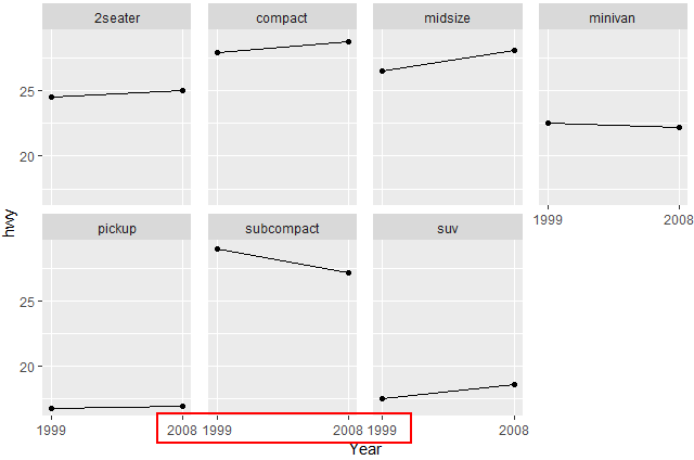
I am trying to plot a facet grid of growth plots and my labels at the ends of each plot are overlapping with the each other. Here is sample code using the mpg data:

print(ggplot(data = aggregate(hwy~class+year, data=mpg, mean), aes(x = year, y=hwy))+
    geom_line(aes(group = 1))+
    geom_point()+
    facet_wrap(~class,  nrow = 2)+
    xlab("Year")+
    scale_x_discrete(limits=unique(mpg$year)))

How do I prevent this overlapping, perhaps by moving the tick marks and labels in from the edge of the plot. I tried using the margin within theme, but I did not have success with this either. Thank you for your help.

Cosenza answered 19/12, 2016 at 14:55 Comment(1)
The easiest soln. is too increase the width of your graphics window or output device. Howvever, you could rotate the labels p + theme(axis.text.x = element_text(angle=-90, vjust=0.5)). Or you could add a little space using expand..scale_x_discrete(expand=c(0.5, 0.5), limits=unique(mpg$year))Illuminating
B
28

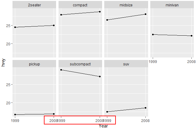
I presume what you are after is adjusting the horizontal spacing between facet panels with panel.spacing.x in theme (tested with ggplot2_3.0.0).

ggplot(data = aggregate(hwy~class+year, data=mpg, mean), aes(x = year, y=hwy))+
  geom_line(aes(group = 1))+
  geom_point()+
  facet_wrap(~class,  nrow = 2)+
  xlab("Year")+
  scale_x_discrete(limits=unique(mpg$year)) +
  theme(panel.spacing.x = unit(4, "mm"))

Before

enter image description here

After - using panel.spacing.x()

enter image description here

Brucebrucellosis answered 28/10, 2018 at 9:50 Comment(0)
G
0

The answer by @Valentin_Ștefan is fantastic is probably sufficient for most circumstances. However, when there are space limitations, it is probably best just to change the axis text alignment.

ggplot(data = aggregate(hwy~class+year, data=mpg, mean), aes(x = year, y=hwy))+
        geom_line(aes(group = 1))+
        geom_point()+
        facet_wrap(~class,  nrow = 2)+
        xlab("Year")+
        scale_x_discrete(limits=unique(mpg$year))+ 
        theme(axis.text.x=element_text(hjust=c(0,1)))

enter image description here

This solution does have an issue in that element_text() does not officially accept vectorized inputs and so creates this warning message.

2: Vectorized input to `element_text()` is not officially supported.
ℹ Results may be unexpected or may change in future versions of ggplot2. 

If anyone knows an official way to do this, feel free to update or comment.

Greatgranduncle answered 2/4 at 16:49 Comment(0)

© 2022 - 2024 — McMap. All rights reserved.