Rotate labels in a chordDiagram (R circlize)
Asked Answered
T

2

17

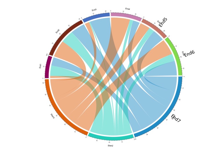
Here is some code from the circlize package for creating a chord diagram.Right now the labels are parallel to the edge of the circle. Is it possible to rotate the labels 90 degrees to they are perpendicular to the circle?

library(circlize)
set.seed(999)
mat = matrix(sample(18, 18), 3, 6)
rownames(mat) = paste0("Start", 1:3)
colnames(mat) = paste0("End", 1:6)
chordDiagram(mat)

In the figure below I manually inserted a few labels to show what I hope to accomplish (End5, End6, End7). Thanks.

enter image description here

Temuco answered 11/8, 2015 at 13:26 Comment(2)
chordDiagram is spelt wrong in this example - in case anyone tries to run this codeKhasi
@baxx, should be fixed now.Popp
A
21

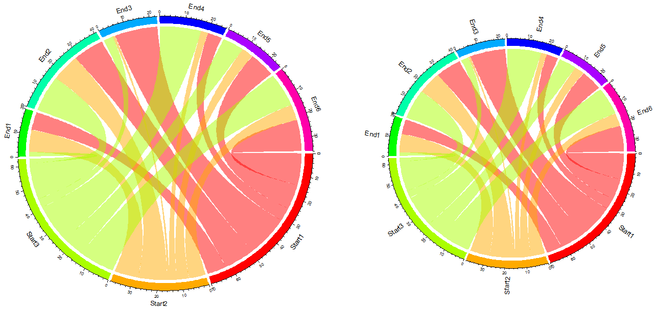
Based on your example data, here's one way to do it:

grid.col <- setNames(rainbow(length(unlist(dimnames(mat)))), union(rownames(mat), colnames(mat)))
par(mar = c(0, 0, 0, 0), mfrow = c(1, 2))

# original image
chordDiagram(mat, grid.col = grid.col) 

# now, the image with rotated labels
chordDiagram(mat, annotationTrack = "grid", preAllocateTracks = 1, grid.col = grid.col)
circos.trackPlotRegion(track.index = 1, panel.fun = function(x, y) {
  xlim = get.cell.meta.data("xlim")
  ylim = get.cell.meta.data("ylim")
  sector.name = get.cell.meta.data("sector.index")
  circos.text(mean(xlim), ylim[1] + .1, sector.name, facing = "clockwise", niceFacing = TRUE, adj = c(0, 0.5))
  circos.axis(h = "top", labels.cex = 0.5, major.tick.percentage = 0.2, sector.index = sector.name, track.index = 2)
}, bg.border = NA)

Result:

enter image description here

Archle answered 11/8, 2015 at 20:39 Comment(3)
This is great. My example show the data in the form of an adjacency matrix. If my data were in the form of an adjacency list, would I just re-work the grid.col variable?Temuco
I just used grid.col to fix the choice of colors. Tbh, never used the package, but grabbed the code from the vignette.Archle
@Brian, Are you using the package with version >=0.3.0? If so, the input variable for chordDiagram() now can be an adjacency list and grid.col can be set as same as if the input is a matrix.Auger
S
1

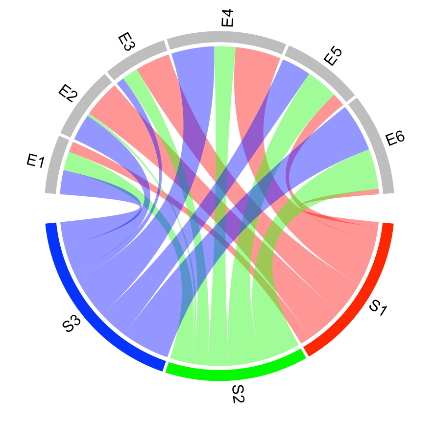
There is now a code example within the official circlize documentation to rotate the outer labels:

chordDiagram(mat, grid.col = grid.col, annotationTrack = "grid", 
    preAllocateTracks = list(track.height = max(strwidth(unlist(dimnames(mat))))))
# we go back to the first track and customize sector labels
circos.track(track.index = 1, panel.fun = function(x, y) {
    circos.text(CELL_META$xcenter, CELL_META$ylim[1], CELL_META$sector.index, 
        facing = "clockwise", niceFacing = TRUE, adj = c(0, 0.5))
}, bg.border = NA) # here set bg.border to NA is important

chord diagram with rotated labels

Serra answered 18/9, 2023 at 20:55 Comment(0)

© 2022 - 2024 — McMap. All rights reserved.