What exactly do the whiskers in pandas' boxplots specify?
Asked Answered
A

4

17

In python-pandas boxplots with default settings, the red bar is the mean median, and the box signifies the 25th and 75th quartiles, but what exactly do the whiskers mean in this case? Where is the documentation to figure out the exact definition (couldn't find it)?

Example code:

df.boxplot()

Example result:

enter image description here

Apiarist answered 22/8, 2012 at 23:3 Comment(0)
S
6

These are specified in the matplotlib documentation. The whiskers are some multiple (1.5 by default) of the interquartile range.

Stater answered 23/8, 2012 at 1:34 Comment(1)
Your short explanation is totally inaccurate. The whiskers are the min and max values within 1.5 times the IQR. The dots are the outliers, i. e. every datum more than 1.5*IQR away from the boxes.Sutherland
S
15

Pandas just wraps the boxplot function from matplotlib. The matplotlib docs have the definition of the whiskers in detail:

whis : float, sequence, or string (default = 1.5)

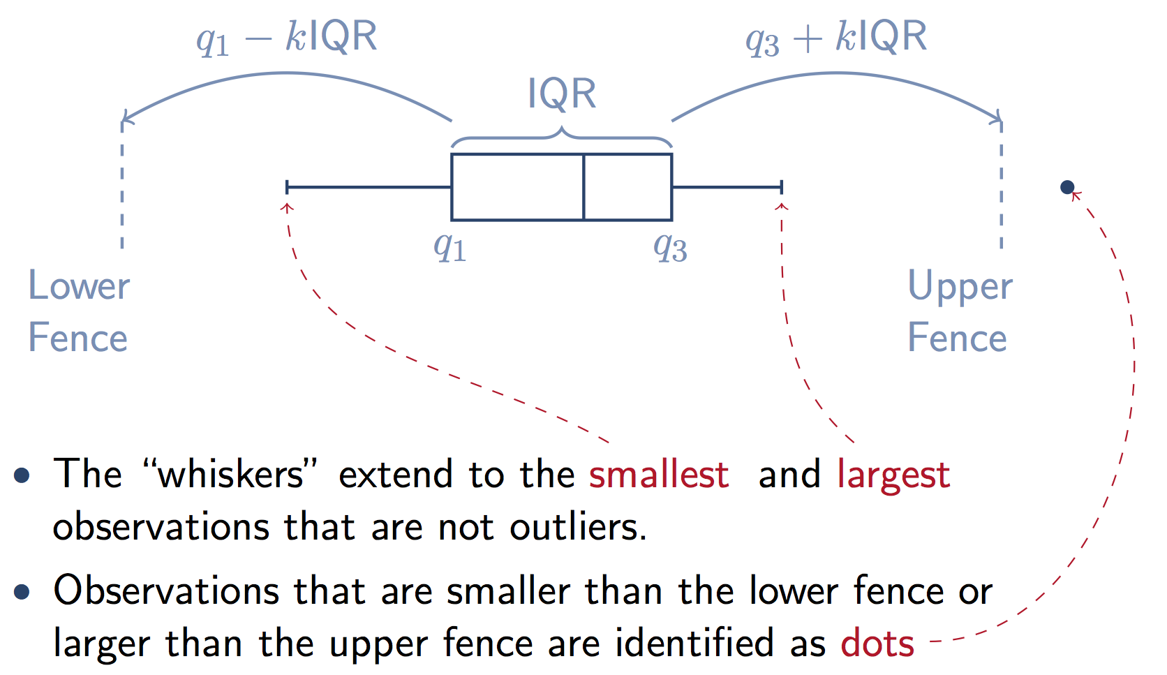
As a float, determines the reach of the whiskers to the beyond the first and third quartiles. In other words, where IQR is the interquartile range (Q3-Q1), the upper whisker will extend to last datum less than Q3 + whis*IQR). Similarly, the lower whisker will extend to the first datum greater than Q1 - whis*IQR. Beyond the whiskers, data are considered outliers and are plotted as individual points.

Matplotlib (and Pandas) also gives you a lot of options to change this default definition of the whiskers:

Set this to an unreasonably high value to force the whiskers to show the min and max values. Alternatively, set this to an ascending sequence of percentile (e.g., [5, 95]) to set the whiskers at specific percentiles of the data. Finally, whis can be the string 'range' to force the whiskers to the min and max of the data.

Below a graphic that illustrates this from a stats.stackexchange answer. Note that k=1.5 if you don't supply the whis keyword in Pandas.

enter image description here

Sutherland answered 11/4, 2018 at 17:58 Comment(1)
If, like me, you're trying to adjust the whiskers values to the 5th and 95th percentile based on the above: df.boxplot(whis=[5,95])Valedictorian
L
9

From Amelio Vazquez-Reina's answer in Boxplots in matplotlib: Markers and outliers:

enter image description here

The outliers (the + markers in the boxplot) are simply points outside of the wide [(Q1-1.5 IQR), (Q3+1.5 IQR)] margin below.

FYI: Confused by location of fences in box-whisker plots

Looming answered 6/8, 2017 at 16:8 Comment(2)
love this! Thanks for sharingMalfunction
Note that the whiskers are not actually at 1.5 x IQR from the box, they are the min and max data values within that range.Sutherland
P
8

You mention in your question that the red line is the mean - it is actually the median.

From the matplotlib link mentioned by Chang She above:

The box extends from the lower to upper quartile values of the data, with a line at the median. The whiskers extend from the box to show the range of the data. Flier points are those past the end of the whiskers.

I didn't experiment, but there is a 'meanline' option which might put the line at the mean.

Peaslee answered 16/10, 2014 at 13:15 Comment(0)
S
6

These are specified in the matplotlib documentation. The whiskers are some multiple (1.5 by default) of the interquartile range.

Stater answered 23/8, 2012 at 1:34 Comment(1)
Your short explanation is totally inaccurate. The whiskers are the min and max values within 1.5 times the IQR. The dots are the outliers, i. e. every datum more than 1.5*IQR away from the boxes.Sutherland

© 2022 - 2024 — McMap. All rights reserved.