CSS text-overflow in a table cell?
Asked Answered
L

15

664

I want to use CSS text-overflow in a table cell, such that if the text is too long to fit on one line, it will clip with an ellipsis instead of wrapping to multiple lines. Is this possible?

I tried this:

td {
  overflow: hidden;
  text-overflow: ellipsis;
  white-space: nowrap;
}

But the white-space: nowrap seems to make the text (and its cell) continually expand out to the right, pushing the total width of the table beyond the width of its container. Without it, however, the text continues to wrap to multiple lines when it hits the edge of the cell.

Lasalle answered 20/3, 2012 at 15:27 Comment(1)
Table cells don't handle overflow well. Try putting a div in the cell and styling that div.Roydd
M
1177

To clip text with an ellipsis when it overflows a table cell, you will need to set the max-width CSS property on each td class for the overflow to work. No extra layout div elements are required:

td
{
 max-width: 100px;
 overflow: hidden;
 text-overflow: ellipsis;
 white-space: nowrap;
}

For responsive layouts; use the max-width CSS property to specify the effective minimum width of the column, or just use max-width: 0; for unlimited flexibility. Also, the containing table will need a specific width, typically width: 100%;, and the columns will typically have their width set as percentage of the total width

table {width: 100%;}
td
{
 max-width: 0;
 overflow: hidden;
 text-overflow: ellipsis;
 white-space: nowrap;
}
td.column_a {width: 30%;}
td.column_b {width: 70%;}

Historical: For IE 9 (or less) you need to have this in your HTML, to fix an IE-specific rendering issue

<!--[if IE]>
<style>
table {table-layout: fixed; width: 100px;}
</style>
<![endif]-->
Midgett answered 9/8, 2012 at 4:58 Comment(17)
The table also needs a width for this to work in IE. jsfiddle.net/rBthS/69Intelligibility
@Trevor Dixon Thanks Trev, didn't notice that was a requirement, but is in my normal code anywayMidgett
@Midgett about the IE issue, could you provide a reading link? Or explain a bit what's going on pleaseUnderexpose
@Underexpose Old IE generally renders different from other render engines. It seems to need width property, regardless of max-width propertyMidgett
Also consider wrapping the contents inside the TD with a DIV tag and then apply the text flow limiting css to that DIV, this gave me the functionality I needed.Duelist
If you set width: 100%; and min-width: 1px; the cell will always be as wide as possible and will only use ellipsis to truncate the text when it needs to (not when the element width hits a certain size) - this is very useful for responsive layouts.Shedd
@OzrenTkalcecKrznaric it works on display: table-cell indeed, but not when the max-width is defined in percentage (%). Tested on FF 32Tillery
(Following up on the above) in the case you use % values, then only using table-layout: fixed on the element with display: table will do the trickTillery
To expand a little on the <td style="width: 100%"> responsive case: remove width: 100%s from all cells or columns, add table-layout: fixed; width: 100% to the <table> element, then specify widths only to <col> or (first row) <td> elements you want to be no wider than that width. Have no width specified for columns that should be as wide as possible.Cupreous
How about if you want the width of the columns to be assigned automatically on a responsive fashion like bootstrap responsive table? setting a max-width will intrude on that. Is there a workaround?Rathenau
Check out #17345658 can reduce max-width to 1px.Cavil
thanks a ton.. it worked like magic. I was just missing max-width:0;Shumway
Works perfectly as of January 2020 and latest version of Chrome etc.Naiad
Using fixed layout kinda goes against using tables in the first place (plain divs or flex work just fine in that case), the answer by Olaf works while preserving fluid table behaviors and automatic width.Bove
ATTENTION - max-width: 0; stopped working on 27-05-2021 with Chrome Version 91.0.4472.77Meat
For variable width columns, you'd need to do something like this: geeksforgeeks.org/how-to-use-text-overflow-in-a-table-cellAmbrogio
THANK YOU SO MUCH, I've been searching this for the last hour.Eleonoreeleoptene
O
131

Specifying a max-width or fixed width doesn't work for all situations, and the table should be fluid and auto-space its cells. That's what tables are for. Works on IE9 and other browsers.

Use this: http://jsfiddle.net/maruxa1j/

table {
    width: 100%;
}
.first {
    width: 50%;
}
.ellipsis {
    position: relative;
}
.ellipsis:before {
    content: '&nbsp;';
    visibility: hidden;
}
.ellipsis span {
    position: absolute;
    left: 0;
    right: 0;
    white-space: nowrap;
    overflow: hidden;
    text-overflow: ellipsis;
}
<table border="1">
    <thead>
        <tr>
            <th>Header 1</th>
            <th>Header 2</th>
            <th>Header 3</th>
            <th>Header 4</th>
        </tr>
    </thead>
    <tbody>
        <tr>
            <td class="ellipsis first"><span>This Text Overflows and is too large for its cell.</span></td>
            <td class="ellipsis"><span>This Text Overflows and is too large for its cell.</span></td>
            <td class="ellipsis"><span>This Text Overflows and is too large for its cell.</span></td>
            <td class="ellipsis"><span>This Text Overflows and is too large for its cell.</span></td>
        </tr>
    </tbody>
</table>
Olgaolguin answered 21/5, 2015 at 0:22 Comment(15)
Note: this solution wraps cell contents in <span> elements.Vervain
This is a really clever solution, and works well for all the tables I would require a solution for. It does however require you to set widths if you don't want all the table cells to be the same width.Conaway
When there are no fixed widths, this solution works best. Very clever indeed!Phenobarbital
This keeps the vertical alignment when other solution like display: block did notKujawa
"table should be fluid and auto-space its cells. That's what tables are for.". Really? Where is this rule from?Uria
what is this :before used for? I tried to remove it and didn't notice any change, browser compatibility maybe?Acquirement
This trick works well with span:hover effect to popup the full text. Just add some border, background, and let the text wrap out of the cell (white-space: normal).Snowshoe
@Acquirement The :before sets height of the cell so that it does not collapse when there is no other cell around. Also, some borders may not be rendered for empty cells.Snowshoe
HTML entities like &nbsp; don't work in CSS content property values.Almedaalmeeta
I must be missing something, although I followed this css exactly and while it does make truncating with the ellipsis work, it definitely does NOT autosize the columns (at least, not in Chrome). They still wind up being forced to equal width, so this is effectively the exact same solution as setting the table to fixed-width, only with lots more CSS.Preacher
So, to follow up, I took a look at the fiddle and there it DOES set a width (though a percentage width) on the column that gets truncated. So, "the table should be fluid and auto-space its cells" is a bit misleading imho.Preacher
The dots are not appearing with this solution, how come?Atomics
@floris click Run Code Snippet aboveOlgaolguin
That's an amazing solution. But I'd replace <td class="ellipsis first"><span>... by <td class="first"><div class="ellipsis"><span>.... Otherwise the cell padding is not respected.Exostosis
This solution significantly reduces performance in Safari 15.Okeefe
F
48

Why does this happen?

It seems this section on w3.org suggests that text-overflow applies only to block elements:

11.1.  Overflow Ellipsis: the ‘text-overflow’ property

text-overflow      clip | ellipsis | <string>  
Initial:           clip   
APPLIES TO:        BLOCK CONTAINERS               <<<<
Inherited:         no  
Percentages:       N/A  
Media:             visual  
Computed value:    as specified  

The MDN says the same.

This jsfiddle has your code (with a few debug modifications), which works fine if it's applied to a div instead of a td. It also has the only workaround I could quickly think of, by wrapping the contents of the td in a containing div block. However, that looks like "ugly" markup to me, so I'm hoping someone else has a better solution. The code to test this looks like this:

td, div {
  overflow: hidden;
  text-overflow: ellipsis;
  white-space: nowrap;
  border: 1px solid red;
  width: 80px;
}
Works, but no tables anymore:
<div>Lorem ipsum and dim sum yeah yeah yeah. Lorem ipsum and dim sum yeah yeah yeah. Lorem ipsum and dim sum yeah yeah yeah. Lorem ipsum and dim sum yeah yeah yeah. Lorem ipsum and dim sum yeah yeah yeah.</div>

Works, but non-semantic markup required:
<table><tr><td><div>Lorem ipsum and dim sum yeah yeah yeah. Lorem ipsum and dim sum yeah yeah yeah. Lorem ipsum and dim sum yeah yeah yeah. Lorem ipsum and dim sum yeah yeah yeah. Lorem ipsum and dim sum yeah yeah yeah.</div></td></tr></table>
Franz answered 20/3, 2012 at 15:41 Comment(1)
Nice, thanks. I couldn't remove the table cells from my markup, so instead I just wrapped the contents in divs (with their widths set to the widths of the cells) and applied the overflow there instead. Worked like a charm!Lasalle
O
38

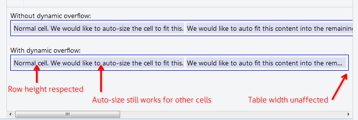
In case you don't want to set fixed width to anything

The solution below allows you to have table cell content that is long, but must not affect the width of the parent table, nor the height of the parent row. For example where you want to have a table with width:100% that still applies auto-size feature to all other cells. Useful in data grids with "Notes" or "Comment" column or something.

enter image description here

Add these 3 rules to your CSS:

.text-overflow-dynamic-container {
    position: relative;
    max-width: 100%;
    padding: 0 !important;
    display: -webkit-flex;
    display: -moz-flex;
    display: flex;
    vertical-align: text-bottom !important;
}
.text-overflow-dynamic-ellipsis {
    position: absolute;
    white-space: nowrap;
    overflow-y: visible;
    overflow-x: hidden;
    text-overflow: ellipsis;
    -ms-text-overflow: ellipsis;
    -o-text-overflow: ellipsis;
    max-width: 100%;
    min-width: 0;
    width:100%;
    top: 0;
    left: 0;
}
.text-overflow-dynamic-container:after,
.text-overflow-dynamic-ellipsis:after {
    content: '-';
    display: inline;
    visibility: hidden;
    width: 0;
}

Format HTML like this in any table cell you want dynamic text overflow:

<td>
  <span class="text-overflow-dynamic-container">
    <span class="text-overflow-dynamic-ellipsis" title="...your text again for usability...">
      //...your long text here...
    </span>
  </span>
</td>

Additionally apply desired min-width (or none at all) to the table cell.

Of course the fiddle: https://jsfiddle.net/9wycg99v/23/

Overprize answered 8/1, 2017 at 16:30 Comment(1)
It messes up the selected width limits of every column, e.g. if you have some columns defined for max-width: X they now can be wider -- I thought this is because of display: flex being used, but I removed that and see no difference...Precocity
E
36

If you just want the table to auto-layout

Without using max-width, or percentage column widths, or table-layout: fixed etc.

https://jsfiddle.net/tturadqq/

How it works:


Step 1: Just let the table auto-layout do its thing.

When there's one or more columns with a lot of text, it will shrink the other columns as much as possible, then wrap the text of the long columns:

enter image description here


Step 2: Wrap cell contents in a div, then set that div to max-height: 1.1em

(the extra 0.1em is for characters which render a bit below the text base, like the tail of 'g' and 'y')

enter image description here


Step 3: Set title on the divs

This is good for accessibility, and is necessary for the little trick we'll use in a moment.

enter image description here


Step 4: Add a CSS ::after on the div

This is the tricky bit. We set a CSS ::after, with content: attr(title), then position that on top of the div and set text-overflow: ellipsis. I've coloured it red here to make it clear.

(Note how the long column now has a tailing ellipsis)

enter image description here


Step 5: Set the colour of the div text to transparent

And we're done!

enter image description here

Einberger answered 9/6, 2017 at 8:16 Comment(8)
Awesome, man! (@Precocity - that's not right: have it working with a table rendered with Vue.js - be sure to put the titles on the the div's, not on the td's )Nonconformity
@ChristianOpitz - Yep I must have messed it up somehow... retried it and it is working.Precocity
I observed that this approach fails when using <a> instead of <div> inside table cell. Adding word-break: break-all; solves the problem. Example: jsfiddle.net/de0bjmqvCauterize
Just great. And you don't even have to have the same text in the cells (titles are enough), and then you don't need max-height: 1.1em etc - all you need for the divs is position: relative;.Godber
I could even get a working example without the title/after trick, using just divs, by applying similar styles to them. Kjetil Hansen did the same, see his answer below.Godber
For what it's worth, I had to also add a white-space: normal; to the td div::after css. Then it worked for what I needed wit ellipsis.Announcer
Clever solution. I learned something new about CSS content and attr() properties. However, I agree with KS74. This solution is over-kill and over-clever. It's hard to understand why you need to set the ellipsis in the ::after-div when it can simply be done to the td (or td>div) text itself. Remember that anything generated in the ::after styling of CSS isn't included in the DOM, and depending on the wider context of where/how the table is being used, this may be a significant problem that needs its own work-around.Sleave
This is such an underrated answer! This solution is really clever and works especially well in a data grid scenario, where you never really need multiple lines per row. Just a minor improvement I would add is pointer-events: none to the :after pseudo element, so that you are able to select the text in the rows.Emmaline
O
28

It seems that if you specify table-layout: fixed; on the table element, then your styles for td should take effect. This will also affect how the cells are sized, though.

Sitepoint discusses the table-layout methods a little here: http://reference.sitepoint.com/css/tableformatting

Orcein answered 12/6, 2012 at 20:30 Comment(1)
This should be the correct answer when you don't want to specify the width of the table.Scrappy
G
20

When it's in percentage table width, or you can't set fixed width on table cell. You can apply table-layout: fixed; to make it work.

table {
  table-layout: fixed;
  width: 100%;
}
td {
  text-overflow: ellipsis;
  white-space: nowrap;
  overflow: hidden;
  border: 1px solid red;
}
<table>
  <tr>
    <td>Lorem ipsum and dim sum yeah yeah yeah. Lorem ipsum and dim sum yeah yeah yeah. Lorem ipsum and dim sum yeah yeah yeah. Lorem ipsum and dim sum yeah yeah yeah. Lorem ipsum and dim sum yeah yeah yeah.</td>
    <td>Lorem ipsum and dim sum yeah yeah yeah. Lorem ipsum and dim sum yeah yeah yeah. Lorem ipsum and dim sum yeah yeah yeah. Lorem ipsum and dim sum yeah yeah yeah. Lorem ipsum and dim sum yeah yeah yeah.</td>
  </tr>
</table>
Goodrich answered 16/1, 2017 at 3:12 Comment(0)
H
11

Wrap cell content in a flex block. As a bonus, cell auto fits visible width.

table {
  width: 100%;
}

div.parent {
  display: flex;
}

div.child {
  flex: 1;
  width: 1px;
  overflow-x: hidden;
  text-overflow: ellipsis;
}
<table>
  <tr>
    <td>
      <div class="parent">
        <div class="child">
          xxxxxxxxxxxxxxxxxxxxxxxxxxxxxxxxxxxxxxxxxxxxxxxxxxxxxxxxxxxxxxxxxxxxxxxxxxxxxxxxxxxxxxxxxxxxxxxxxxxxxxxxxxxxxxxxxxxxxxxxxxxxxxxxxxxxxxxxxxxxxxxxxxxxxxxxxxxxxxxxxxxxxxxxxxxxxxxxxxxxxxxxxxxxxxxxxxxxxxxxxxxxxxxxxxxxxxxxxxxxxxxxxxxxxxxxxxxxxxxxxxxxxxxxxxxxxxxxxxxxxxxxxxxxxxxxxxxxxxxxxxxxxxxxxxxxxxxxxxxxxxxxxxxxxxxxxxxxxxxxxxxxxxxxxxxxxxxxxxxxxxxxxxxxxxxxxxxxxxxxxxxxxxxxxxxxxxxxxxxxxxxxxxxxxxxxxxxxxxxxxxxxxxxxxxxxxxxxxxxxxxxxxxxxxxxxxxxxxxxxxxxxxxxxxxxxxxxxxxxxxxxxxxxxxxxxxxxxxxxxxxxxxxxxxxxxxxxxxxxxxxxxxxxxxxxxxxxxxxxxxxxxxxxxxxxxxxxxxxxxxxxxxxxxxxxxxxxxxxxxxxxxxxxxxxxxxxxxxxxxxxxxxxxxxxxxxxxx
        </div>
      <div>
    </td>
  </tr>
</table>
Hipparchus answered 5/11, 2017 at 5:59 Comment(2)
I also had to add white-space: nowrap; to the child class.Picturize
This is exactly the same as all the other solutions here, in that it forces columns to equal width, disabling auto-sizing of columns.Preacher
A
8

This worked in my case, in both Firefox and Chrome:

td {
  max-width: 0;
  overflow: hidden;
  text-overflow: ellipsis;
  white-space: nowrap;
  width: 100%;
}
Alfredoalfresco answered 23/4, 2020 at 7:54 Comment(2)
When I did this, I got my th and td mispositioned...Becalmed
This worked for me too in all browsers, thank you!Hydrophilous
D
7

I solved this using an absolutely positioned div inside the cell (relative).

td {
    position: relative;
}
td > div {
    position: absolute;
    white-space: nowrap;
    overflow: hidden;
    text-overflow: ellipsis;
    max-width: 100%;        
}

That's it. Then you can either add a top: value to the div or vertically center it:

td > div {      
    top: 0;
    bottom: 0;
    margin: auto 0;
    height: 1.5em; // = line height 
}

To get some space on the right side, you can reduce the max-width a little.

Dewie answered 18/10, 2018 at 20:23 Comment(3)
it would be nice with a JSFiddle, as many of the other answers to this popular question.Twinflower
Yep, this works, but I used a bit different styles for divs: left:0;top:0;right:0;bottom:0;padding:2px; to get the right position, and to have the same padding as in the table's cells.Godber
This does force all columns to be equal in width, so it is the same solution as setting the table to fixed-width, just involving an extra element (div).Preacher
R
5

It is worked for me

table {
    width: 100%;
    table-layout: fixed;
}

td {
   text-overflow: ellipsis;
   white-space: nowrap;
}
Ressler answered 12/11, 2020 at 11:42 Comment(0)
M
4

For Clean Autosized Tables with Ellipsis

If you can ditch the table tags, then modern CSS has a much cleaner (IMO) solution available: using the grid layout.

You simply need one div or similar to represent the table, with cells inside, e.g.:

<div class="table">
  <div class="cell">text</div>
  <div class="cell">text</div>
  <div class="cell">text</div>
  <div class="cell">text</div>
</div>

Now if I want this to be a 2x2 table then it's simply a case of defining two auto sized columns for the grid:

.table {
  display: grid;
  grid-template-columns: auto auto;
}

For the cells you simply need a few more lines of CSS:

.cell {
  text-overflow: ellipsis;
  overflow: hidden;
  white-space: nowrap;
}

Job done! If you need to ensure some columns are wider than others then using the fr units or other available options for the columns template works well.

.table {
  display: grid;
  grid-template-columns: auto auto;
}
.cell {
  text-overflow: ellipsis;
  overflow: hidden;
  white-space: nowrap;
  border: 1px solid black;
}
<div class="table">
  <div class="cell">long long long long long long long long long long long long long long long long long long long long long long long long</div>
  <div class="cell">text</div>
  <div class="cell">text</div>
  <div class="cell">text</div>
</div>
Marjoriemarjory answered 25/8, 2021 at 1:55 Comment(7)
jsfiddle.net/r92c4b0pCreel
This is the only solution here that works without messing up the auto-width of table columns.Montmartre
This solution requires that you know the number of columns in the table ahead of time (i.e. grid-template-auto property needs to define an auto keyword for each column in the table). If your table is dynamic and you don't know the number of columns in advance, you need to do some CSS gymnastics to make it work. One possible work-around would be to define: .table-col-2 { grid-template-columns: auto auto; } .table-col-5 { grid-template-columns: auto auto auto auto auto; } etc. and dynamically apply the correct class in the HTML at runtime. But it's a messy solution.Sleave
@Sleave If I didn't know the number of columns at run time I'd probably use a CSS variable for the value of grid-template-columns and then just set that via JS - no need for any extra classes etc. and it could default to the expected count.Marjoriemarjory
@MattLacey no doubt there are clever JavaScript solutions to make the grid system work dynamically. And for some scenarios your solution would be very elegant. All the same, I can't help but feel that in any dynamic scenario where the aim is to present data in a tabular context, CSS grids just over-engineer the problem. Why use a solution that was designed to address a completely different problem, then have to gloss over the cracks with unnecessary JavaScript, when plain HTML already offers a simple means of presenting 2D/tabular data.Sleave
Because the standard elements don't work as desired in this specific scenario? I'd always use a table for a table where it works, but in my scenario (and what led me to this question) was I needed a 2x2 grid with 1 to 4 cells that would truncate text in this mannerMarjoriemarjory
Anyone doing this (using the grid method as opposed to the classic <table>) should be implementing aria-roles for SEO & accessibility concerns.Eristic
J
1

what worked fine for me is this simple code. By playing with number of character you can get the dots in almost any td you want

table *{
    max-width: 50ch;
    text-overflow: ellipsis;
    overflow: hidden;
    white-space: nowrap; 

}
Jacobina answered 8/1 at 21:11 Comment(0)
C
0

XML

<td><div>Your overflowing content here.</div></td>

CSS

td div
{
 max-height: 30vh;
 overflow: auto;
}

Trying to mess with the overall table for this very specific purpose makes no sense. Yes, sometimes it is okay to add an extra element if you explicitly work to not be another 600-divs-nested Twitter/Facebook "developer".

Cuttler answered 12/1, 2022 at 18:24 Comment(0)
C
-8

This is the version that works in IE 9.

http://jsfiddle.net/s27gf2n8/

<div style="display:table; table-layout: fixed; width:100%; " >
        <div style="display:table-row;">
            <div style="display:table-cell;">
                <table style="width: 100%; table-layout: fixed;">
                    <div style="text-overflow:ellipsis;overflow:hidden;white-space:nowrap;">First row. Lorem Ipsum is simply dummy text of the printing and typesetting industry. Lorem Ipsum has been the industry's standard dummy text ever since the 1500s, when an unknown printer took a galley of type and scrambled it to make a type specimen book. It has survived not only five centuries, but also the leap into electronic typesetting, remaining essentially unchanged. It was popularised in the 1960s with the release of Letraset sheets containing Lorem Ipsum passages, and more recently with desktop publishing software like Aldus PageMaker including versions of Lorem Ipsum.</div>
                </table>
            </div>
            <div style="display:table-cell;">
                Top right Cell.
            </div>
        </div>
        <div style="display:table-row;">
            <div style="display:table-cell;">
                <table style="width: 100%; table-layout: fixed;">
                    <div style="text-overflow:ellipsis;overflow:hidden;white-space:nowrap;">Second row - Lorem Ipsum is simply dummy text of the printing and typesetting industry. Lorem Ipsum has been the industry's standard dummy text ever since the 1500s, when an unknown printer took a galley of type and scrambled it to make a type specimen book. It has survived not only five centuries, but also the leap into electronic typesetting, remaining essentially unchanged. It was popularised in the 1960s with the release of Letraset sheets containing Lorem Ipsum passages, and more recently with desktop publishing software like Aldus PageMaker including versions of Lorem Ipsum.</div>
                </table>
            </div>
            <div style="display:table-cell;">
                Bottom right cell.
            </div>
        </div>
    </div>
Catalyze answered 8/1, 2015 at 18:12 Comment(3)
a <div> as a direct child of <table> ? That doesn't seem right!Galligaskins
@michiel FYI - browsers can handle Divs below table tags.Karns
@RyanO'Connell, just because you can, doesn't mean you should... according to the HTML spec this is invalid, regardless of browsers can render it or notStonedeaf

© 2022 - 2024 — McMap. All rights reserved.