Set Round Corner image in ImageView
Asked Answered
U

12

23

I have searched more on websites and got many suggestions like below

  • Changing background with custom style to set the corner radius and padding ( Getting image as rectangle and background as rounded corner)

  • Changing Given image to Bitmap by decoding the image and cropping functionality by passing this bitmap and width ( its taking more time to load)

I have checked the WhatsApp Chat history list and it has rounded corner images but its loaded with minimum time.

Could you please suggest me the best way to create listview template with rounded images as in WhatsApp?

I am expecting to change the image with rounded corner by setting the style details in xml page. (image width and height is 60 dp, also my listview having around 60 items)

References :

res/mylayout.xml:

<ImageView
        android:id="@+id/contactssnap"
        android:layout_width="50dp"
        android:layout_height="50dp"
        android:src="@drawable/contactssnap"
        android:background="@drawable/roundimage" />

res/drawable/roundimage.xml:

<?xml version="1.0" encoding="UTF-8"?>
<shape xmlns:android="http://schemas.android.com/apk/res/android"
    android:shape="rectangle" >
    <solid android:color="#ffffffff" />
    <stroke
        android:width="2dp"
        android:color="#90a4ae" />
    <size
        android:height="50dp"
        android:width="50dp" />
    <padding
        android:bottom="2dp"
        android:left="2dp"
        android:right="2dp"
        android:top="2dp" />
    <corners android:radius="100dp" />
</shape>

Note: Supported Android Version from 14 to 22

Ultramicroscope answered 28/7, 2015 at 11:48 Comment(5)
How are you setting the ImageView? From resource or do you download the bitmap from somewhere else?Viscardi
stackover flow already have an answer refer this #2460416Mogul
@bGorle: yes i tried this and its taking more time to load imagesUltramicroscope
use android.support.v4.graphics.drawable.RoundedBitmapDrawableChevy
Check this now we have ShapeableImageView to make circular or rounded imageView https://mcmap.net/q/50039/-imageview-rounded-corners-duplicateRestrain
N
34

The Material Components Library provides the new ShapeableImageView.
Just use a layout like:

  <com.google.android.material.imageview.ShapeableImageView
      ...
      app:shapeAppearanceOverlay="@style/roundedCorners"
      app:srcCompat="@drawable/...." />

With the shapeAppearanceOverlay attribute you can apply a custom shape, in this case rounded corners:

  <style name="roundedCorners" parent="">
    <item name="cornerFamily">rounded</item>
    <item name="cornerSize">xxdp</item>
  </style>

enter image description here

*Note: it requires at least the version 1.2.0-alpha03.

Nuclide answered 27/5, 2020 at 8:57 Comment(2)
This is one of the most elegant ways I've seen, applies very well for Picasso error / placeholders, too!Forename
best answer.. no need to redevelop the wheel... thanks to google material.Euhemerus
Q
21

The answer from sats is worked. But RoundedBitmapDrawable cannot be applied to an ImageView with scaleType: centerCrop.

An updated.

If you are using Android API at level 21. We have a simple solution here.

1st, create drawable as background for the imageview

<shape xmlns:android="http://schemas.android.com/apk/res/android"
android:shape="rectangle">
<corners android:radius="8dp" />
<solid android:color="@android:color/white" />

<stroke
    android:width="1dp"
    android:color="@color/colorWhite" />
</shape>

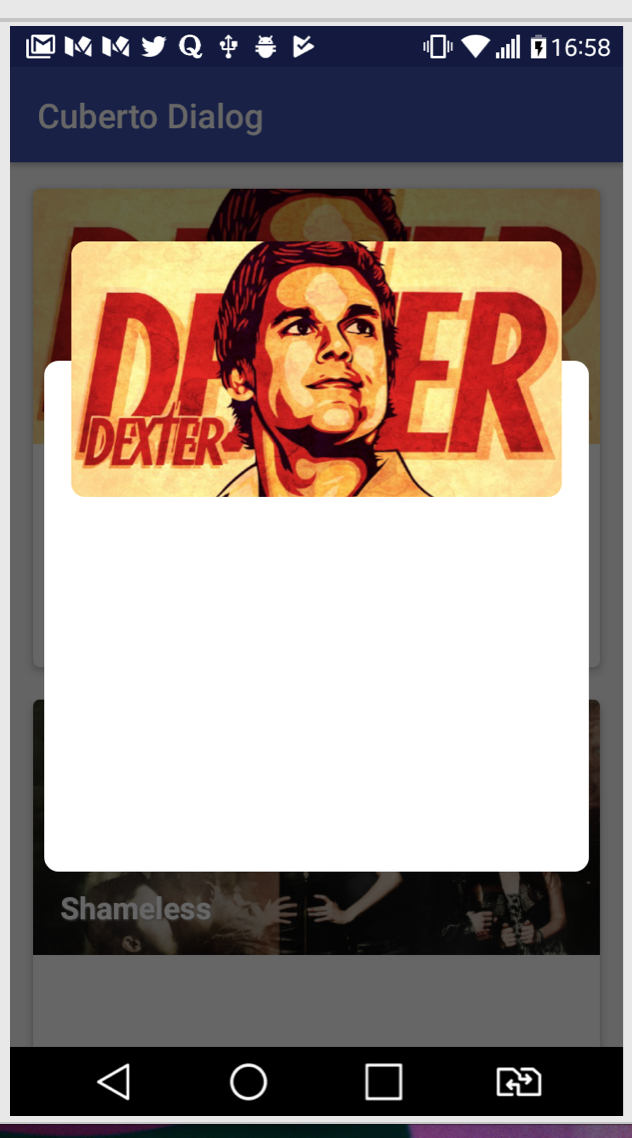
Next, change ImageView's property setClipToOutline to true. And set rounded drawable as ImageView's background.

That's it.

enter image description here

In my demo, I using this method for rounded imageview. Can find it here cuberto's dialog

Quartering answered 19/5, 2017 at 3:33 Comment(4)
Check this now we have ShapeableImageView to make circular or rounded imageView https://mcmap.net/q/50039/-imageview-rounded-corners-duplicateRestrain
Attribute clipToOutline is only used in API level 31 and higher not 21Morley
@AbdulWaheed No, it added at 21, developer.android.com/reference/android/view/…Quartering
Yes maybe you're right. The android studio was showing me this warning I don't know why.Morley
M
20

Put imageView in CardView and set CornerRadius for CardView

<android.support.v7.widget.CardView
        android:layout_width="wrap_content"
        android:layout_height="wrap_content"
        android:orientation="vertical"
        app:cardCornerRadius="8dp"
        app:cardElevation="0dp">

        <ImageView
            android:id="@+id/imgTourismHr"
            android:layout_width="wrap_content"
            android:layout_height="wrap_content"
            android:scaleType="fitXY" />

    </android.support.v7.widget.CardView>
Madeup answered 3/9, 2018 at 7:13 Comment(2)
this is the only solution worked for me for transparent rounded cornersTanner
Check this now we have ShapeableImageView to make circular or rounded imageView https://mcmap.net/q/50039/-imageview-rounded-corners-duplicateRestrain
N
10

you can use the standard API's provided by Google to create a circular ImageView.

ImageView imageView = (ImageView) findViewById(R.id.circleImageView);
Bitmap bitmap = BitmapFactory.decodeResource(getResources(), R.drawable.image);
RoundedBitmapDrawable roundedBitmapDrawable = RoundedBitmapDrawableFactory.create(getResources(), bitmap);
roundedBitmapDrawable.setCircular(true);
imageView.setImageDrawable(roundedBitmapDrawable);

Also refer https://www.youtube.com/watch?v=zVC-YAnDlgk

Nolly answered 4/2, 2017 at 15:41 Comment(1)
Thanks this look like works for me but the only problem I'm having is the second parameter of decodeResource. I have a imageUrl which loads the image. how do I achieve this in this case ?Lapointe
P
9

See the rounded rectangle image Output with Rounded Corner border

Now to Set Rounded Rectangle Image with rounded Border.

You Can Simple Declare CardView inside CardView With app:cardCornerRadius="30dp", app:cardUseCompatPadding="true", app:cardElevation="0dp".

See the Below Xml Code

            <androidx.cardview.widget.CardView
                android:layout_width="match_parent"
                android:layout_height="match_parent"
                android:layout_gravity="center"
                app:cardCornerRadius="30dp"
                app:cardUseCompatPadding="true"
                app:cardElevation="0dp"
                android:layout_margin="5dp"
                >
                <ImageView
                    android:layout_width="match_parent"
                    android:layout_height="match_parent"
                    android:src="@drawable/temp"
                    android:scaleType="fitXY"
                    android:layout_gravity="center"
                    />
            </androidx.cardview.widget.CardView>
        </androidx.cardview.widget.CardView>
Petit answered 8/8, 2019 at 4:29 Comment(0)
G
1

Change cardCornerRadius according to your need

<androidx.cardview.widget.CardView
    android:layout_width="120dp"
    android:layout_height="120dp"
    android:layout_gravity="center"
    app:cardCornerRadius="20dp">
    <LinearLayout
        android:layout_width="match_parent"
        android:layout_height="match_parent">
        <ImageView
            android:layout_width="match_parent"
            android:layout_height="match_parent"
            android:src="@drawable/sample"
            android:scaleType="centerCrop"/>

    </LinearLayout>
</androidx.cardview.widget.CardView>
Gridley answered 11/5, 2021 at 17:1 Comment(0)
B
1

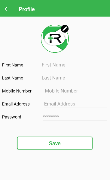
We can use the CardView widget that is provided by androidx for this problem solution. Sample picture of the CardView widget

The code is the following.

<RelativeLayout
                android:layout_width="wrap_content"
                android:layout_height="wrap_content">
                <LinearLayout
                    android:id="@+id/avatar_layout"
                    android:layout_width="wrap_content"
                    android:layout_height="wrap_content"
                    android:layout_marginBottom="@dimen/padding_20"
                    android:background="@drawable/roundimage">

                    <androidx.cardview.widget.CardView
                        android:layout_width="wrap_content"
                        android:layout_height="wrap_content"
                        android:orientation="vertical"
                        app:cardCornerRadius="50dp"
                        app:cardElevation="0dp">

                        <ImageView
                            android:id="@+id/avatar"
                            android:layout_width="100dp"
                            android:layout_height="100dp"
                            android:padding="@dimen/padding_5"
                            android:scaleType="fitXY"
                            android:src="@drawable/launch_icon" />

                    </androidx.cardview.widget.CardView>
                </LinearLayout>

                <ImageView
                    android:id="@+id/avatar_edit"
                    android:layout_width="@dimen/padding_30"
                    android:layout_height="@dimen/padding_30"
                    android:src="@drawable/edit_profile_btn"
                    android:clickable="true"
                    android:layout_alignEnd="@id/avatar_layout"/>
</RelativeLayout>
Babysitter answered 2/11, 2021 at 8:33 Comment(0)
M
0

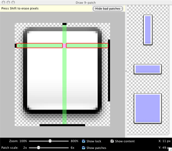
Did you check 9 patch technique in android?

If you are trying to create something like whats app bubble chats with rounded corners I suggest you to use this technique instead of using XML Bitmap Decoder.

here is an example : Link

according to this example you can use 9 patch generators to create your own custom shapes and bitmap images that automatically resize to accommodate the contents of the view and the size of the screen. Selected parts of the image are scaled horizontally or vertically based indicators drawn within the image.

enter image description here

Messalina answered 28/7, 2015 at 11:57 Comment(0)
F
0

kotlin solution:

class RoundedCornerImageView(context: Context?, attrs: AttributeSet?) : 
androidx.appcompat.widget.AppCompatImageView(context, attrs) {

private val path: Path? = Path()
private var cornerRadius: Int = 0
private var roundedCorner: Int = 0

init {
    val a: TypedArray = context!!.obtainStyledAttributes(attrs, R.styleable.RoundedCornerImageView)
    cornerRadius = a.getDimensionPixelSize(R.styleable.RoundedCornerImageView_radius, 0)
    roundedCorner = a.getInt(R.styleable.RoundedCornerImageView_corner, 0)
    a.recycle()
}

override fun onDraw(canvas: Canvas?) {
    if (!path!!.isEmpty){
        canvas!!.clipPath(path)
    }
    super.onDraw(canvas)
}

override fun onSizeChanged(w: Int, h: Int, oldw: Int, oldh: Int) {
    super.onSizeChanged(w, h, oldw, oldh)
    setPath()
}

private fun setPath() {
    path!!.rewind()

    val radii = FloatArray(8)

    Log.d(TAG, "setPath : $roundedCorner")

    when(roundedCorner){
        0 ->{
            // all side
            for(i in 0 until 8)
                radii[i] = cornerRadius.toFloat()
        }

        1 ->{
            //top left
            radii[0] = cornerRadius.toFloat()
            radii[1] = cornerRadius.toFloat()
        }

        2 ->{
            //top right
            radii[2] = cornerRadius.toFloat()
            radii[3] = cornerRadius.toFloat()
        }

        3 ->{
            //bottom right
            radii[4] = cornerRadius.toFloat()
            radii[5] = cornerRadius.toFloat()

        }

        4 ->{
            //bottom left
            radii[6] = cornerRadius.toFloat()
            radii[7] = cornerRadius.toFloat()

        }

        5 ->{
            //left
            radii[0] = cornerRadius.toFloat()
            radii[1] = cornerRadius.toFloat()
            radii[6] = cornerRadius.toFloat()
            radii[7] = cornerRadius.toFloat()

        }

        6 ->{
            //right
            radii[2] = cornerRadius.toFloat()
            radii[3] = cornerRadius.toFloat()
            radii[4] = cornerRadius.toFloat()
            radii[5] = cornerRadius.toFloat()

        }

        7 ->{
            //top
            radii[0] = cornerRadius.toFloat()
            radii[1] = cornerRadius.toFloat()
            radii[2] = cornerRadius.toFloat()
            radii[3] = cornerRadius.toFloat()

        }

        8 ->{
            //bottom
            radii[4] = cornerRadius.toFloat()
            radii[5] = cornerRadius.toFloat()
            radii[6] = cornerRadius.toFloat()
            radii[7] = cornerRadius.toFloat()

        }
    }  
    path.addRoundRect(RectF(0F,0F,width.toFloat(),
                      height.toFloat()),
                      radii,Path.Direction.CW)
}

}

don't forget to add this in your attr.xml file

<declare-styleable name="RoundedCornerImageView">
    <attr name="radius" format="dimension"/>
    <attr name="corner">
       <flag name="topLeft" value="1"/>
       <flag name="topRight" value="2"/>
       <flag name="bottomRight" value="3"/>
       <flag name="bottomLeft" value="4"/>
       <flag name="left" value="5"/>
       <flag name="right" value="6"/>
       <flag name="top" value="7"/>
       <flag name="bottom" value="8"/>
    </attr>
</declare-styleable> 
Fluted answered 7/7, 2020 at 6:52 Comment(0)
L
0

Use the ShapeableImageView from material package

<com.google.android.material.imageview.ShapeableImageView
        android:layout_height="150dp"
        android:layout_width="150dp"
        android:layout_margin="10dp"
        android:scaleType="centerCrop"
        app:srcCompat="@drawable/photo"
        app:shapeAppearanceOverlay="@style/circleImageStyle"/>

And add the below style in themes.xml

   <style name="circleImageStyle" parent="ShapeAppearance.MaterialComponents.MediumComponent">
    <item name="cornerFamily">rounded</item>
    <item name="cornerSize">50%</item>
</style>
Levo answered 28/5, 2023 at 17:56 Comment(0)
S
-2

Quick solution for anyone using Glide in loading network images, which is using RequestOptions.circleCropTransform():

Glide.with(context)
     .load(imageUrl)
     .apply(RequestOptions.circleCropTransform())
     .into(object : CustomViewTarget<ImageView, Drawable>(imageView) {
            override fun onLoadFailed(errorDrawable: Drawable?) {
            }
            override fun onResourceCleared(placeholder: Drawable?) {
            }
            override fun onResourceReady(resource: Drawable, transition: Transition<in Drawable>?) {
                imageView.setImageDrawable(resource)
            }
        })
Stegodon answered 17/4, 2019 at 21:39 Comment(0)
F
-5

Just add android:padding="5pt"to you xml layout like

 <ImageView
            android:id="@+id/ivGadgetImage"
            android:layout_width="50pt"
            android:layout_height="50pt"
            android:padding="5pt"
            tools:srcCompat="@tools:sample/avatars" />
Fasto answered 3/7, 2020 at 12:20 Comment(0)

© 2022 - 2024 — McMap. All rights reserved.