visualize a list of colors/palette in R
Asked Answered
N

6

30

I have following data.frame with rgb values. Hence each row indicates a color.

pdf <- read.table(header = TRUE, text = "
r     g     b
0.374 0.183 0.528
0.374 0.905 0.337
0.051 0.662 0.028
0.096 0.706 0.898
0.876 0.461 0.628
0.415 0.845 0.286
0.596 0.07  0.523
0.724 0.101 0.673
0.847 0.434 0.937
0.588 0.885 0.604
0.481 0.366 0.337
0.142 0.075 0.276
0.819 0.737 0.658
0.91  0.722 0.979
0.969 0.012 0.451
0.887 0.536 0.123
0.432 0.967 0.446
0.927 0.125 0.332
0.381 0.646 0.656
0.04  0.898 0.798
")

How can I visualize these colors? This can be either as bars of color or a palette or a pie chart. I tried to use following method but could not fit it in my data:

pie(rep(1,20), col=rainbow(20)) 
Nidifugous answered 8/9, 2014 at 14:12 Comment(0)
W
16

image() will work well here if you convert the colors via rgb()

image(1:nrow(ddf), 1, as.matrix(1:nrow(ddf)), 
      col=rgb(ddf$r, ddf$g, ddf$b),
      xlab="", ylab = "", xaxt = "n", yaxt = "n", bty = "n")

enter image description here

Wickman answered 8/9, 2014 at 14:20 Comment(1)
This is exactly what I wanted.Nidifugous
K
63

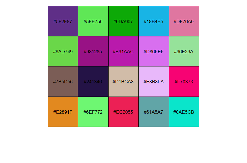
I think the simplest option is scales. This also has the advantage of showing the hex values in the colours.

library(scales)
pal <- rgb(ddf$r, ddf$g, ddf$b)
show_col(pal)

enter image description here

Kiri answered 29/10, 2019 at 0:35 Comment(0)
W
16

image() will work well here if you convert the colors via rgb()

image(1:nrow(ddf), 1, as.matrix(1:nrow(ddf)), 
      col=rgb(ddf$r, ddf$g, ddf$b),
      xlab="", ylab = "", xaxt = "n", yaxt = "n", bty = "n")

enter image description here

Wickman answered 8/9, 2014 at 14:20 Comment(1)
This is exactly what I wanted.Nidifugous
N
5

As an alternative to the solution using image you could also use polygon and create a quite similar plot:

plot(NA, xlim=c(0, nrow(ddf)), ylim=c(0,1))

for (i in 1:nrow(ddf)) {

  row <- ddf[i,]
  color <- rgb(red=row$r, green=row$g, blue=row$b)
  polygon(x=c(i-1, i, i, i-1), y=c(0, 0, 1, 1), col = color)
}
Nissie answered 8/9, 2014 at 14:36 Comment(1)
Good alternative method. Polygon() is a useful function.Nidifugous
H
4

You could also use ggplot2:

library(ggplot2)
qplot(x=1:nrow(ddf), y = 1, fill=factor(1:nrow(ddf)), geom="tile") +
  scale_fill_manual(values = rgb(ddf$r, ddf$g, ddf$b)) +
  theme_void()+
  theme(legend.position="none") 

Henceforward answered 17/5, 2019 at 3:32 Comment(1)
Good suggestion.Nidifugous
T
3

You can use the hues package:

library("hues")

pal <- c("#351d34", "#f5ccb5", "#159ea2", "#d05d6c", "#ec4934")

swatch(pal)

enter image description here

Teodorateodorico answered 10/8, 2023 at 16:21 Comment(2)
Seems a new package. I had asked this question 9 years back!Nidifugous
hahaha I haven't noticed it. But it works pretty good in 2023 :)Teodorateodorico
Q
2

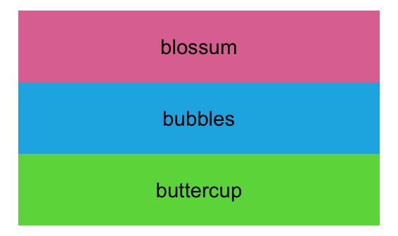
Convert to R color with rgb(), plot with ggplot using geom_tile (extending the answer from @Matifou), and add text label.

With the original post data:

    # a palette is a named vector
    myPalette=rgb(pdf)
    names(myPalette) = paste("row", 1:nrow(pdf))
    
    # create data that references the palette
    colorKey = data.frame(colorName=names(myPalette))
    # plot with ggplot, referencing the palette
    ggplot(data=colorKey, aes(x=1, y = 1:nrow(colorKey), fill=colorName, label=colorName)) +
      geom_tile() +
      scale_fill_manual(values = myPalette) +
      theme_void()+
      theme(legend.position="none") + 
      geom_text()

horizontal bar for each color

SECOND EXAMPLE - for text labels

    myPalette =  c(
      buttercup = "#6AD749",
      bubbles = "#18B4E5",
      blossum = "#DF76A0")
    
    colorKey = data.frame(colorName=names(myPalette))
    ggplot(data=colorKey, aes(x=1, y = 1:nrow(colorKey), fill=colorName, label=colorName)) +
      geom_tile() +
      scale_fill_manual(values = myPalette) +
      theme_void()+
      theme(legend.position="none") + 
      geom_text()

image of 3 color bars with labels

Quadruplex answered 28/7, 2023 at 12:47 Comment(0)

© 2022 - 2024 — McMap. All rights reserved.