How could I edit my code to plot 4D contour something similar to this example in python?
Asked Answered
T

2

3

Similar to many other researchers on stackoverflow who are trying to plot a contour graph out of 4D data (i.e., X,Y,Z and their corresponding value C), I am attempting to plot a 4D contour map out of my data. I have tried many of the suggested solutions in stackover flow. From all of the plots suggested this, and this were the closest to what I want but sill not quite what I need in terms of data interpretation. Here is the ideal plot example: (source) enter image description here

Here is a subset of the data. I put it on the dropbox. Once this data is downloaded to the directory of the python file, the following code will work. I have modified this script from this post.

import numpy as np
from mpl_toolkits.mplot3d import Axes3D
import matplotlib.pyplot as plt
import matplotlib.tri as mtri

#####Importing the data
df = pd.read_csv('Data_4D_plot.csv')

do_random_pt_example = False;

index_x = 0; index_y = 1; index_z = 2; index_c = 3;
list_name_variables = ['x', 'y', 'z', 'c'];
name_color_map = 'seismic';

if do_random_pt_example:
    number_of_points = 200;
    x = np.random.rand(number_of_points);
    y = np.random.rand(number_of_points);
    z = np.random.rand(number_of_points);
    c = np.random.rand(number_of_points);
else:
    x = df['X'].to_numpy(); 
    y = df['Y'].to_numpy();
    z = df['Z'].to_numpy();
    c = df['C'].to_numpy();
#end
#-----

# We create triangles that join 3 pt at a time and where their colors will be
# determined by the values of their 4th dimension. Each triangle contains 3
# indexes corresponding to the line number of the points to be grouped. 
# Therefore, different methods can be used to define the value that 
# will represent the 3 grouped points and I put some examples.
triangles = mtri.Triangulation(x, y).triangles;

choice_calcuation_colors = 2;
if choice_calcuation_colors == 1: # Mean of the "c" values of the 3 pt of the triangle
    colors = np.mean( [c[triangles[:,0]], c[triangles[:,1]], c[triangles[:,2]]], axis = 0);
elif choice_calcuation_colors == 2: # Mediane of the "c" values of the 3 pt of the triangle
    colors = np.median( [c[triangles[:,0]], c[triangles[:,1]], c[triangles[:,2]]], axis = 0);
elif choice_calcuation_colors == 3: # Max of the "c" values of the 3 pt of the triangle
    colors = np.max( [c[triangles[:,0]], c[triangles[:,1]], c[triangles[:,2]]], axis = 0);
#end
#----------

###=====adjust this part for the labeling of the graph

list_name_variables[index_x] = 'X (m)'
list_name_variables[index_y] = 'Y (m)'
list_name_variables[index_z] = 'Z (m)'
list_name_variables[index_c] = 'C values'


# Displays the 4D graphic.
fig = plt.figure(figsize = (15,15));
ax = fig.gca(projection='3d');
triang = mtri.Triangulation(x, y, triangles);
surf = ax.plot_trisurf(triang, z, cmap = name_color_map, shade=False, linewidth=0.2);
surf.set_array(colors); surf.autoscale();

#Add a color bar with a title to explain which variable is represented by the color.
cbar = fig.colorbar(surf, shrink=0.5, aspect=5);
cbar.ax.get_yaxis().labelpad = 15; cbar.ax.set_ylabel(list_name_variables[index_c], rotation = 270);

# Add titles to the axes and a title in the figure.
ax.set_xlabel(list_name_variables[index_x]); ax.set_ylabel(list_name_variables[index_y]);
ax.set_zlabel(list_name_variables[index_z]);
ax.view_init(elev=15., azim=45)

plt.show() 

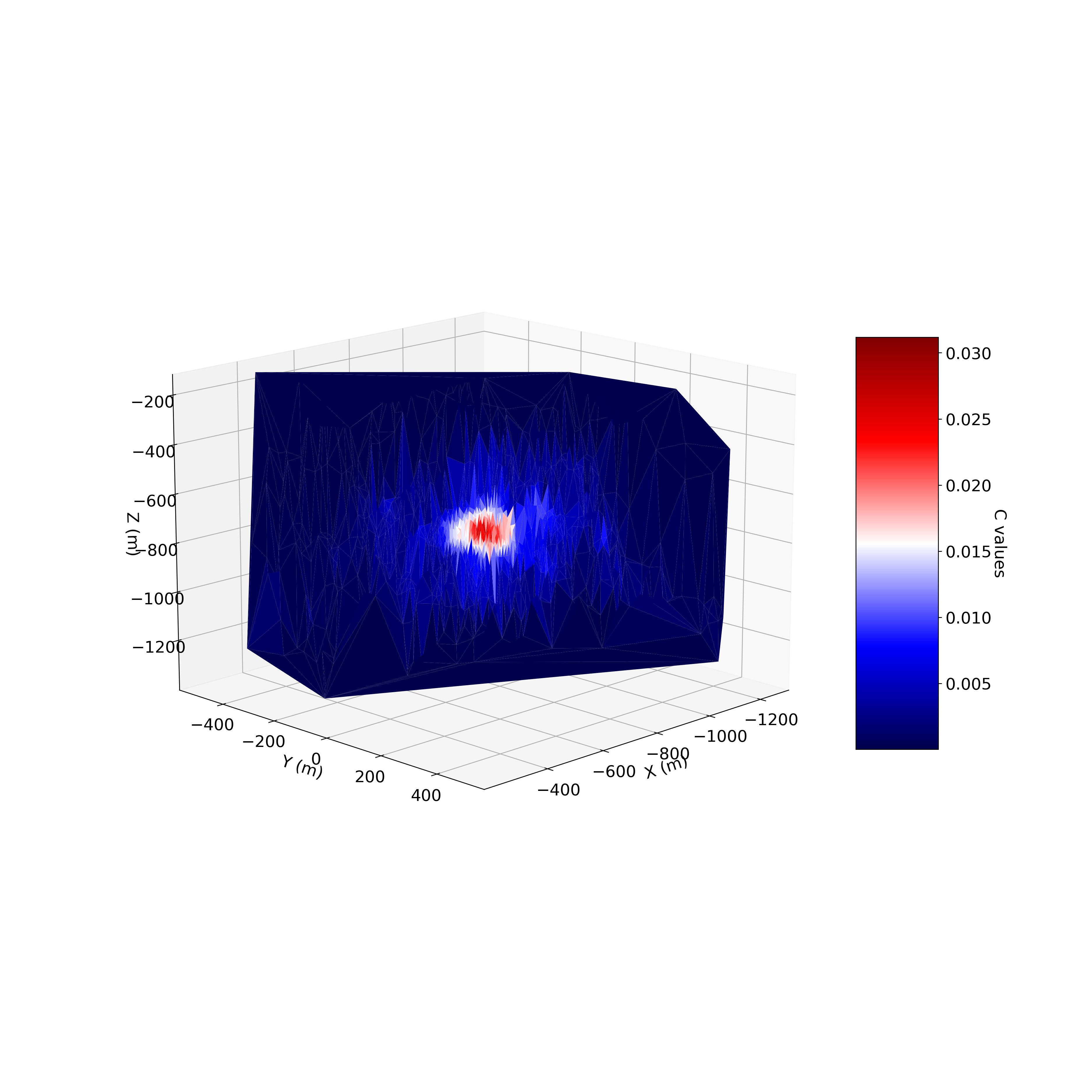
Here would be the output: enter image description here

Although it looks brilliant, it is not quite what I am looking for (the above contour map example). I have modified the following script from this post in the hope to reach the required graph, however, the chart looks nothing similar to what I was expecting (something similar to the previous output graph). Warning: the following code may take some time to run.

import matplotlib
import matplotlib.pyplot as plt
from mpl_toolkits.mplot3d import Axes3D
import numpy as np

df = pd.read_csv('Data_4D_plot.csv')

x = df['X'].to_numpy(); 
y = df['Y'].to_numpy();
z = df['Z'].to_numpy();
cc = df['C'].to_numpy();


# convert to 2d matrices
Z = np.outer(z.T, z)       
X, Y = np.meshgrid(x, y)   
C = np.outer(cc.T,cc)
# fourth dimention - colormap
# create colormap according to cc-value 
color_dimension = C # change to desired fourth dimension
minn, maxx = color_dimension.min(), color_dimension.max()
norm = matplotlib.colors.Normalize(minn, maxx)
m = plt.cm.ScalarMappable(norm=norm, cmap='jet')
m.set_array([])
fcolors = m.to_rgba(color_dimension)

# plot
fig = plt.figure()
ax = fig.gca(projection='3d')
ax.plot_surface(X,Y,Z, rstride=1, cstride=1, facecolors=fcolors, vmin=minn, vmax=maxx, shade=False)
ax.set_xlabel('x')
ax.set_ylabel('y')
ax.set_zlabel('z')
plt.show()

Now I was wondering from our kind community and experts if you can help me to plot a contour figure similar to the example graph (image one in this post), where the contours are based on the values within the range of C?

Toothlike answered 8/5, 2021 at 17:21 Comment(4)
I haven't tried your code yet, but I would say that in the "example graph", the values are probably sorted to have a continuous increase in X, Y in function of Z. So the overall shape is smooth. Have you tried applying sort orders to your data (like [#1-#2-#3]: X-Y-Z, X-Z-Y, Y-X-Z, ...) to see if it could improve the visual appearance obtained?Mars
I tried a few sort orders just to see (I tested 24 possibilities out of 360) with the first solution with the triangles. However, this will change the shape of the color distribution a bit, but not that much either. Sorting by C (as the first column for the sorting) can help create a circle shape in the center while sorting against X or Y or Z will create colors for C that are along a line of a certain width, in a specific direction. Also, change the “name_color_map” to “jet” if you want to have the same color palette as in the “example graph”.Mars
If you are primarily looking for something that would have a similar effect to the white lines of contours that group similar "C" values in the "example graphic", then maybe something to smooth the map could be used first to reduce the variation in measurements (because it is a bit noisy, especially if it is measurements that come from a sensor). The resulting figure will not show the actual measurements, but it will give a smoother graph that gives a better overview of the situation while correcting the resulting measurements.Mars
@Toothlike could you please look at this questionRojo
P
0

enter image description here

As it happens (left subplot) your (x, y, z)'s lie in a plane, minus measurements errors(?), and if you rotate appropriately (right subplot) the scatter plot you can see, in a clear way, the structure of your data.

I suggest to find the plane of best fit, then you can plot two scatter plots, one for C and one for the residuals, the first is what you ultimately want, the second may show some correlation between the residuals and C.

Polash answered 2/9, 2023 at 10:28 Comment(0)
W
0

You are facing 2 challenges:

  • Data variance is not spread over normal axis (PCA);
  • 3D surfaces and 2D contours need 2D regular mesh to work properly (interpolation):
    • z = f(x,y) over a 2D classic rectangular grid;
    • f(x,y,z) = 0 over a 2D rectangular parametrization z = g(u, v) (sorted vertices).

MCVE

Let's load your dataset:

import numpy as np
import pandas as pd
import matplotlib as mpl
import matplotlib.pyplot as plt
from sklearn.decomposition import PCA
from scipy.interpolate import LinearNDInterpolator

data = pd.read_csv("Data_4D_plot.csv")
y = data.pop("C").values
X = data.values

We apply PCA to get major axis aligned to x and y axis:

pca = PCA()
Xp = pca.fit_transform(X)

fig, axe = plt.subplots(subplot_kw={"projection": "3d"})
axe.scatter(*Xp.T, c=y, cmap="jet")
axe.set_zlim([-400, 400])

Transformed data looks like:

enter image description here

We can see the elevation of the surface and the fourth variable as color.

Then, we interpolate elevation from the data cloud using only x and y (approximation on the least important component):

xmin = Xp.min(axis=0)
xmax = Xp.max(axis=0)
xlin = np.linspace(xmin[0], xmax[0], 200)
ylin = np.linspace(xmin[1], xmax[1], 200)
Xlin, Ylin = np.meshgrid(xlin, ylin)

height_interpolant = LinearNDInterpolator(Xp[:,:-1], Xp[:,-1])
Zlin = height_interpolant(np.array([Xlin.ravel(), Ylin.ravel()]).T)
Zlin = Zlin.reshape(Xlin.shape)

We interpolate fourth variable in a same fashion:

level_interpolant = LinearNDInterpolator(Xp, y)
Clin = level_interpolant(np.array([Xlin.ravel(), Ylin.ravel(), Zlin.ravel()]).T)
Clin = Clin.reshape(Xlin.shape)

Now we are able to natively plot surface and contour to highlight your data:

fig, axe = plt.subplots(subplot_kw={"projection": "3d"})
axe.plot_surface(Xlin, Ylin, Zlin, cmap="gray", alpha=0.75)
axe.contour(Xlin, Ylin, Clin, cmap="jet")
axe.set_zlim([-400, 400])

enter image description here

enter image description here

The gray colormap of the surface stands for elevation (it allows us to appreciate the surface), the jet colormap of contours stands for the fourth dimension.

At this point we can read your dataset at a glance, spotting on the surface how the fourth variable is shaped.

Then if we want to plot the fourth variable colormap over the surface, we can go with something like:

fig, axe = plt.subplots(subplot_kw={"projection": "3d"})
norm = mpl.colors.Normalize(vmin=np.nanmin(Clin), vmax=np.nanmax(Clin))
axe.plot_surface(Xlin, Ylin, Zlin, facecolors=plt.cm.jet(norm(Clin)))
axe.set_zlim([-400, 400])

enter image description here

Wares answered 5/12, 2023 at 8:14 Comment(0)

© 2022 - 2024 — McMap. All rights reserved.