How could I add a trendline to a dot graph drawn using matplotlib.scatter?
How to add trendline to a scatter plot
Asked Answered
this question shows how to calculate a trendline. Then plot it. –
Carnify
as explained here
With help from numpy one can calculate for example a linear fitting.
# plot the data itself
pylab.plot(x,y,'o')

# calc the trendline
z = numpy.polyfit(x, y, 1)
p = numpy.poly1d(z)
pylab.plot(x,p(x),"r--")
# the line equation:
print "y=%.6fx+(%.6f)"%(z[0],z[1])
z = numpy.polynomial.polynomial.polyfit(x, y, 1) is more numerically stable –
Ripen np.polynomial.polynomial.polyfit does very bad things when I tried it. polyfit worked well though. –
Epimorphosis
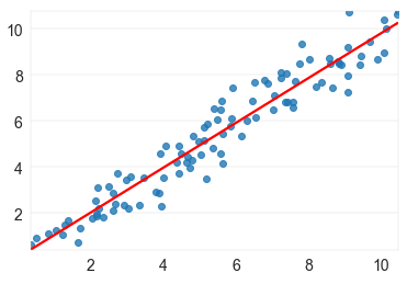
Trendline for a scatter plot is the simple regression line. The seaborn library has a function (regplot) that does it in one function call. You can even draw the confidence intervals (with ci=; I turned it off in the plot below).
import seaborn as sns
sns.regplot(x=x_data, y=y_data, ci=False, line_kws={'color':'red'});
The above call produces the following plot for the following dataset:
import numpy as np
x_data, y_data = np.repeat(np.linspace(0, 9, 100)[None,:], 2, axis=0) + np.random.rand(2, 100)*2
If you were using subplots, you can pass the ax= as well.
import matplotlib.pyplot as plt
fig, axs = plt.subplots(1,2, figsize=(12,3))
axs[0].scatter(x_data, y_data)
sns.regplot(x=x_data, y=y_data, ci=False, line_kws={'color':'red'}, ax=axs[1]);
Simple regression coefficients have a closed form solution so you can also solve explicitly for them and plot the regression line along with the scatter plot.
If x_data and y_data are lists:
x_mean = sum(x_data) / len(x_data)
y_mean = sum(y_data) / len(y_data)
covar = sum((xi - x_mean) * (yi - y_mean) for xi, yi in zip(x_data, y_data))
x_var = sum((xi - x_mean)**2 for xi in x_data)
beta = covar / x_var
alpha = y_mean - beta * x_mean
y_hat = [alpha + beta * xi for xi in x_data]
If x_data and y_data are numpy arrays:
x_mean, y_mean = np.mean(x_data), np.mean(y_data)
beta = np.sum((x_data - x_mean) * (y_data - y_mean)) / np.sum((x_data - x_mean)**2)
alpha = y_mean - beta * x_mean
y_hat = alpha + beta * x_data
Then just draw the two plots:
import matplotlib.pyplot as plt
plt.plot(x_data, y_data, 'bo', x_data, y_hat, "r-");
© 2022 - 2024 — McMap. All rights reserved.


