Correct Sizing of Markers In Scatter Plot to a Radius R in Matplotlib
Asked Answered
C

3

5

I have a plot with limits -1 to 1. I know the scatter plot doesn't plot with size as a radius, it plots with size as a point.

I need my plot to be scaled correctly with the size of each point, which I have as a radius. Is this possible with modifications to the below code?

fig, ax = plt.subplots(1)
ax.set_title("Post Synaptic Neurons")
sizes = [x.size * 100 for x in post_synaptic_neurons]
offsets = [(x.origin[0],x.origin[1]) for x in post_synaptic_neurons]
print(sizes)
ax.scatter([x.origin[0] for x in post_synaptic_neurons], [x.origin[1] for x in post_synaptic_neurons], 
  cmap=plt.cm.hsv, s=sizes, alpha=0.5)
ax.set_xlim([-1,1]) 
ax.set_ylim([-1,1])
ax.set_aspect(1)
plt.tight_layout

If no, can someone explain to me why matplotlib doesn't have a function for plotting a circle with a particular radius on the scale of the plot? I didn't expect this to be an issue, but there must be a good reason behind my difficulties.

Caponize answered 13/10, 2015 at 5:4 Comment(0)
A
4

As far as I know there is not a high-level way to do this, but you can make it work with an EllipseCollection. Since your data isn't available, I made some up and wrote this code:

import matplotlib.pyplot as plt
import numpy as np
from matplotlib.collections import EllipseCollection

x, y = 1500 * np.random.rand(2, 100)
size = 50 + 10 * np.random.randn(100)
color = np.random.rand(100)
cmap = plt.cm.hsv

fig, ax = plt.subplots(1, 2, figsize=(16, 6),
                       sharex=True, sharey=True)
ax[0].scatter(x, y, s=size, c=color, cmap=cmap)

offsets = list(zip(x, y))
ax[1].add_collection(EllipseCollection(widths=size, heights=size, angles=0, units='xy',
                                       facecolors=plt.cm.hsv(color),
                                       offsets=offsets, transOffset=ax[1].transData))
ax[1].axis('equal') # set aspect ratio to equal
ax[1].axis([-400, 1800, -200, 1600])

The result is what you hope for; simple scatter plot on the left, scaled plot on the right: enter image description here

If you scale the plots, say by changing the axis limits to ax[1].axis([200, 1000, 300, 900]), then the circles on the right plot scale as desired:

enter image description here

You can find more examples of using collections in the matplotlib docs.

Amentia answered 13/10, 2015 at 6:3 Comment(0)
W
6

Yes, there is a way to plot scatters with a specific radius on the scale of the plot. The way is to carefully define the figure size and specify the radius in the number of points, since the documentation for plt.scatter says the argument s is "The marker size in points**2".

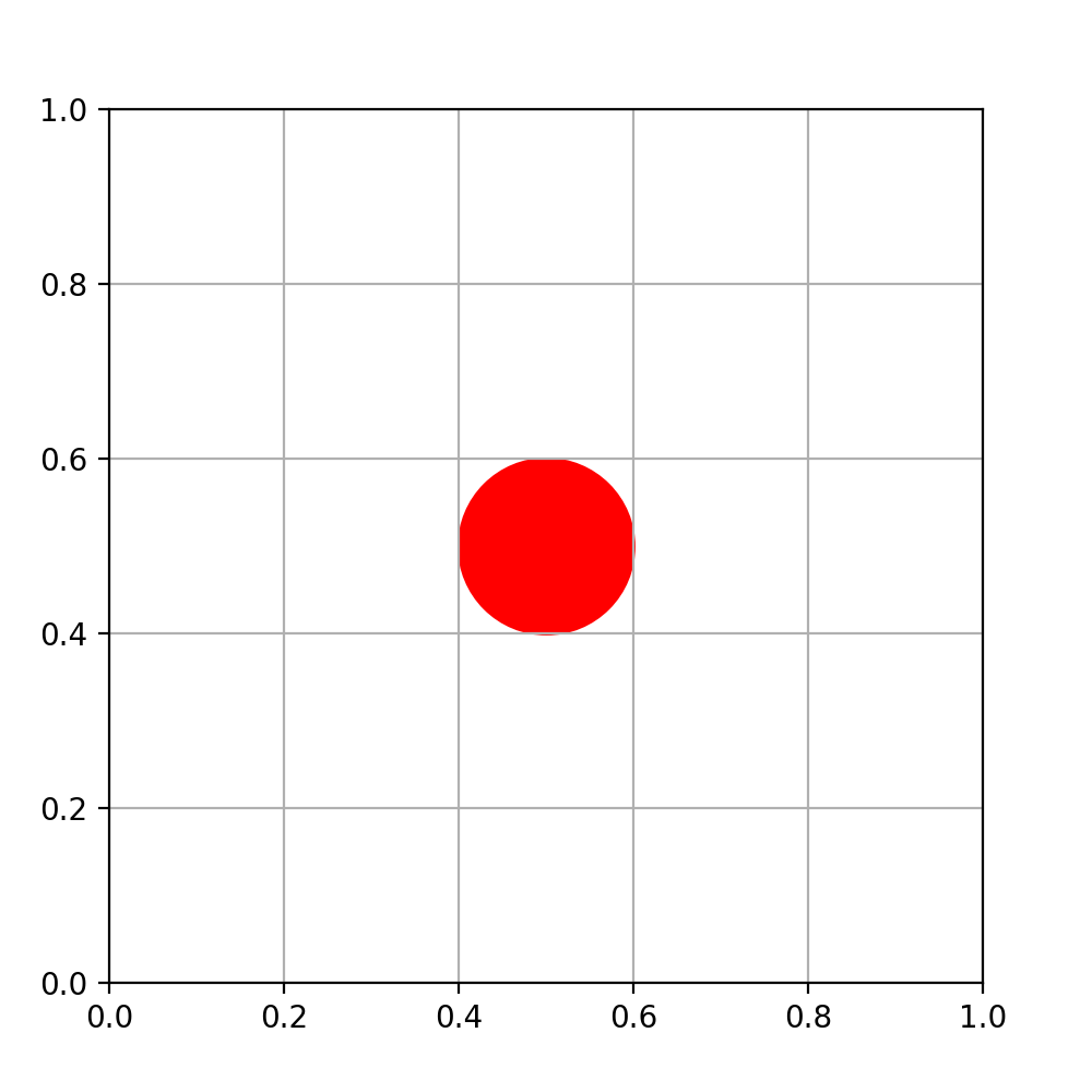
Here's an example that plots a circle with radius 0.1 at the position [0.5, 0.5]

import matplotlib.pyplot as plt
plt.figure(figsize=[5, 5])
ax = plt.axes([0.1, 0.1, 0.8, 0.8], xlim=(0, 1), ylim=(0, 1))
points_whole_ax = 5 * 0.8 * 72    # 1 point = dpi / 72 pixels
radius = 0.1
points_radius = 2 * radius / 1.0 * points_whole_ax
ax.scatter(0.5, 0.5, s=points_radius**2, color='r')
plt.grid()
plt.show()

The key here is that the standard size of points in matplotlib is 72 points per inch (ppi), no matter the dpi. The factor of 2 in the formula of points_radius comes from the fact that the area is the area of a box just outside of the shere, i.e. area = (2 * radius)**2. The output figure is shown below.

A circle with a radius of 0.1 in code scale, plot with plt.scatter

Worthy answered 2/2, 2020 at 0:28 Comment(1)
Why is plt.axes([0.1, 0.1, 0.8, 0.8], xlim=(0, 1), ylim=(0, 1)) important? I mean why can't I work without specifying the width and height of Axes.Cinematography
A
4

As far as I know there is not a high-level way to do this, but you can make it work with an EllipseCollection. Since your data isn't available, I made some up and wrote this code:

import matplotlib.pyplot as plt
import numpy as np
from matplotlib.collections import EllipseCollection

x, y = 1500 * np.random.rand(2, 100)
size = 50 + 10 * np.random.randn(100)
color = np.random.rand(100)
cmap = plt.cm.hsv

fig, ax = plt.subplots(1, 2, figsize=(16, 6),
                       sharex=True, sharey=True)
ax[0].scatter(x, y, s=size, c=color, cmap=cmap)

offsets = list(zip(x, y))
ax[1].add_collection(EllipseCollection(widths=size, heights=size, angles=0, units='xy',
                                       facecolors=plt.cm.hsv(color),
                                       offsets=offsets, transOffset=ax[1].transData))
ax[1].axis('equal') # set aspect ratio to equal
ax[1].axis([-400, 1800, -200, 1600])

The result is what you hope for; simple scatter plot on the left, scaled plot on the right: enter image description here

If you scale the plots, say by changing the axis limits to ax[1].axis([200, 1000, 300, 900]), then the circles on the right plot scale as desired:

enter image description here

You can find more examples of using collections in the matplotlib docs.

Amentia answered 13/10, 2015 at 6:3 Comment(0)
C
1

Limitation of existing solutions in this question:

I have tried Jordan He's and jakevdp's solution (two answers below this question), and I find Jordan He's solution only working with figure sizes that are carefully (manually) designed. Jakevdp's code is Python-2, which not fit Python-3.

The biggest problem of Jordan He's solution is that the size of 'scatter' is limited to circle. That is to say, when the range of x-axis and y-axis are not equal, although the 'scatter' looks like a circle, it's actually a ellipse numerically.

My solution:

In short, I refer to matplotlib demo about ellipse.

I use matplotlib.patches.Ellipse to plot a ellipse(numerically), and make it precisely the size (not inch, but values like those in axis) I set manually.

That is my code:

import matplotlib.pyplot as plt
from matplotlib.patches import Ellipse

x = 5
y = 5
e = Ellipse(xy=(x,y), width=6, height=10, angle=0) # set the width and heiget with number you want, this would be precisely numerical to the axis

fig = plt.figure(0)
# ax = fig.add_subplot(1,1,1)
ax = fig.add_subplot(1,1,1, aspect='equal') # add a plot, making the x-axis and y-axis equally looked

ax.add_artist(e)
e.set_clip_box(ax.bbox)
e.set_facecolor('#C0C0C0') # color here could be RGB like (0,0,0)

ax.set_xlim(0, 10) # set the range of x-axis
ax.set_ylim(0, 10) # set the range of y-axis

plt.grid()
plt.show()
Cartan answered 30/1 at 13:11 Comment(0)

© 2022 - 2024 — McMap. All rights reserved.