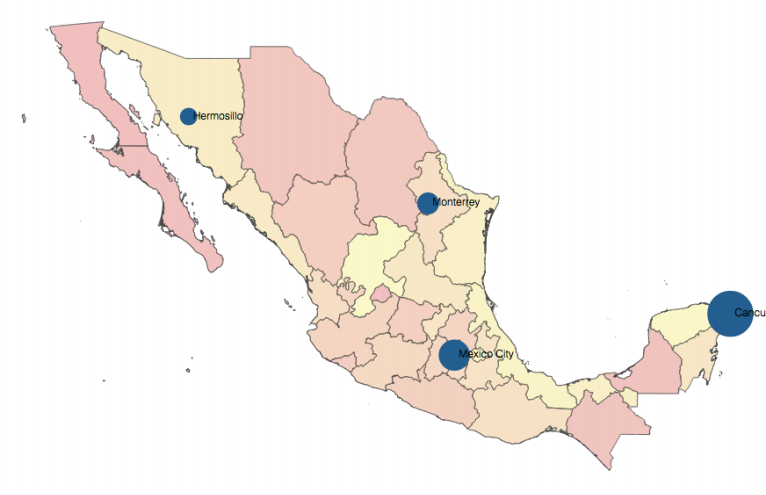
I've implemented an infographic / map using crossfilter and d3.js.
What I would like is to add the functionality of rendering different data entries as points of interest on the map:
For example here we have cities in Mexico and data to indicate a metric of tequila consumption.
What I would like to make is, for instance, tequila consumption in different cities of Europe.
How can I overlay such information over my map of Europe.
The thing is, it's very clear how to do this with d3.js but it is unclear how to achieve this with a map that is working with dc.js, i.e. crossfilter.
All of my code can be found here.
This is the part most closely related to the map itself:
//This is the data for the Map
d3.json("data/europe.json", function (error, eu) {

    console.log('map', eu)
    usChart
        .width(590)
        .height(500)
        .projection(projection
            .scale((1200 + 1) / 2 )
            .translate([660 / 4, 3360 / 4])
            .precision(.1))
        .dimension(countries)
        .group(countriesJobsdSum)
        .filterHandler( function(dimension, filter) {
             dimension.filter(
             function(d) {return usChart.filter() != null ? d.indexOf(usChart.filter()) >= 0 : true;}); // perform filtering

             return filter; // return the actual filter value
        })

        .colors(d3.scale.quantize().range(
            ["#8c857d", "#d982ab", "#d9525e", "#a63f52", "#8c6976", "#55b1b1", "#637e9e"])
        )
        .colorDomain([0, 200])
        .colorCalculator(function (d) { return d ? usChart.colors()(d) : '#ccc'; })
        .overlayGeoJson(eu.features, "countries", function (d) {
            return d.properties.name;
                    //return d.properties.Country;
        })
        .transitionDuration(0)
        .title(function (d) {
            return "Country: " + d.key + "\nNumber of Jobs: " + numberFormat(d.value ? d.value : 0) ;
        });

