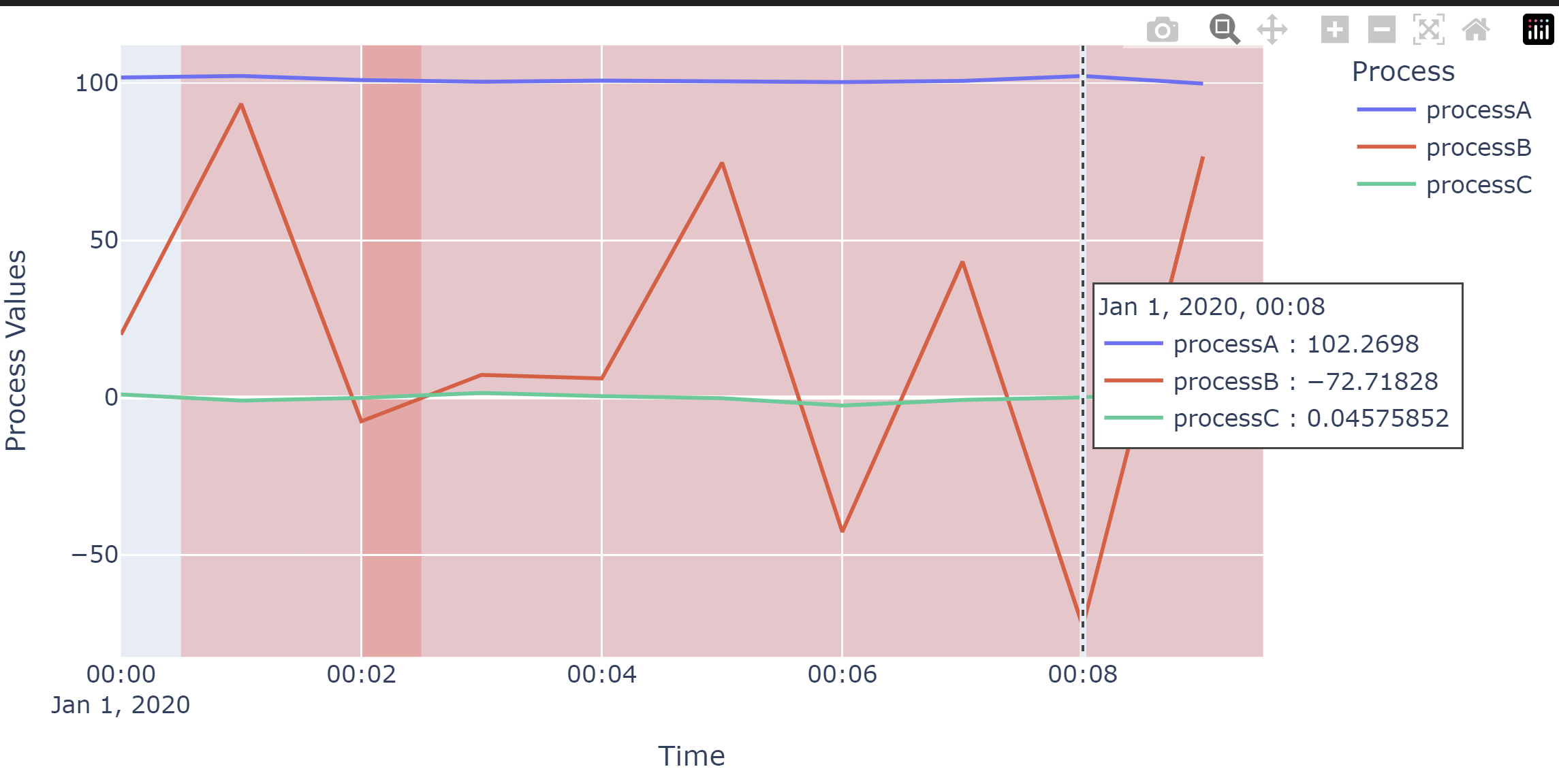
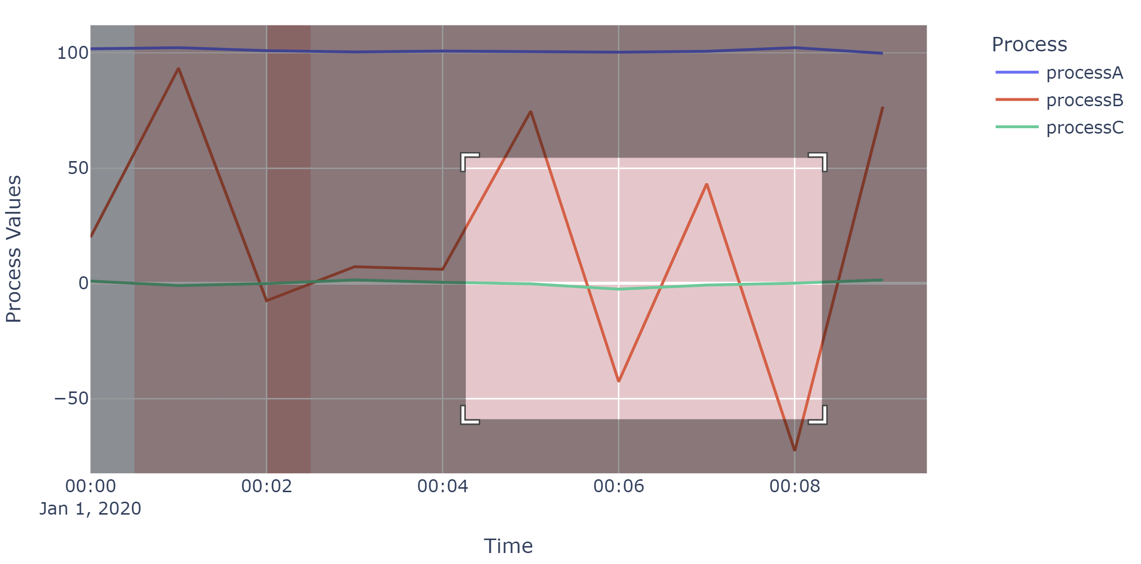
I have a dataframe df that contains values over time (process data). I have a dataframe ef that contains events (alarms) that have a starting time and end time. I would like to combine them together in one plot, in a presentable way.
"""
df==
+---------------------+------------+------------+------------+
|                     |   processA |   processB |   processC |
|---------------------+------------+------------+------------|
| 2020-01-01 00:00:00 |    101.764 |   20.0079  |   0.978738 |
| 2020-01-01 00:01:00 |    102.241 |   93.3779  |  -0.977278 |
| 2020-01-01 00:02:00 |    100.95  |   -7.56786 |  -0.103219 |
| 2020-01-01 00:03:00 |    100.411 |    7.20218 |   1.45427  |
| 2020-01-01 00:04:00 |    100.761 |    6.08375 |   0.443863 |
+---------------------+------------+------------+------------+

ef==
+----+-----------------------------------------+---------------------+---------------------+----------+
|    | alm                                     | Start               | Finish              | almid    |
|----+-----------------------------------------+---------------------+---------------------+----------|
|  0 | alarm A something something has alarmed | 2020-01-01 00:00:30 | 2020-01-01 00:01:30 | alm_id A |
|  1 | alarm B something else happened         | 2020-01-01 00:01:30 | 2020-01-01 00:02:30 | alm_id B |
|  2 | alarm A something something has alarmed | 2020-01-01 00:02:00 | 2020-01-01 00:09:30 | alm_id A |
+----+-----------------------------------------+---------------------+---------------------+----------+
"""
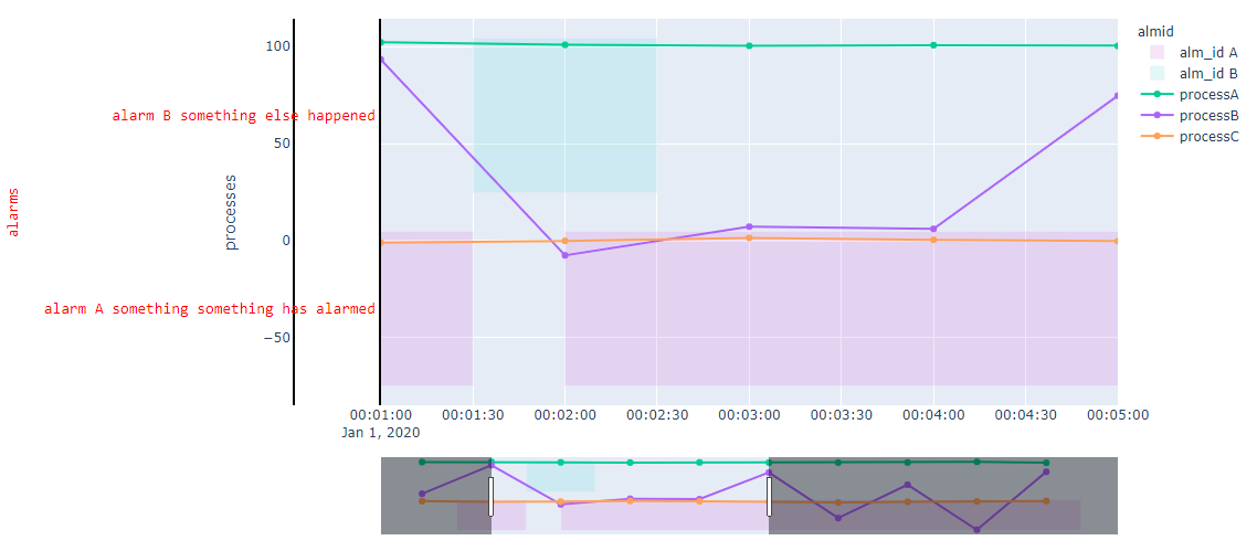
What I have gathered from plotly's documentation, .create_gantt() is deprecated. The recommended approach is .timeline(). I have not figured out how to customize anything in a .timeline() plot, what I have so far is this:

Immediate concerns are: how to customize the location and width of the bars. The alarm (red in color) ticks on the y axis is taking lots of space away, how to convey the information more gracefully.
A bigger question would be Am I taking the wrong approach? is there a better way (a new chart type, combo of different charts) of doing this?
PS. Starting Point:
import plotly.graph_objects as go
import plotly.express as px
import pandas as pd
import numpy as np
import plotly.io as pio
pio.renderers.default = "browser"

np.random.seed(0)
rowcounts = 10
df = pd.DataFrame(
    index = pd.date_range(start=pd.Timestamp('2020-01-01'), freq = 'min', periods=rowcounts, ),
    data = np.random.randn(rowcounts, 3), columns=['process'+ x for x in list('ABC')],
)
df.processA += 100
df.processB *= 50

idx = pd.date_range(start=pd.Timestamp('2020-01-01'), freq = '30S', periods=rowcounts*2, )
ef = pd.DataFrame([
    dict(alm="alarm A something something has alarmed", Start=idx[1], Finish=idx[3], almid="alm_id A"),
    dict(alm="alarm B something else happened", Start=idx[3], Finish=idx[5], almid="alm_id B"),
    dict(alm="alarm A something something has alarmed", Start=idx[4], Finish=idx[-1], almid="alm_id A")
])

"""
df==
+---------------------+------------+------------+------------+
|                     |   processA |   processB |   processC |
|---------------------+------------+------------+------------|
| 2020-01-01 00:00:00 |    101.764 |   20.0079  |   0.978738 |
| 2020-01-01 00:01:00 |    102.241 |   93.3779  |  -0.977278 |
| 2020-01-01 00:02:00 |    100.95  |   -7.56786 |  -0.103219 |
| 2020-01-01 00:03:00 |    100.411 |    7.20218 |   1.45427  |
| 2020-01-01 00:04:00 |    100.761 |    6.08375 |   0.443863 |
+---------------------+------------+------------+------------+

ef==
+----+-----------------------------------------+---------------------+---------------------+----------+
|    | alm                                     | Start               | Finish              | almid    |
|----+-----------------------------------------+---------------------+---------------------+----------|
|  0 | alarm A something something has alarmed | 2020-01-01 00:00:30 | 2020-01-01 00:01:30 | alm_id A |
|  1 | alarm B something else happened         | 2020-01-01 00:01:30 | 2020-01-01 00:02:30 | alm_id B |
|  2 | alarm A something something has alarmed | 2020-01-01 00:02:00 | 2020-01-01 00:09:30 | alm_id A |
+----+-----------------------------------------+---------------------+---------------------+----------+
"""

fig = px.timeline(
    ef, x_start="Start", x_end="Finish", y="alm", color="almid",
    color_discrete_map={
        "alm_id A": 'rgba(222, 111, 222, .2)',
        "alm_id B": 'rgba(111, 222, 222, .2)',
    }
)

myfont=dict(
    color="red",
    family="monospace",
    size=14,
)
for c in df.columns:
    fig = fig.add_trace(
        go.Scatter(
            x=df.index,
            y=df[c],
            name = c,
            yaxis = 'y2',
            hovertemplate = '%{y} <extra></extra>',
        ))

fig = fig.update_layout(
    xaxis=dict(
        type="date",
        domain=[0.15,1],
        range = [idx[2], idx[10]],
        rangeslider=dict(
            autorange=True,
            visible=True,
        ),
    ),
    yaxis=dict(
        title="alarms",
        titlefont=myfont,
        tickfont=myfont,
    ),
    yaxis2=dict(
        title="processes",
        anchor="free",
        overlaying="y",
        side="left",
        position=0.05
    ),
)

fig = fig.update_yaxes(showline=True, linewidth=2, linecolor='black')
fig.show()


