Approaches to add tracks / layers / grids to circlize::chordDiagram with specifications
Asked Answered
I

1

6

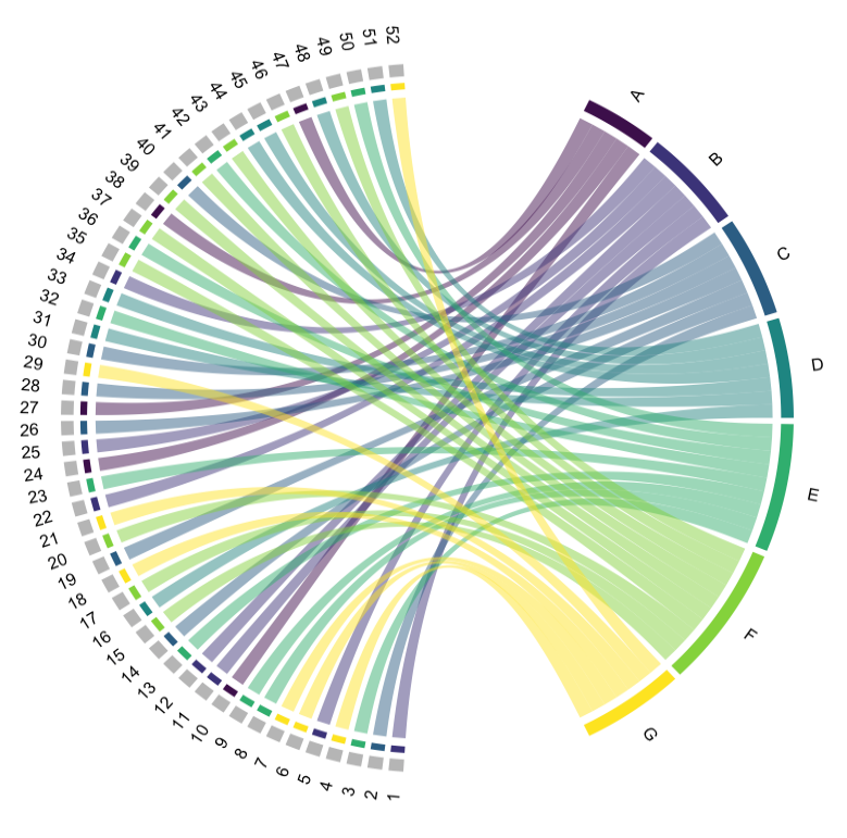
I need to visualize additional information on my chordDiagram made via circlize. I cannot figure out how to. I tried highlight.section, but that did not seem to work as straightforward

Let's use this data.

set.seed(1)

  df <- data.frame(
    Genes = 1:52,
    Description = sample(LETTERS[1:7], size = 52, replace = TRUE),
    value1 = sample(0:1, size = 52, replace = TRUE),
    value2 = sample(runif(52, min = 0, max = 0.001), size = 52, replace = TRUE),
    value3 = sample(10:20, size = 52, replace = TRUE)
  )

I have made this plot using the code below

enter image description here

library(circlize)
library(viridis)

matrix <- with(df, table(Description, Genes))  
  
  
  circos.clear()
  circos.par(start.degree = 90)
  
  description_colors <- setNames(viridis(length(rownames(matrix))), rownames(matrix))
  col_names_color <- setNames(rep("grey", length(colnames(matrix))), colnames(matrix))
  all_colors <- c(description_colors, col_names_color)
  
  # Generate the chord diagram with specified colors
  chordDiagram(matrix, transparency = 0.5, 
               annotationTrack = "grid", 
               annotationTrackHeight = c(0.03),
               preAllocateTracks = list(track.height = 0.1), # Reduced track height for genes
               grid.col = all_colors, # Apply colors to both descriptions and genes
               directional = -1,
               big.gap = 30, small.gap = 1)  # Adjust the highlight sector height here


  # Text labels for the sectors
  circos.trackPlotRegion(track.index = 1, panel.fun = function(x, y) {
    xlim = get.cell.meta.data("xlim")
    ylim = get.cell.meta.data("ylim")
    sector.name = get.cell.meta.data("sector.index")
    circos.text(CELL_META$xcenter, ylim[1] + cm_h(2), sector.name, 
                facing = "clockwise", niceFacing = TRUE, adj = c(0, 0.5))
  }, bg.border = NA)

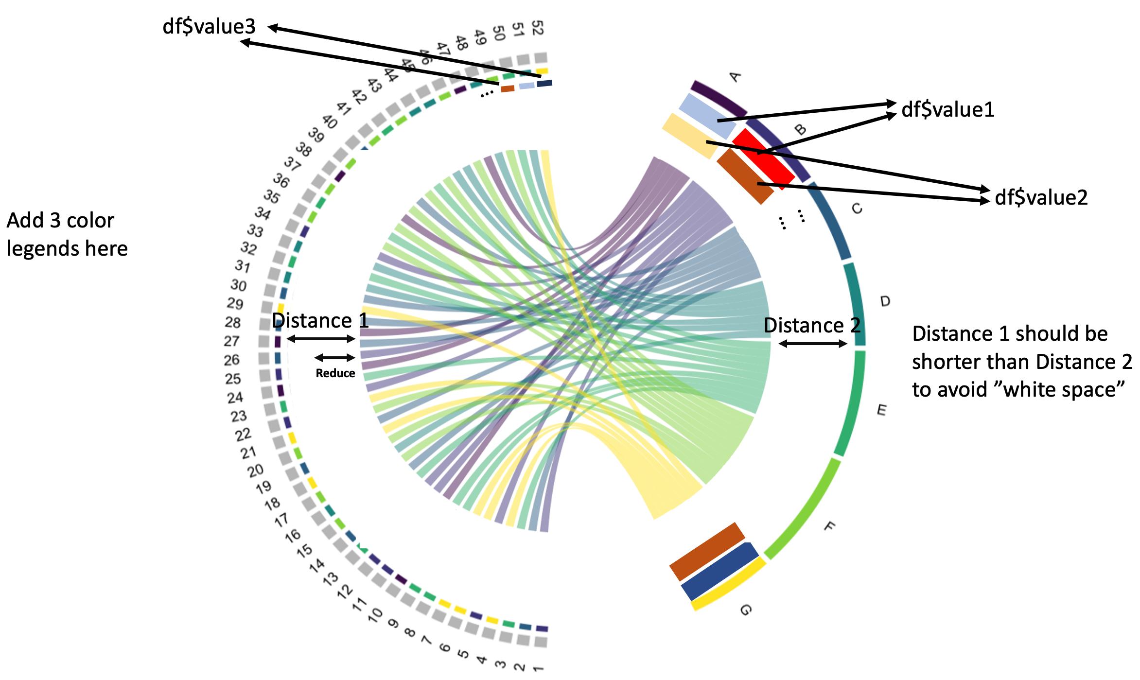
Question As you can see, df also have $value1, $value2, $value3. I want to add something like this:

enter image description here

The df$value could denote log2-fold change or FDR. Therefore, a gradient color legend should be added and correspond to each of the 3 values.

OBS: The df$value3 has been drawn "below" / on the inside of the "directional" color. It may also be drawn on the "outside" of the grey colored areas of each df$Gene so the directional color maintain a clear connection to each Description.

Incite answered 2/4 at 6:14 Comment(1)
Maybe this page helps?Marcheshvan
B
1

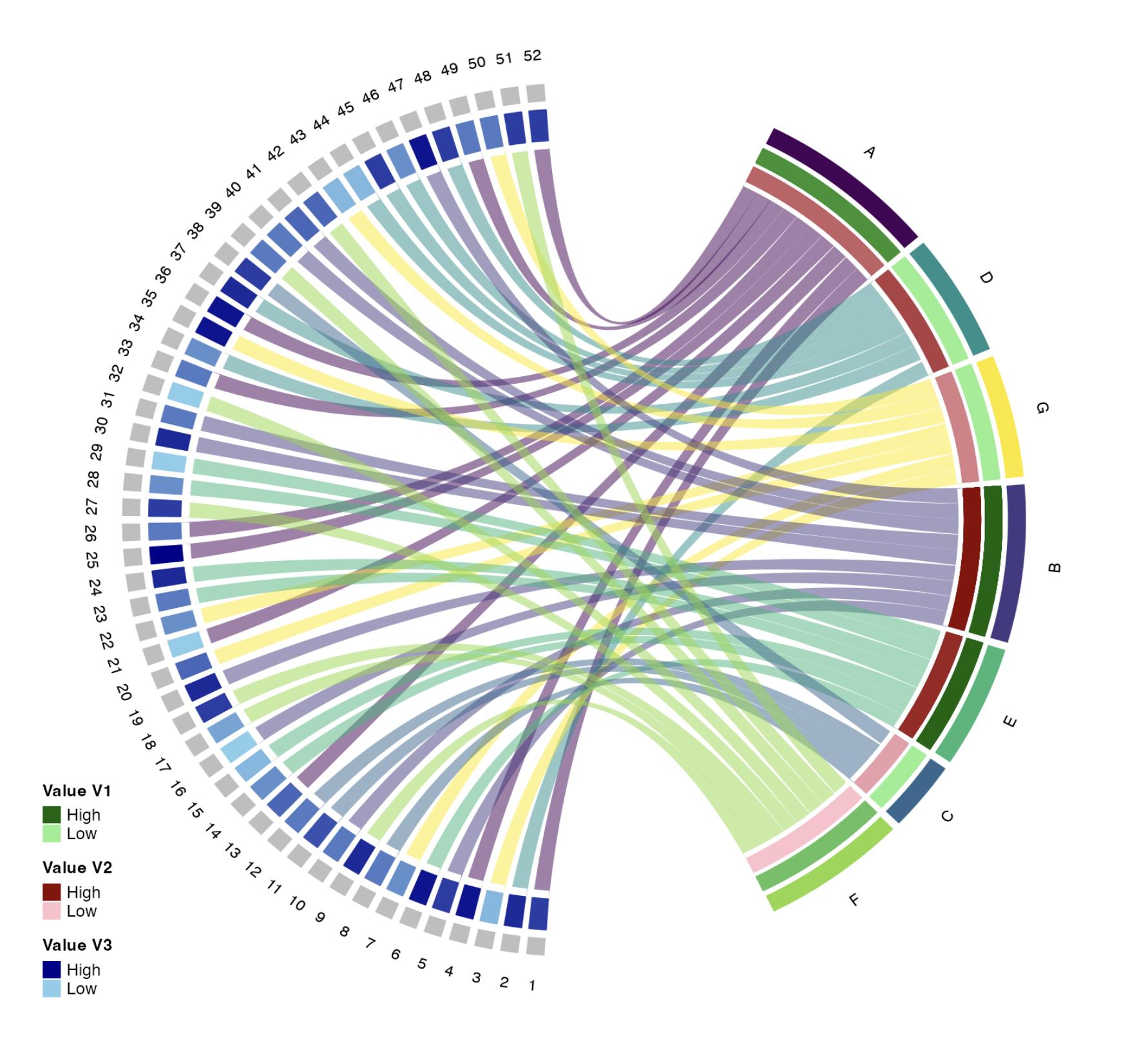
Is this anywhere close to what you'd like to achieve?

Note, because chordDiagram creates value1 and value2 columns, I've renamed the df values to v1, v2 and v3 to distinguish them when joined to the output of chordDiagram.

I've interpreted the requirement as v3 to be plotted on the left side only; v1 and v2 on the right side only using the sum of the respective values for each Description.

library(circlize)
library(ComplexHeatmap)
library(tidyverse)
library(viridis)

set.seed(1)

df <- data.frame(
  Description = sample(LETTERS[1:7], size = 52, replace = TRUE),
  Genes = as.character(1:52),
  v1 = sample(0:1, size = 52, replace = TRUE),
  v2 = sample(runif(52, min = 0, max = 0.001), size = 52, replace = TRUE),
  v3 = sample(10:20, size = 52, replace = TRUE)
)

circos.clear()
circos.par(start.degree = 90)
set_track_gap(gap = 0)

matrix <- with(df, table(Description, Genes))
description_colors <- setNames(viridis(length(rownames(matrix))), rownames(matrix))
col_names_color <- setNames(rep("grey", length(colnames(matrix))), colnames(matrix))
all_colors <- c(description_colors, col_names_color)

cdm_res <- chordDiagram(
  df[, 1:2],
  big.gap = 30,
  annotationTrack = c("name", "grid"),
  grid.col = all_colors
) |>
  left_join(df, join_by(rn == Description, cn == Genes)) |>
  mutate(across(c(v1, v2), sum), .by = rn) |>
  mutate(across(c(v1, v2, v3), \(x) ordered(x) |> fct_rev()))

circos.track(
  track.index = 3, ylim = c(-1.05, -1),
  track.height = 0.05, bg.border = "white", bg.col = "white"
)

circos.track(
  track.index = 4, ylim = c(-1.1, -1.05),
  track.height = 0.05, bg.border = "white", bg.col = "white"
)

greens <- c("darkgreen", "lightgreen")
reds <- c("darkred", "pink")
blues <- c("darkblue", "skyblue")

col1 <- colorRampPalette(greens)(n_distinct(cdm_res$v1))
col2 <- colorRampPalette(reds)(n_distinct(cdm_res$v2))
col3 <- colorRampPalette(blues)(n_distinct(cdm_res$v3))

lgd <- \(x, y) Legend(
  at = c("High", "Low"), type = "grid",
  legend_gp = gpar(fill = x, col = "black", lwd = 5),
  title_position = "topleft", title = y, background = "white"
)

lgd1 <- lgd(greens, "Value V1")
lgd2 <- lgd(reds, "Value V2")
lgd3 <- lgd(blues, "Value V3")

lgd_list <- packLegend(lgd1, lgd2, lgd3)

for (i in seq_len(nrow(cdm_res))) {
  circos.rect(
    xleft = cdm_res[i, "x1"], ybottom = -1, xright = 0, ytop = -1.06,
    col = col1[cdm_res[i, "v1"]], border = col1[cdm_res[i, "v1"]],
    sector.index = cdm_res$rn[i], track.index = 3
  )
  circos.rect(
    xleft = cdm_res[i, "x1"], ybottom = -1.04, xright = 0, ytop = -1.1,
    col = col2[cdm_res[i, "v2"]], border = col2[cdm_res[i, "v2"]],
    sector.index = cdm_res$rn[i], track.index = 4
  )
  circos.rect(
    xleft = cdm_res[i, "x2"], ybottom = -1, xright = 0, ytop = -1.13,
    col = col3[cdm_res[i, "v3"]], border = col3[cdm_res[i, "v3"]],
    sector.index = cdm_res$cn[i], track.index = 3
  )
}

draw(lgd_list, x = unit(10, "mm"), y = unit(10, "mm"), just = c("left", "bottom"))

chord plot

Created on 2024-04-08 with reprex v2.1.0

Berar answered 8/4 at 10:34 Comment(0)

© 2022 - 2024 — McMap. All rights reserved.