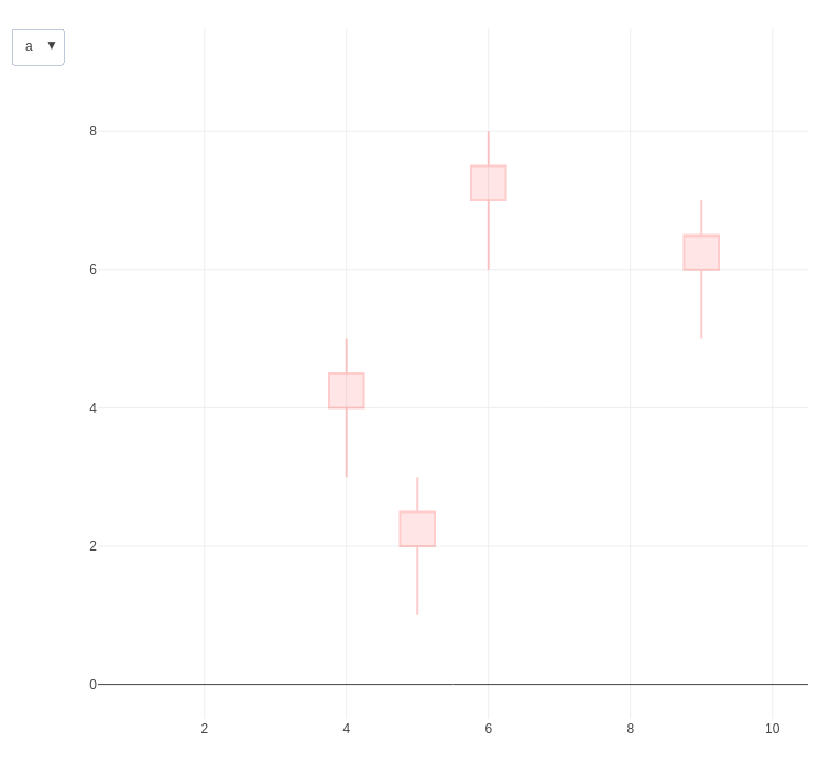
I am attempting to use update / restyle buttons in an interactive shiny / plotly candlestick chart to switch between two sets of open/high/low/close (OHCL) values. I'm observing some strange behaviour, possible related to NAs in the data or to the way RStudio updates interactive plots, which I hope somebody would be able to explain to me.
These are the mock data
set.seed(11357)
library(tidyverse)
library(shiny)
library(plotly)

n<-10
dd <- data_frame(Date = 1:n, o.a=sample(1:n, n), h.a=o.a+1, l.a=o.a-1, c.a=o.a+.5
                 , o.b=sample((n+1):(2*n), n), h.b=o.b+1, l.b=o.b-1, c.b=o.b+.5)
dd <- apply(dd, 2, function(x) {x[sample( c(1:n), floor(n/5))] <- NaN; x} ) %>% as.data.frame()
resulting in
   Date o.a h.a l.a  c.a o.b h.b l.b  c.b
1     1 NaN   6 NaN  NaN  16  17  15 16.5
2     2   3 NaN   2  3.5  15  16  14  NaN
3     3   8   9 NaN  8.5  14  15  13 14.5
4     4   4   5   3  4.5  11  12  10 11.5
5     5   2   3   1  2.5  12  13  11  NaN
6     6   7   8   6  7.5  20  21 NaN 20.5
7   NaN NaN  11   9 10.5 NaN NaN NaN 13.5
8   NaN   9  10   8  9.5 NaN NaN  18 19.5
9     9   6   7   5  6.5  18  19  17 18.5
10   10   1 NaN   0  NaN  17  18  16 17.5
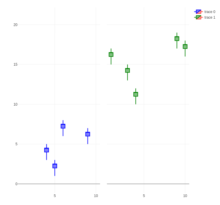
Either set of OHLC value (indicated by suffixes .a and .b) can be plotted using
col.a <- list(line = list(color = 'blue'))
col.b <- list(line = list(color = 'green'))
f <- function(x)layout(x, xaxis = list(rangeslider=list(visible=FALSE)))

fig.a <- plot_ly(type = 'candlestick'
                 , x = dd$Date, open = dd$o.a, high = dd$h.a, low = dd$l.a, close = dd$c.a
                 , increasing = col.a) %>% f
fig.b <- plot_ly(type = 'candlestick'
                 , x = dd$Date, open = dd$o.b, high = dd$h.b, low = dd$l.b, close = dd$c.b
                 , increasing = col.b) %>% f

subplot(fig.a, fig.b, shareY = TRUE)
I used the following code to implement a dropdown menu to switch between OHLC.a and OHLC.b in a single plot.
col.0 <- list(line = list(color = 'red'))
plot_ly(type = 'candlestick'
        , x=dd$Date, open = dd$o.a, high = dd$h.a, low = dd$l.a, close = dd$c.a
        , increasing = col.0, opacity = .2) %>%
  layout(updatemenus = list(
    list(
      buttons=list(
        list(
          label = 'a'
          , active = 0
          , method = 'restyle'
          , args = list(
            list(
              increasing.line.color = col.a$line$color
              , x = list(dd$Date)
              , open = list(dd$o.a)
              , high = list(dd$h.a)
              , low = list(dd$l.a)
              , close = list(dd$c.a)
              )
            )
          )
        , list(
          label = 'b'
          , method = 'restyle'
          , args = list(
            list(
              increasing.line.color = col.b$line$color
              , x = list(dd$Date)
              , open = list(dd$o.b)
              , high = list(dd$h.b)
              , low = list(dd$l.b)
              , close = list(dd$c.b)
              )
            )
          )
        )
      )
    )
    ) %>% f
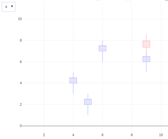
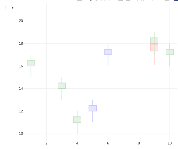
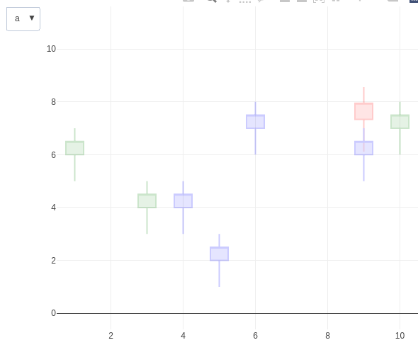
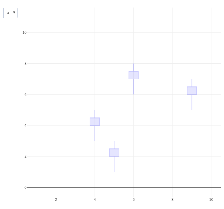
However, after executing this code, and selecting, in this order, a, b, and a from the menu, I obtain the following, puzzling, sequence of plots:
If I, instead, use the plotly Download plot as a PNG button to save the image, the results are as expected (same order):
How can I get RStudio to disply the correct plots, with 'after images' in the Viewer panel?
I have already tried using the alternative syntax dd %>% plot_ly(x=~Date, ...) and ..., args = list(list(x = list(~Date) ..., which produced the same results.
Update: Oddly enough, when I pan one of the offending plots in the RStudio Viewer, the unwanted extra candles seem to retain a fixed position on the screen but move relative to the other chart elements, indicating that they are indeed not really part of the plot, but some sort of phantom afterimages that are still begin displayed...
Update2: The problem can be worked around by including a third button to removes the candlestick data altogether between switching from a tob.
list(
      label = 'Reset'
      , method = 'restyle'
      , args = list(
        list(
          increasing.line.color = col.0$line$color
          , x = list(list())
          , open = list(list())
          , high = list(list())
          , low = list(list())
          , close = list(list())
        )
      )
    )
Of course, direct switching would be preferable.

