Why does background-image not extend to the overscroll in webkit like background-color does?
Asked Answered
N

2

7

I'm trying to implement a linear-gradient on the html tag so that when the user overscrolls it will appear.

I can apply css background-color to the html element to allow the colors to appear like they extend above and below our page to make overscrolling less jarring or 'native.' This is sometimes referred to as 'rubber banding.'

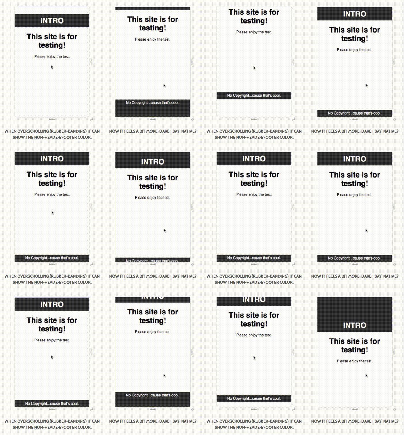
A great example of what I mean can be found on Peter Ramsing's site. His example is below:

Peter Ramsing's examples of overscrolling

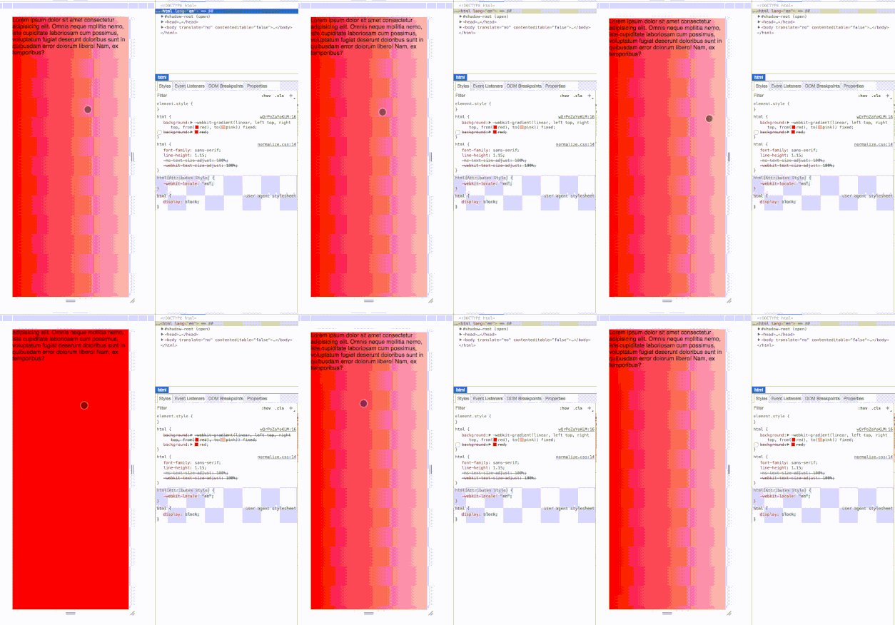
However, background-color seems to be the only property that works like this. Here is an example of the difference in behaviour between background-color and background-image (linear-gradient) - apologies for the gif quality:

enter image description here

You can find the markup to replicate the issue on codepen - this cannot be replicated within codepen itself unless on debug mode so I suggest forking this link to test.

It would be nice to have the option to have any background property extend and take rubber banding into account. I don't think there's a work around for this so I'm looking to see if anyone would know as to why Chrome team have not included this as a feature?

If no one knows as to why I'm going to submit a bug/feature request for this.

Natachanatal answered 30/11, 2017 at 16:4 Comment(1)
Tip: It's better to include the minimal, applicable source in the question. And phrasing this as a "how can I fix it to work this way" (instead of a "is this a bug in tool X") would be a little better too. Not a big deal, just might help for future readers.Medallion
T
2

You could try using html:before to have a gradient fixed behind you content.

html {
    margin: 0;
    height: 100%;
}

// Ensures gradient background is static when overscrolling
html:before{
    content:"";
    width: 100%;
    height: 100%;
    position: fixed;
    background: linear-gradient(to bottom, #143E0C, #136902);
}

// Allows the overscroll
body {
    overflow: scroll;
    height: 100vh;
    position: relative;
    background: transparent;
}

// Makes active container solid white over the gradient
.solid {
    background-color: white;
}

html

<html>
    <body>
        <div class="solid">
            Your content
        </div>
    </body>
</html>
Titfer answered 12/3 at 9:36 Comment(1)
Finally an awesome solution to this problem. Thanks so much! Using :before was the key for me to have a fixed gradient, even when overscrolling.Orpiment
W
1

When setting a background to the html, it will be applied on all four borders. If you just want to have a background-color on e.g. the top site, add a div element above your page:

<div style="height:1000px;background:#00BD9C;margin-top:-1000px;position:fixed;width:100%;"></div>

By that, the overflow color will just be applied on the top side. Depending on the background configuration of your inserted div, you can make there also gradients or insert an image that will be shown on overscroll.

Woolly answered 22/5, 2019 at 13:4 Comment(0)

© 2022 - 2024 — McMap. All rights reserved.