Stacked barplot with colour gradients for each bar
Asked Answered
P

4

8

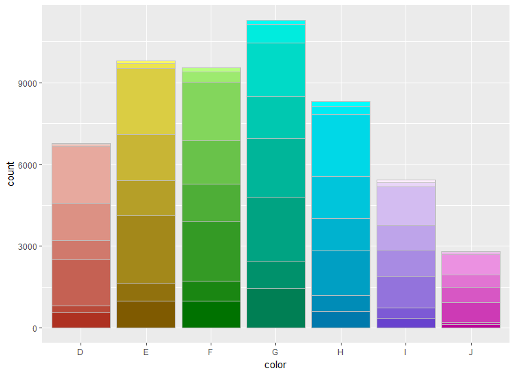
I want to color a stacked barplot so that each bar has its own parent colour, with colours within each bar to be a gradient of this parent colour.

Example:

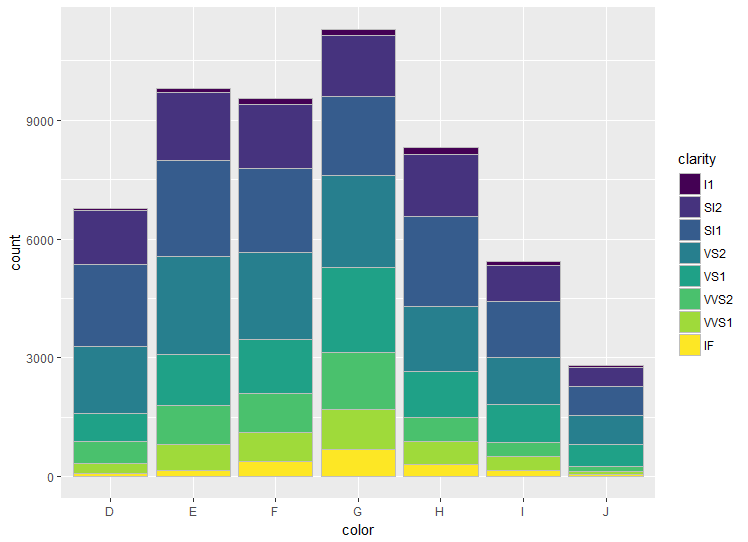
Here is a minimal example. I would like for the color of each bar to be different for color, with a gradient within each bar set by `clarity.

library(ggplot2)

ggplot(diamonds, aes(color)) + 
  geom_bar(aes(fill = clarity), colour = "grey")

enter image description here

In my real problem, I have many more groups of each: requiring 18 different bars with 39 different gradient colours.

Plexiform answered 13/4, 2018 at 13:32 Comment(3)
Can you provide your dataframe with dput()? This should be doable!Stomatal
I'm quite new to R, but I'll try. Will take a few days.Plexiform
Use this: dput(Rome) and copy-paste what is outputted in the consoleStomatal
Q
12

I have made a function ColourPalleteMulti, which lets you create a multiple colour pallete based on subgroups within your data:

ColourPalleteMulti <- function(df, group, subgroup){

  # Find how many colour categories to create and the number of colours in each
  categories <- aggregate(as.formula(paste(subgroup, group, sep="~" )), df, function(x) length(unique(x)))
  category.start <- (scales::hue_pal(l = 100)(nrow(categories))) # Set the top of the colour pallete
  category.end  <- (scales::hue_pal(l = 40)(nrow(categories))) # set the bottom

  # Build Colour pallette
  colours <- unlist(lapply(1:nrow(categories),
                          function(i){
                            colorRampPalette(colors = c(category.start[i], category.end[i]))(categories[i,2])}))
  return(colours)
}

Essentially, the function identifies how many different groups you have, then counts the number of colours within each of these groups. It then joins together all the different colour palettes.

To use the palette, it is easiest to add a new column group, which pastes together the two values used to make the colour palette:

library(ggplot2)

# Create data
df <- diamonds
df$group <- paste0(df$color, "-", df$clarity, sep = "")

# Build the colour pallete
colours <-ColourPalleteMulti(df, "color", "clarity")

# Plot resultss
ggplot(df, aes(color)) + 
  geom_bar(aes(fill = group), colour = "grey") +
  scale_fill_manual("Subject", values=colours, guide = "none")

enter image description here


Edit:

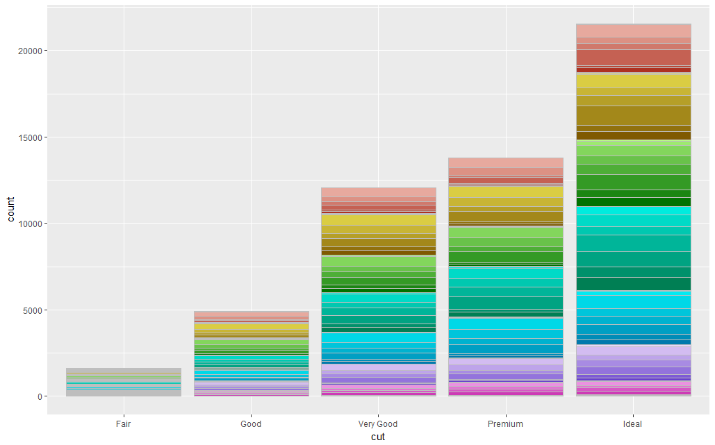
If you want the bars to be a different colour within each, you can just change the way the variable used to plot the barplot:

# Plot resultss
ggplot(df, aes(cut)) + 
  geom_bar(aes(fill = group), colour = "grey") +
  scale_fill_manual("Subject", values=colours, guide = "none")

enter image description here


A Note of Caution: In all honesty, the dataset you have want to plot probably has too many sub-categories within it for this to work.

Also, although this is visually very pleasing, I would suggest avoiding the use of a colour scale like this. It is more about making the plot look pretty, and the different colours are redundant as we already know which group the data is in from the X-axis.

Quagga answered 14/4, 2018 at 13:59 Comment(4)
Thanks for the assistance, but this changed the meaning of my original question. I do not want a parent color for 18 bars. I have 88 bars and within the bars I have 18 groups (18 different Phyla), and 39 subgroups (Classes). I'm trying to make the Phyla the parent colors, and the Classes different gradients of the Phyla.Plexiform
@Plexiform Sorry for changing the meaning: it was quite confusing so my interpretation was this. This solution shouldn't be to adapt to make that work though: see my editQuagga
Thanks, this looks really good! Is there a way to randomize the parent colors of the 18 groups within the stack, rather then following a rainbow palette? It's tricky to differentiate them since I have so many colors. Would be great, for example, if the dark red group was next to the light blue, and the yellow, rather than med blue between dark blue, and light blue.Plexiform
The colour palette is selected by the scales::hue_pal(l = 100)(nrow(categories)) argument in the function. You could replace this with a vector of the colours you like of the same length as the number of different categories i.e. c("purple", "blue", "pink"). See here for more colours. sape.inf.usi.ch/quick-reference/ggplot2/colour Please upvote and accept my answer if you are happy :)Quagga
Q
4

An easier approach to achieve a colour gradient is to use alpha to change the transparency of the colour. However, this can have unintended consequences as transparency means you can see the guidelines through the plot.

library(ggplot2)

ggplot(diamonds, aes(color, alpha = clarity)) + 
  geom_bar(aes(fill = color), colour = "grey") +
  scale_alpha_discrete(range = c(0,1))

enter image description here

Quagga answered 14/4, 2018 at 14:14 Comment(0)
D
1

I have recently created the package ggnested which creates such plots. It is essentially a wrapper around ggplot2 that takes main_group and sub_group in the aesthetic mapping, where colours are generated for the main_group, and a gradient is generated for the levels of sub_group that are nested within each level of the main_group.

devtools::install_github("gmteunisse/ggnested")
require(ggnested)
data(diamonds)
ggnested(diamonds, aes(main_group = color, sub_group = clarity)) +
  geom_bar(aes(x = color))

Example of a nested bar plot created with ggnested

Descendent answered 12/8, 2022 at 13:12 Comment(0)
L
0

Another option is to use any custom color palette and simply darken/lighten those depending on the fill category. It can be slightly tricky to get a smooth gradient in each bar, but if you keep the natural order of the data (either appearance in data frame or the factor levels) this is not a big problem.

I am using the colorspace package for this task. The shades package also has the option to darken/lighten colors, but the syntax is slightly longer. It is more suitable for modification of entire palettes without specifying specific colors.

library(tidyverse)
library(colorspace)

## get some random colors, here n colors based on the Dark2 palette using the colorspace package.
## But ANY palette is possible
my_cols <- qualitative_hcl(length(unique(diamonds$color)), "Dark2")
## for easier assignment, name the colors
names(my_cols) <- unique(diamonds$color)

## assign the color to the category, by group
df_grad <-
  diamonds %>%
  group_by(color) %>%
  ## to keep the order of your stack and a natural gradient
  ## use order by occurrence in data frame or by factor
  ## clarity is an ordered factor, so I'm using a dense rank
  mutate(
    clarity_rank = dense_rank(as.integer(clarity)),
    new_cols = my_cols[color],
    ## now darken or lighten according to the rank
    clarity_dark = darken(new_cols, amount = clarity_rank / 10),
    clarity_light = lighten(new_cols, amount = clarity_rank / 10)
  )

## use this new color for your fill with scale_identity
## you additionally need to keep your ordering variable as group, in this case
## an interaction between color and your new rank
ggplot(df_grad, aes(color, group = interaction(color, clarity_rank))) +
  geom_bar(aes(fill = clarity_dark)) +
  scale_fill_identity()

ggplot(df_grad, aes(color, group = interaction(color, clarity_rank))) +
  geom_bar(aes(fill = clarity_light)) +
  scale_fill_identity()

Created on 2022-07-03 by the reprex package (v2.0.1)

Laban answered 3/7, 2022 at 21:35 Comment(0)

© 2022 - 2024 — McMap. All rights reserved.