Independent axis for each subplot in pandas boxplot
Asked Answered
S

3

4

The below code helps in obtaining subplots with unique colored boxes. But all subplots share a common set of x and y axis. I was looking forward to having independent axis for each sub-plot:

import pandas as pd
import numpy as np
import matplotlib.pyplot as plt
from matplotlib.patches import PathPatch

df = pd.DataFrame(np.random.rand(140, 4), columns=['A', 'B', 'C', 'D'])

df['models'] = pd.Series(np.repeat(['model1','model2', 'model3', 'model4',     'model5', 'model6', 'model7'], 20))

bp_dict = df.boxplot(
by="models",layout=(2,2),figsize=(6,4),
return_type='both',
patch_artist = True,
)

colors = ['b', 'y', 'm', 'c', 'g', 'b', 'r', 'k', ]
for row_key, (ax,row) in bp_dict.iteritems():
    ax.set_xlabel('')
    for i,box in enumerate(row['boxes']):
        box.set_facecolor(colors[i])

plt.show()

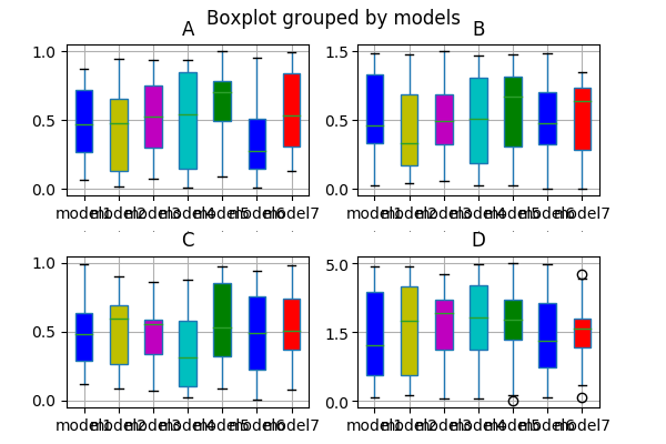
Here is an output of the above code: enter image description here

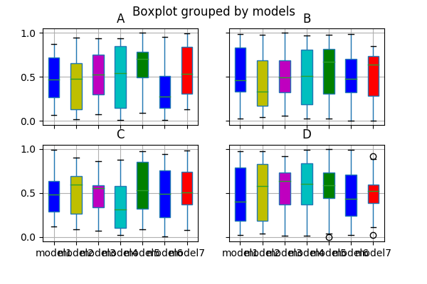
I am trying to have separate x and y axis for each subplot... enter image description here

Semen answered 21/6, 2018 at 14:32 Comment(0)
D
2

You need to create the figure and subplots before hand and pass this in as an argument to df.boxplot(). This also means you can remove the argument layout=(2,2):

fig, axes = plt.subplots(2,2,sharex=False,sharey=False)

Then use:

bp_dict = df.boxplot(
by="models", ax=axes, figsize=(6,4),
return_type='both',
patch_artist = True,
)
Diep answered 21/6, 2018 at 14:41 Comment(1)
Thanks for the answer...limiting the layout to plt.subplots mandates the number of grid boxes to be equal to subplots needed. Can you suggest a relatively easy way to accommodate 13 subplots in 2xn layout? And if I use layout argument in df.boxplot then the axis stay shared..Semen
U
1

You may set the ticklabels visible again, e.g. via

plt.setp(ax.get_xticklabels(), visible=True)

This does not make the axes independent though, they are still bound to each other, but it seems like you are asking about the visibilty, rather than the shared behaviour here.

Underplot answered 21/6, 2018 at 14:40 Comment(2)
Thanks for the answer..but I meant to have independent axes with independent ranges for all of them (especially the yaxis where ylims need to be separate for each subplot). Bound ranges are inhibiting the views of boxes having lower data range but higher axis range.Semen
In that case refer to the other answer.Underplot
F
1

If you really think it is necessary to un-share the axes after the creation of the boxplot array, you can do this, but you have to do everything 'by hand'. Searching a while through stackoverflow and looking at the matplotlib documentation pages I came up with the following solution to un-share the yaxes of the Axes instances, for the xaxes, you would have to go analogously:

import pandas as pd
import numpy as np
import matplotlib.pyplot as plt
from matplotlib.patches import PathPatch
from matplotlib.ticker import AutoLocator, AutoMinorLocator

##using differently scaled data for the different random series:
df = pd.DataFrame(
    np.asarray([
        np.random.rand(140),
        2*np.random.rand(140),
        4*np.random.rand(140),
        8*np.random.rand(140),
    ]).T,
    columns=['A', 'B', 'C', 'D']
)

df['models'] = pd.Series(np.repeat([
    'model1','model2', 'model3', 'model4',   'model5', 'model6', 'model7'
], 20))

##creating the boxplot array:
bp_dict = df.boxplot(
    by="models",layout = (2,2),figsize=(6,8),
    return_type='both',
    patch_artist = True,
    rot = 45,
)

colors = ['b', 'y', 'm', 'c', 'g', 'b', 'r', 'k', ]

##adjusting the Axes instances to your needs
for row_key, (ax,row) in bp_dict.items():
    ax.set_xlabel('')

    ##removing shared axes:
    grouper = ax.get_shared_y_axes()
    shared_ys = [a for a in grouper]
    for ax_list in shared_ys:
        for ax2 in ax_list:
            grouper.remove(ax2)

    ##setting limits:
    ax.axis('auto')
    ax.relim()      #<-- maybe not necessary

    ##adjusting tick positions:
    ax.yaxis.set_major_locator(AutoLocator())
    ax.yaxis.set_minor_locator(AutoMinorLocator())

    ##making tick labels visible:    
    plt.setp(ax.get_yticklabels(), visible=True)

    for i,box in enumerate(row['boxes']):
        box.set_facecolor(colors[i])

plt.show()

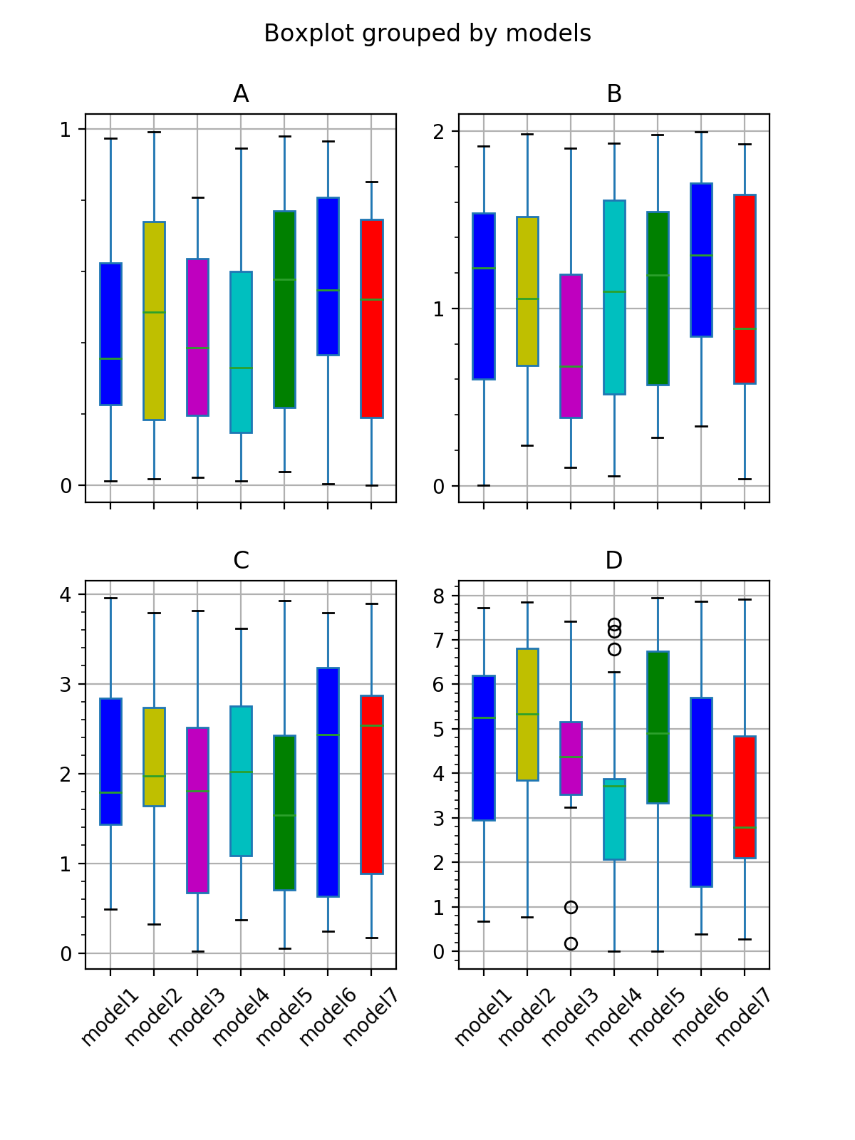
The resulting plot looks like this:

result of the above code

Explanation:

You first need to tell each Axes instance that it shouldn't share its yaxis with any other Axis instance. This post got me into the direction of how to do this -- Axes.get_shared_y_axes() returns a Grouper object, that holds references to all other Axes instances with which the current Axes should share its xaxis. Looping through those instances and calling Grouper.remove does the actual un-sharing.

Once the yaxis is un-shared, the y limits and the y ticks need to be adjusted. The former can be achieved with ax.axis('auto') and ax.relim() (not sure if the second command is necessary). The ticks can be adjusted by using ax.yaxis.set_major_locator() and ax.yaxis.set_minor_locator() with the appropriate Locators. Finally, the tick labels can be made visible using plt.setp(ax.get_yticklabels(), visible=True) (see here).

Considering all this, @DavidG's answer is in my opinion the better approach.
Fibrilla answered 25/6, 2018 at 9:19 Comment(0)

© 2022 - 2024 — McMap. All rights reserved.