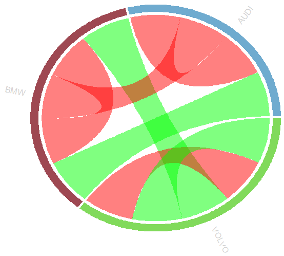
I have the code below which im trying to make into a circular diagram using the amazing package circlize
I have read the vigenette and admit some of it has gone over my head a bit,
I was wondering if there is a quick way to remove all the labels on my diagram including tick marks and just add back in AUDI, VOLVO and BMW in light grey at the same angle to the sector as per this example
library (dplyr)
library(circlize)

df = read.table(textConnection("
 Brand_from model_from Brand_to Model_to
                           VOLVO        s80      BMW  5series
                           BMW    3series      BMW  3series
                           VOLVO        s60    VOLVO      s60
                           VOLVO        s60    VOLVO      s80
                           BMW    3series     AUDI       s4
                           AUDI         a4      BMW  3series
                           AUDI         a5     AUDI       a5
                           "), header = TRUE, stringsAsFactors = FALSE)


# Add customer satisfaction (1 being positive, 0 being negative)
df <- df %>%
  mutate(Customer.Sat = c("POS","NEG","NEG","POS","POS","NEG","NEG")) %>%
  select(Brand_from,Brand_to,Customer.Sat )

# Set the colour Scheme for the association
col = c("NEG" = "red",
    "POS" = "green")

diffHeight = c("POS" = -0.02,
           "NEG" = 0.04)

# Build the Chord Diagram
chordDiagram(df[1:2],
         col = col[df$Customer.Sat],
         diffHeight = diffHeight[df$Customer.Sat])

circos.clear()
I see that it is possible based on page 17 of the vignette using the code
# Rotates the Labels so they are 90 Degrees to the chord diagram
circos.trackPlotRegion(track.index = 1, panel.fun = function(x, y) {
 xlim = get.cell.meta.data("xlim")
 ylim = get.cell.meta.data("ylim")
 sector.name = get.cell.meta.data("sector.index")
 circos.text(mean(xlim), ylim[1] + .1, sector.name, facing = "clockwise", niceFacing = TRUE, adj = c(0, 0.5))
 circos.axis(h = "top", labels.cex = 0.5, major.tick.percentage = 0.2,     sector.index = sector.name, track.index = 2)
}, bg.border = NA)
I have seen the answer to Rotate labels in a chordDiagram (R circlize) which is very similiar
However this does not remove the existing labels such as tick marks and names of the sectors.

