Disclaimer
First of all I would like to emphasize that this is rather a workaraound, because Plotly currently does not support to distribute a single data source to multiple axis without interpreting them as new trace-instances (although it would be great to just set an array of target axis like { yaxis: [ "y", "y2" ] }).
However, Plotly is very deterministic in the way it handles ordering and grouping of traces, which can be taken to our advantage.
The following workaround approaches the problem in the following way:
- Use two charts with one xaxis/yaxis instead of two axes
- Use a single source of data for each trace (
A, B, C)
- Add traces to each (or both) of the plots dynamically, based on external decision
- Use one of the following tactics to insert ghost objects and thus keep traces of both plots on the same x-axis positions:
- a) use opacity
- b) use a minimal width
- c) use a threshold
1. Use two charts instead of two axes
Let's assume we can use two charts with the same layout:
<head>
    <!-- Plotly.js -->
    <script src="https://cdn.plot.ly/plotly-latest.min.js"></script>
</head>
<body>
   <!-- render the upper axis 2 chart -->
   <div id="myDiv_upper"></div>

   <!-- render the lower axis 1 chart -->
    <div id="myDiv_lower"></div>

    <script>
        /* JAVASCRIPT CODE GOES HERE */
   </script>
</body>
With the accompanying js code to create two inital empty charts with the given layouts:
const myDiv = document.getElementById("myDiv_lower");
const myDiv2 = document.getElementById("myDiv_upper");

const layout = {
    yaxis: {
        domain: [0, 0.5],
        title: "axis 1",
        constrain: "range"
    },
    margin: {
        t: 0,
        b: 0,
        pad: 0
    },
    showlegend: false,
    boxmode: "group"
};

const layout2 = {
    yaxis: {
        domain: [ 0.5, 1 ],
        title: "axis 2",
    },
    xaxis: {
        domain: [ 0, 1 ]
    },
   margin: {
        t: 0,
        b: 0,
        pad: 0
    },
    boxmode: "group"
};

Plotly.newPlot(myDiv, [], layout);
Plotly.newPlot(myDiv2, [], layout2);
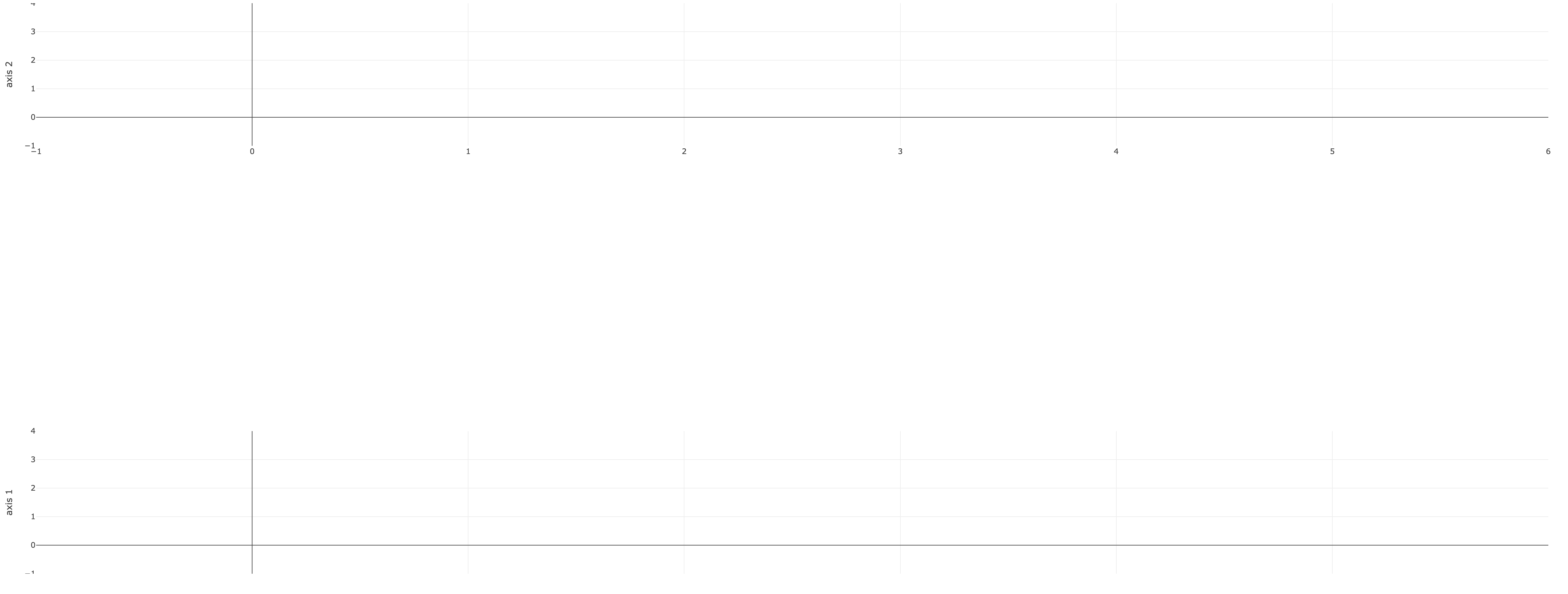
The resulting empty plot will look like this, if no further data is added:
![enter image description here]()
2. Use a single source of data for each trace (A, B, C)
We can then split the data into three main source-objects:
const A = {
    x: ["Site 1", "Site 1", "Site 1", "Site 1", "Site 1", "Site 1"],
    xaxis: "x",
    yaxis: "y",
    name: "A",
    legendgroup: "A",
    type: "box",
    boxpoints: false,
    y: ["3.81", "3.74", "3.62", "3.50", "3.50", "3.54"]
};

const B = {
    x: ["Site 1", "Site 1", "Site 1", "Site 1", "Site 1", "Site 1"],
    xaxis: "x",
    yaxis: "y",
    name: "B",
    legendgroup: "B",
    type: "box",
    boxpoints: false,
    y: ["1.54", "1.54", "1.60", "1.41", "1.65", "1.47"]
};

const C = {
    x: ["Site 1", "Site 1", "Site 1", "Site 1", "Site 1", "Site 1"],
    xaxis: "x",
    yaxis: "y",
    name: "C",
    legendgroup: "C",
    type: "box",
    boxpoints: false,
    y: ["3.31", "3.81", "3.74", "3.63", "3.76", "3.68"]
}
3. Add traces to each (or both) of the plots dynamically, based on external decision
First of all we create a helper add, that updates the charts, based on new incoming data and one that creates our ghost object helper, named placeholder:
const placeholder = src => {
    const copy = Object.assign({}, src)
    // use one of the strategies here to make this a ghost object
    return copy
}

const add = ({ src, y1, y2 }) => {
    let src2
    if (y1 && y2) {
        Plotly.addTraces(myDiv, [src])
        Plotly.addTraces(myDiv2, [src])
    } else if (y1 && !y2) {
        src2 = placeholder(src)
        Plotly.addTraces(myDiv, [src])
        Plotly.addTraces(myDiv2, [src2])
    } else if (!y1 && y2) {
       src2 = placeholder(src)
       Plotly.addTraces(myDiv, [src2])
        Plotly.addTraces(myDiv2, [src])
   } else {
        throw new Error('require either y1 or y2 to be true to add data')
    }
}
Based on the given images the decisions to add the data to the axis would result in the following calls:
add({ src: A, y1: true, y2: true })
add({ src: B, y1: true, y2: false })
add({ src: C, y1: true, y2: true })
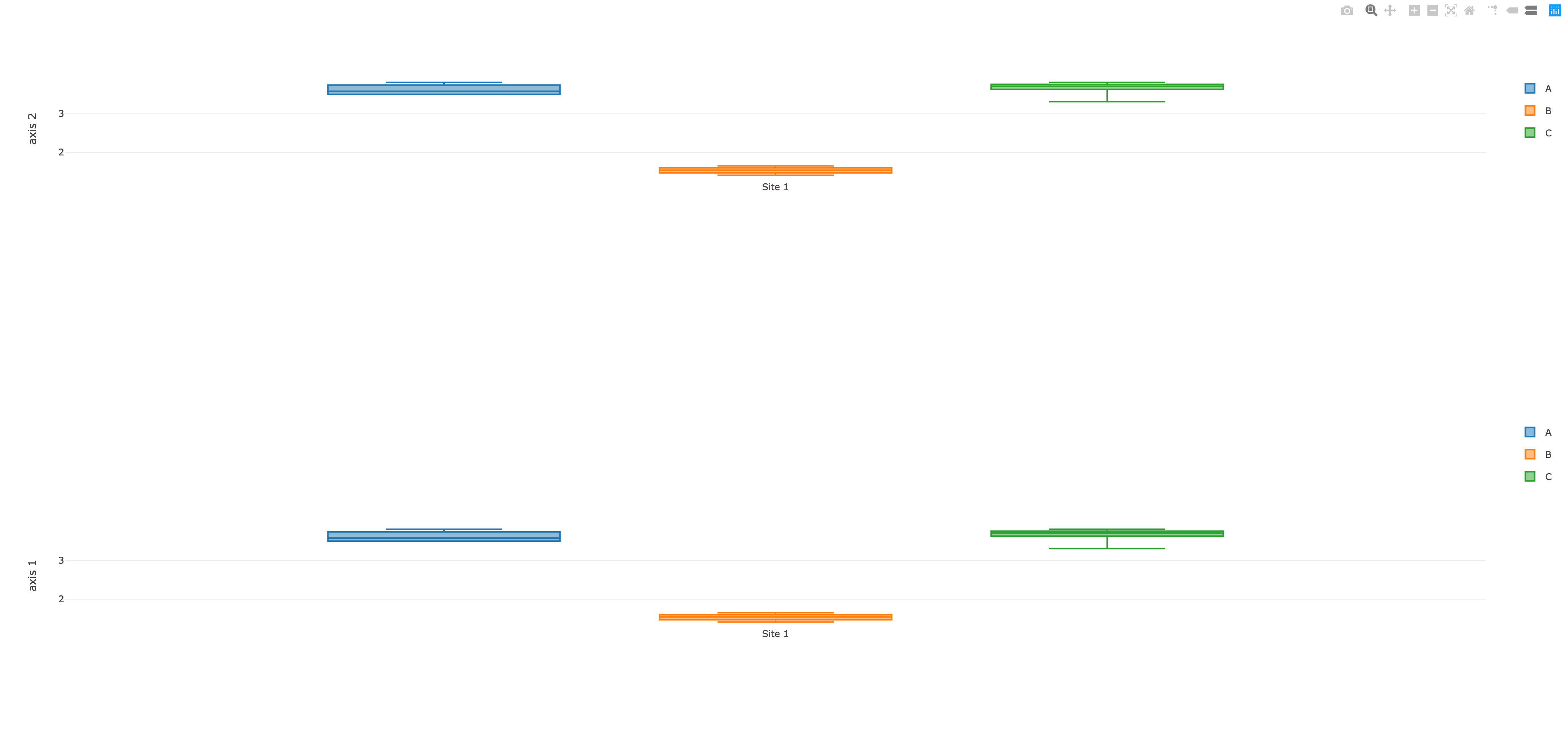
This would create the following (yet not satisfiable) result:
![enter image description here]()
Now we have at least resolved the grouping and color. The next step is to look for possible ways of making B a ghost object, that requires spacing in the upper chart but won't display the data.
4. Use one of the following tactics to insert ghost objects and thus keep traces of both plots on the same x-axis positions
Before we look into the different options, let's see what happens, if we remove the data or null the data.
remove the data
Removing the data would mean, that the placeholder has no x/y values:
const placeholder = src => {
    const copy = Object.assign({}, src)
    delete copy.x
    delete copy.y
    return copy
}
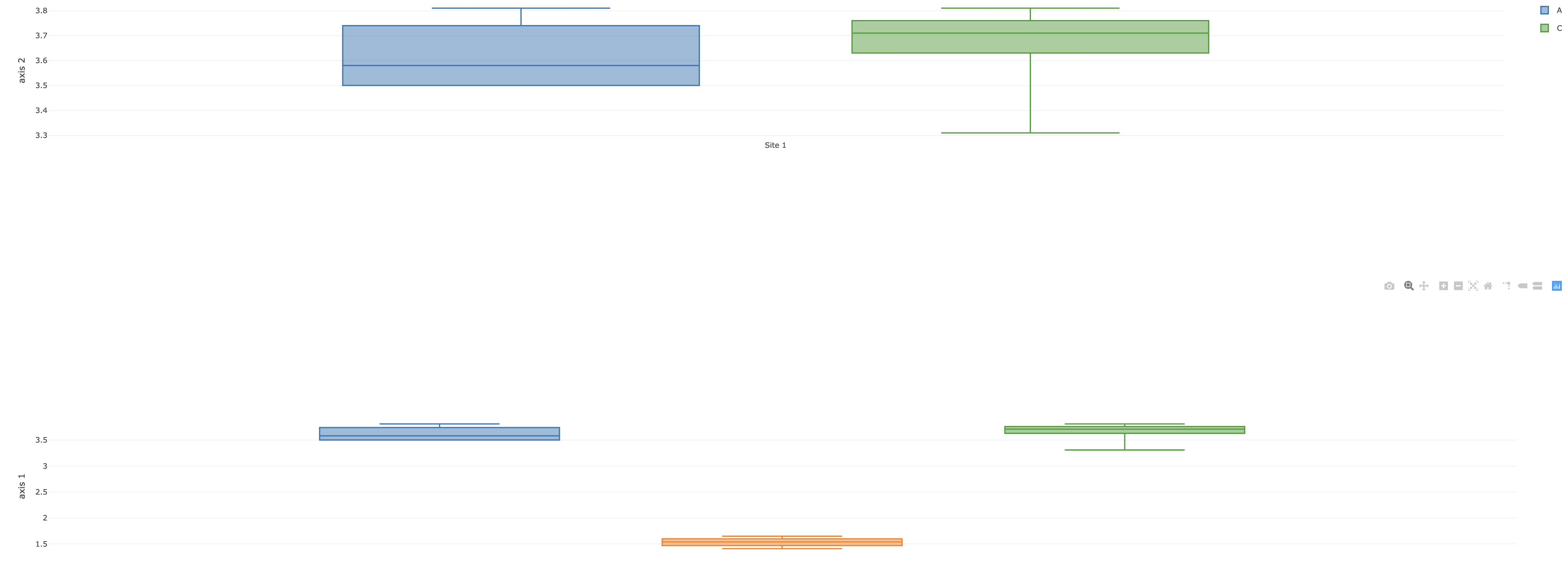
The result would still not satisfy the requirements:
![enter image description here]()
null the data
Nulling the data has the nice effect, that the data is added to the legend (which has basically the same effect as visible: 'legendonly':
const placeholder = src => {
    const copy = Object.assign({}, src)
    copy.x = [null]
    copy.y = [null]
    return copy
}
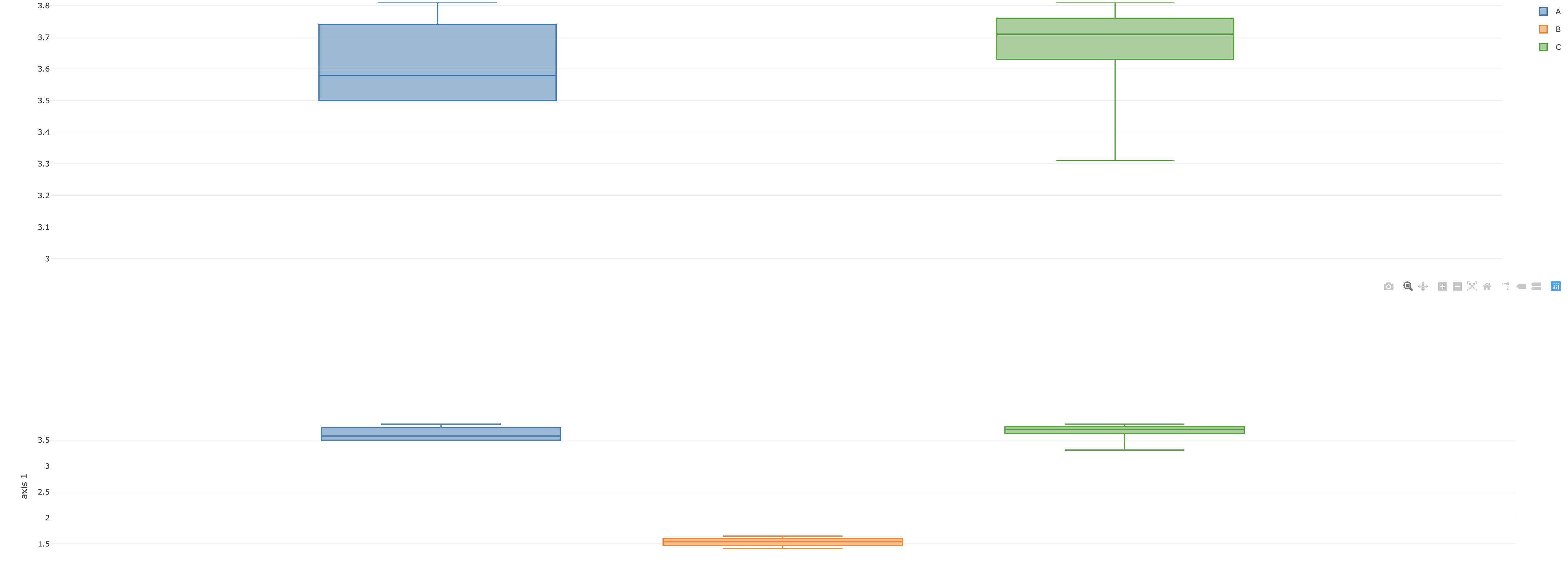
The result would still not satisfy the requirements, allthough at least the legend grouping is now correct:
![enter image description here]()
a) use opacity
One option to create a ghost object is to set it's opacity to zero:
const placeholder = src => {
    const copy = Object.assign({}, src)
    copy.opacity = 0
    copy.hoverinfo = "none" // use "name" to show "B"
    return copy
}
The result has the advantage, that it pleaces the objects in the right positions. A big disadvantage is, that the legend's opactiy for B is bound to the object's opacity and this shows only the label B but not the colored box.
Another disadvantage is that the data of B still affects the yaxis scaling:
![enter image description here]()
b) use a minimal width
Using a minimal amount greater zero causes the trace to nearly disappear, while a small line remains.
const placeholder = src => {
    const copy = Object.assign({}, src)
    copy.width = 0.000000001
    copy.hoverinfo = "none" // or use "name"
    return copy
}
This example keeps the grouping, positioning and legend correct but the scaling is still affected and the remaining line can be misinterpreted (which can be very problematic IMO):
![enter image description here]()
c) use a threshold
Now this is the only solution that satisfies all the requirements with a great caveit: it requires a range to be set on the yaxis:
const layout2 = {
    yaxis: {
        domain: [ 0.5, 1 ],
        title: "axis 2",
        range: [3.4, 4] // this is hardcoded for now
    },
    xaxis: {
        domain: [ 0, 1 ]
    },
   margin: {
        t: 0,
        b: 0,
        pad: 0
    },
    boxmode: "group"
}

// ...

// with ranges we can safely add
// data to both charts, because they
// get ghosted, based on their fit
// within / outside the range
const add = ({ src }) => {
    Plotly.addTraces(myDiv, [src])
    Plotly.addTraces(myDiv2, [src])
}

add({ src: A })
add({ src: B })
add({ src: C })
The result will then look like the following:
![enter image description here]()
Now the only question remains, how to determin the range after the new data has been added? Fortunately Plotly provides a function to update the layout, named Plotly.relayout.
For this example we may choose a simple anchor, like the mean. Of course any other method to determine the range is possible.
const add = ({ src }) => {
    Plotly.addTraces(myDiv, [src])
    Plotly.addTraces(myDiv2, [src])
    return src.y
}

// add the data and generate a sum of all values
const avalues = add({ src: A })
const bvalues = add({ src: B })
const cvalues = add({ src: C })
const allValues = [].concat(avalues, bvalues, cvalues)

// some reusable helpers to determine our range
const highest = arr => Math.max.apply( Math, arr )
const mean = arr => arr.reduce((a, b) => Number(a) + Number(b), 0) / arr.length

const upperRange = highest(allValues)  // 3.81
const meanRange = mean(allValues)      // 2.9361111111111113

// our new values to update the upper layour
const updatedLayout = {
    yaxis: {
        range: [meanRange, upperRange]
    }
}

Plotly.relayout(myDiv2, updatedLayout)
The resulting graph looks mostly like the desired result:
![enter image description here]()
You can use this link to play around and improve it at your wish: https://codepen.io/anon/pen/agzKBV?editors=1010
Summary
This example is still to be considered a workaround and is not tested beyond the given data. There is also room for improvement regarding the reusability and code efficiency and it is all written down in a sequencial manner to make this code understandable as possible.
Please also keep in mind, that displaying the same data on two different axis can be misleading to be interpreted as two different sets of data.
Any suggestions for improvement are allowed, code is free to use.


domaininstead ofrange). Maybe you can add some little detail on the possible variations of the data and why you chose the two domains (0 - 0.5 and 0.5 - 1) – Archername: "B"will be part ofyaxisbut not ofyaxis2? Of course you just manually omitted in in your example but this will not work when throwing in arbitrary data, where autorange will consider all the data to be displayed and domain will consider all the data for scaling. I can provide you an example that works, if you could determine a range (or any other threshold criteria to omitBin the upper axis) for the two axis. – Archeryaxisoryaxis2(or evenyaxis3and so on) based on an attribute in the data. I then split it into thedataobject you see in the example. If you can create an example that looks like what I need, I could then most likely convert my original data into that format. At the moment I'm not able to get the chart that I need even with fixed data. – Narrative